GRAU
Source: portorocha.com License: All Rights Reserved.

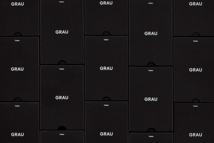
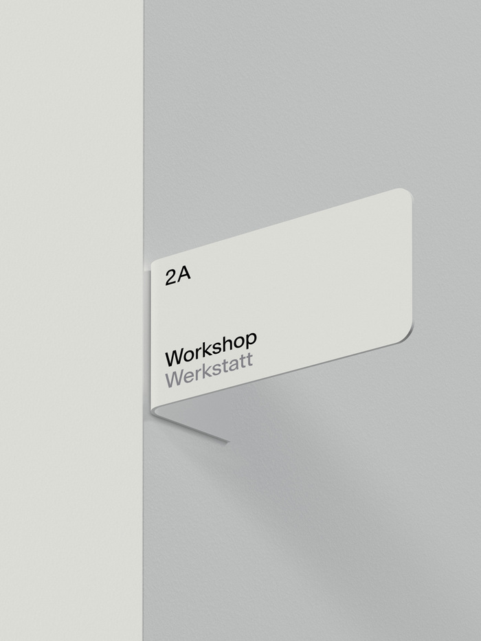
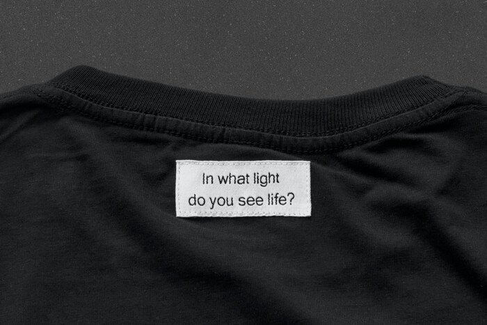
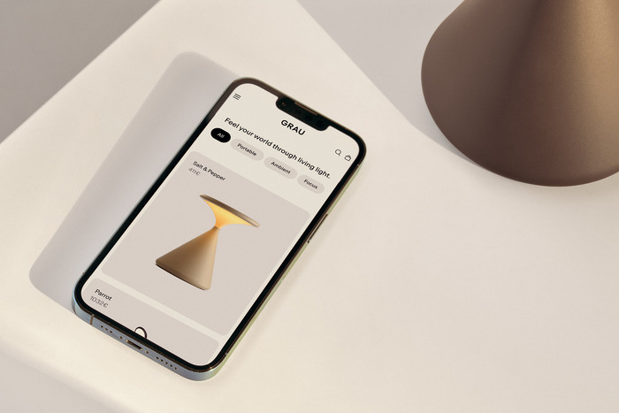
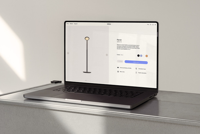
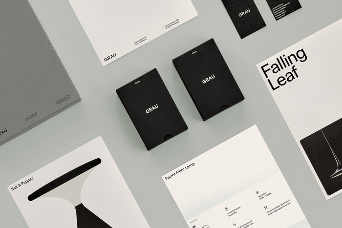
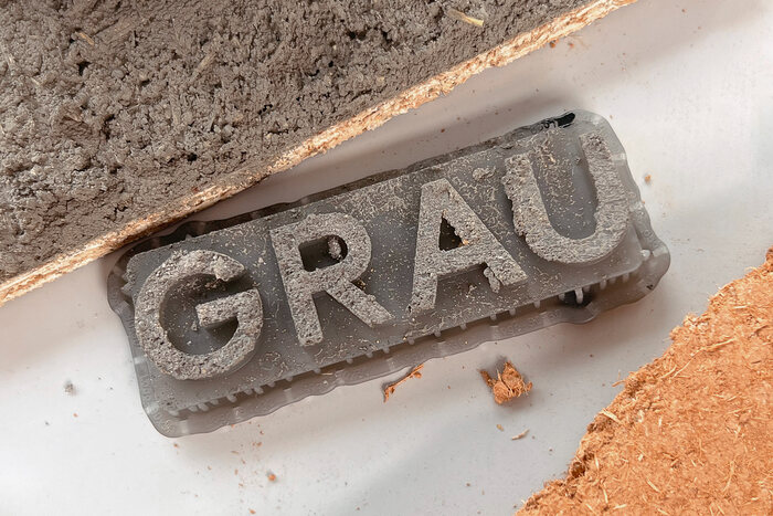
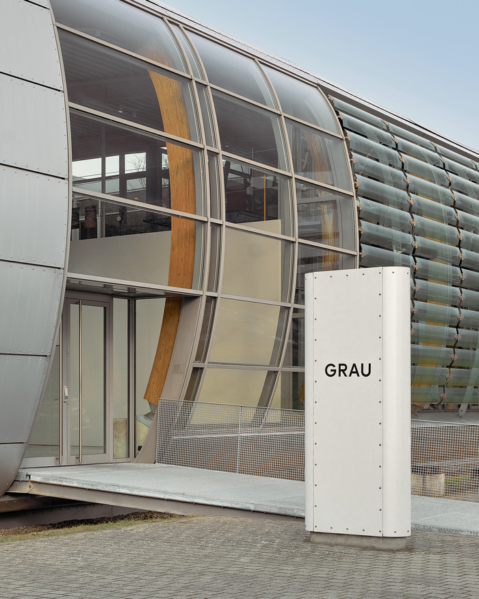
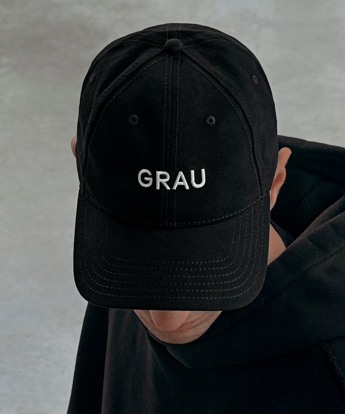
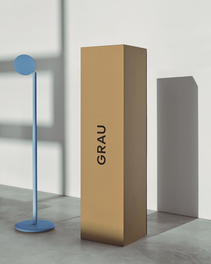
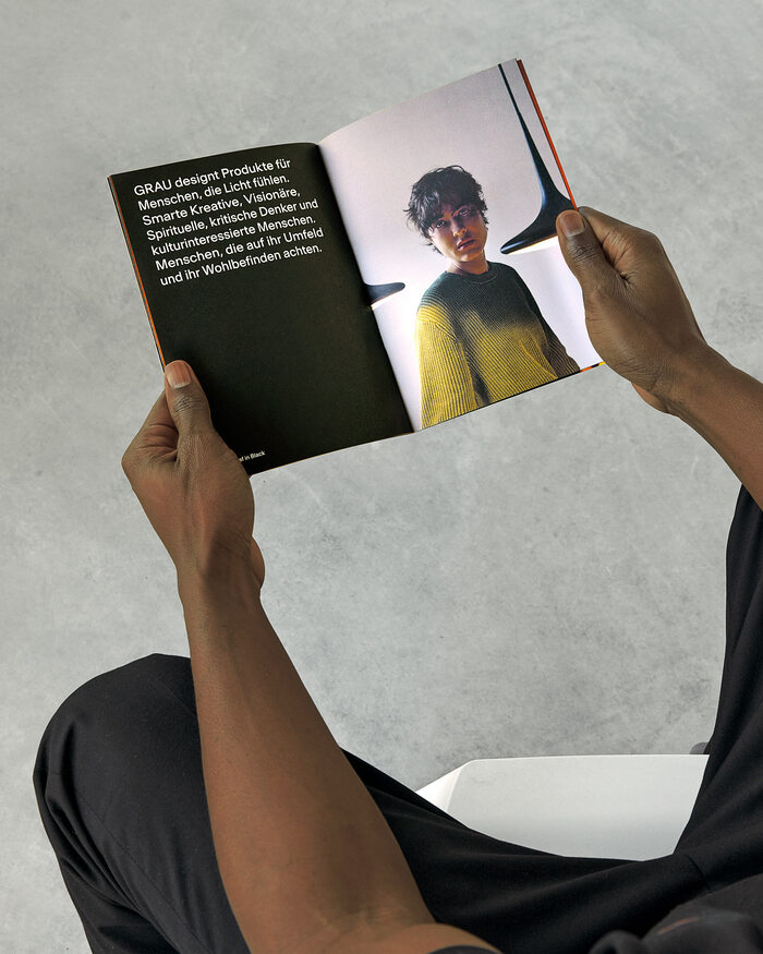
Antarctica typeface in use for the branding of the innovative lighting design company GRAU. The design was handled by New-York-based design agency Porto Rocha, who write:
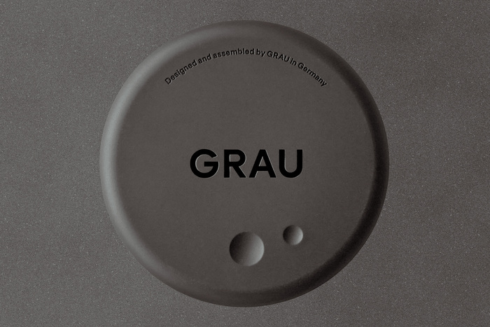
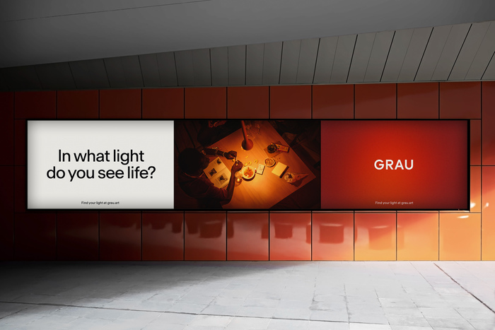
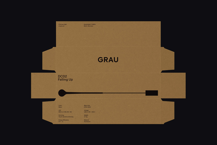
We constructed a logo with open geometric forms, engineered to take on new meanings over time. Across physical and digital applications, the mark becomes an iconic signature for GRAU products and art practice. To complement it: Antarctica, a sans serif typeface from Newglyph that is equally utilitarian and conversational. As an exercise in reduction, the color palette relies on a neutral foundation of black and off-white; accents of red and blue nod to the visible light spectrum’s expressions of warm and cool. Ample negative space, a keystone of digital and analog compositions, becomes its own brand gesture by making room for other elements to artfully coexist.
Source: portorocha.com License: All Rights Reserved.
Source: portorocha.com License: All Rights Reserved.
Source: portorocha.com License: All Rights Reserved.
Source: portorocha.com License: All Rights Reserved.
Source: portorocha.com License: All Rights Reserved.
Source: portorocha.com License: All Rights Reserved.
Source: portorocha.com License: All Rights Reserved.
Source: portorocha.com License: All Rights Reserved.
Source: portorocha.com License: All Rights Reserved.
Source: portorocha.com License: All Rights Reserved.
Source: portorocha.com License: All Rights Reserved.
Source: portorocha.com License: All Rights Reserved.
Source: portorocha.com License: All Rights Reserved.
This post was originally published at Fonts In Use