49º Festival Sesc Melhores Filmes
Paula Cruz. License: All Rights Reserved.
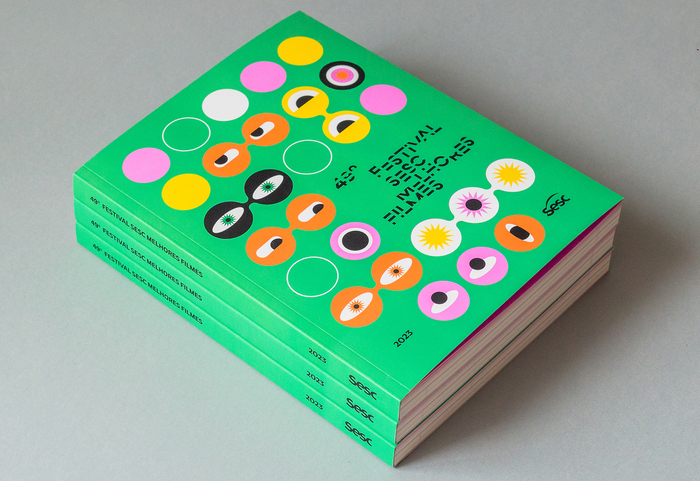
Program cover


This year’s colorful identity for Brazilian film festival Sesc Melhores Films was created by editorial designers Paula Cruz and Lucas D’Ascenção, and motion designer Fernando Doti. The type palette features Map Roman Compressed for titles, Massilia for extended text, and JetBrains Mono for meta-information and running heads.
Here’s a little more about about the project from Paula Cruz:
Sesc Melhores Filmes is one of the most traditional film festivals in the city of São Paulo and in Brazil. For their 49th edition, the entire visual identity was designed referring to the movie theater where the event would take place. The objects present in the cinema, such as the box office and movie tickets, were essential references for the construction of the identity, animation and the catalogue. The final result is a dynamic material that values both the various winners and selections of the festival, from digital to paper.
Map Roman is the perfect typeface to shout out big news in both contemporary and classical styles. Boldly condensed, sophisticatedly avant-garde serif.
Paula Cruz. License: All Rights Reserved.
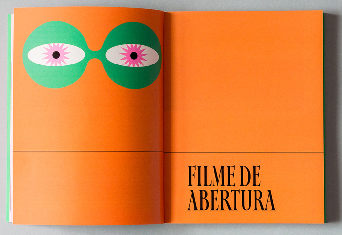
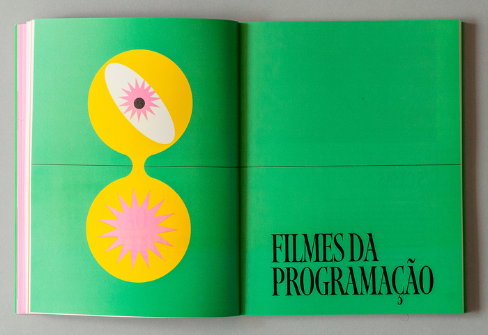
Program chapter head
Paula Cruz. License: All Rights Reserved.
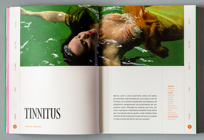
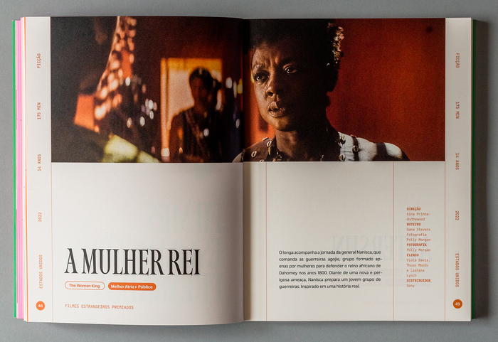
Film listing

Paula Cruz. License: All Rights Reserved.
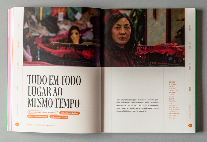
Chapter head
Paula Cruz. License: All Rights Reserved.
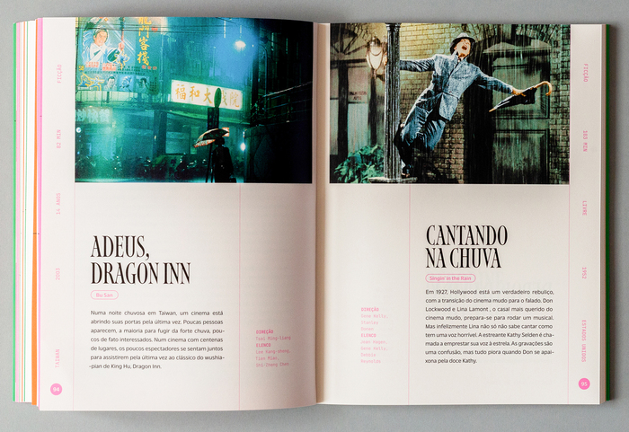
Film listing
Paula Cruz. License: All Rights Reserved.
Film listing
Paula Cruz. License: All Rights Reserved.
Chapter head
Paula Cruz. License: All Rights Reserved.
Film listings

Paula Cruz. License: All Rights Reserved.
Content
Paula Cruz. License: All Rights Reserved.
Environmental graphics
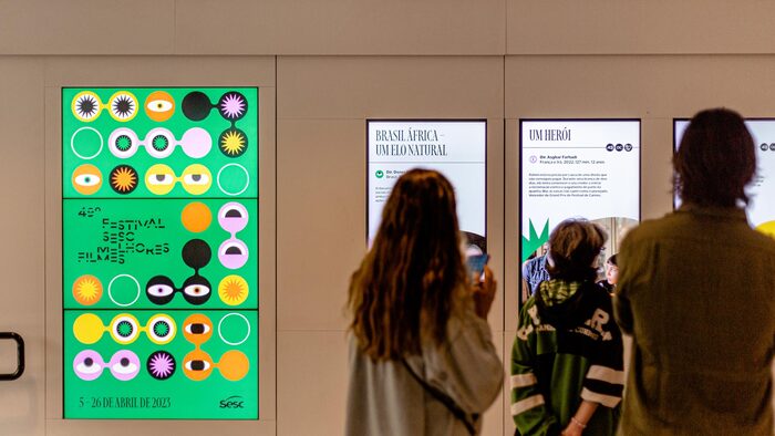
Paula Cruz. License: All Rights Reserved.
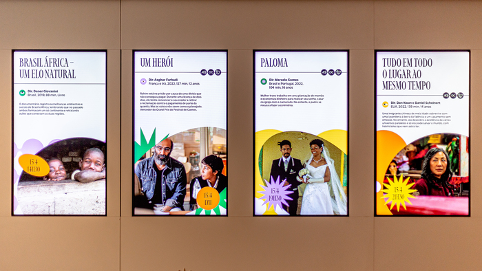
Environmental graphics in action
Paula Cruz. License: All Rights Reserved.
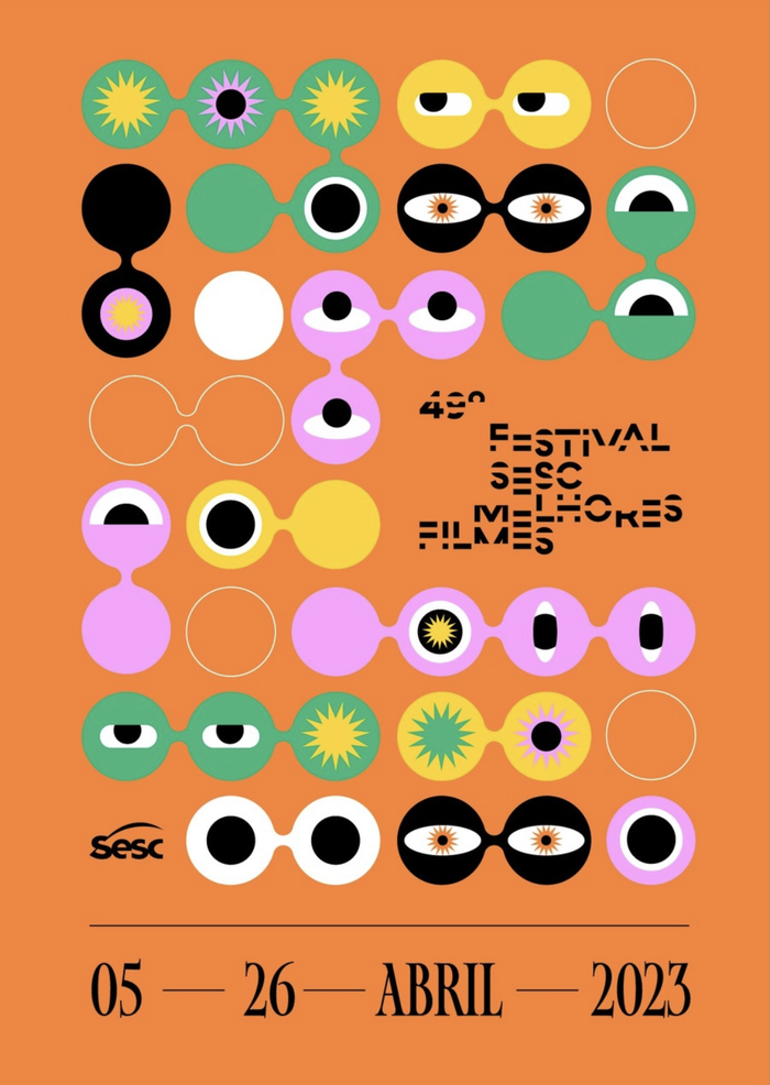
Poster

Paula Cruz. License: All Rights Reserved.
Instagram post

Paula Cruz. License: All Rights Reserved.
Instagram post

Source: paulacruz.com.br Paula Cruz. License: All Rights Reserved.
Instagram post
This post was originally published at Fonts In Use