Roger Food
Source: dillo.studio DilloStudio. License: All Rights Reserved.


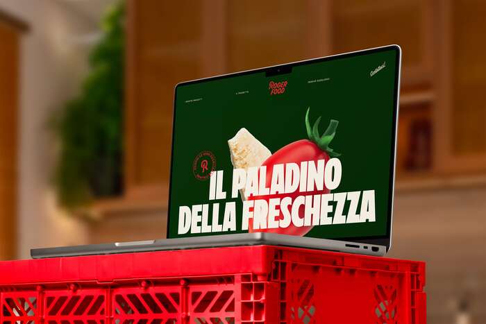
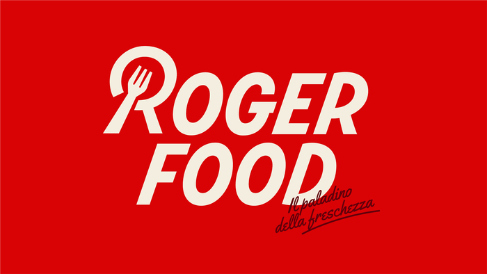
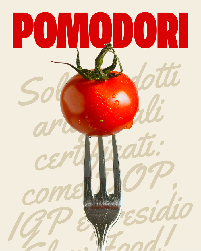
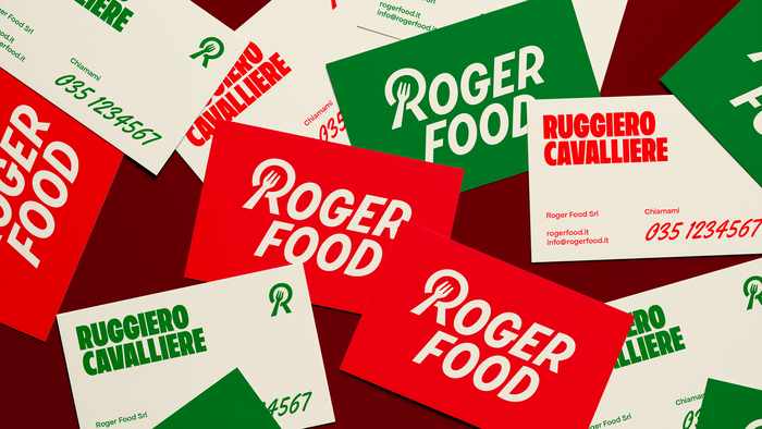
Roger Food is a distributor of Italian culinary excellence, operating in both B2B and B2C markets. Its mission is to bring the best of Italian food to the table: authentic products, carefully selected, that tell stories of regions, traditions, and passion. The name comes from Ruggiero, founder and driving force behind the project, who defines himself as a “Paladin of Freshness” – a reference to both the quality of his products and the efficiency of his deliveries.
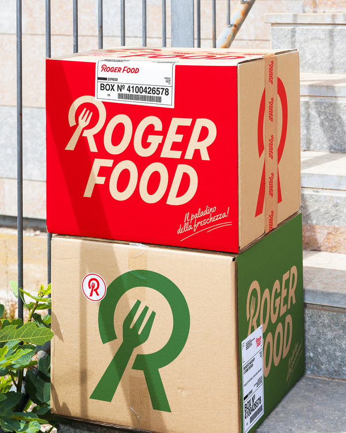
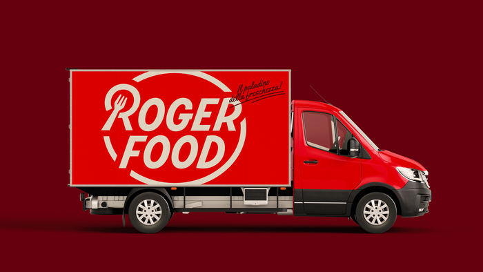
The visual identity is built around a red and green palette, evoking Italian heritage as well as the typical colors of many of the products he offers – first and foremost, tomatoes. The overall style is rooted in tradition, with retro accents that recall the legacy of historic Italian food brands. The main typeface is bold and condensed, reflecting Ruggiero’s strong and pragmatic personality, while the use of a script font brings in the warmth of tradition and the handmade.
The symbol is centered on the letter R – the brand’s initial and its visual core. This R is formed by merging a fork, symbol of conviviality and the pleasure of sharing a meal, with a magnifying glass, representing the tireless search for quality ingredients across Italy. The slanted form adds a sense of movement, conveying speed and dynamism – qualities that define every choice, every delivery, every product. It’s an identity that brings together passion, substance, and vision – just like the person who inspired it.
Design by Mattia Finardi with direction from Marco Fogaccia at DilloStudio. Web development by Daniele Capelli.
Source: dillo.studio DilloStudio. License: All Rights Reserved.
Source: dillo.studio DilloStudio. License: All Rights Reserved.
Source: dillo.studio DilloStudio. License: All Rights Reserved.
Source: dillo.studio DilloStudio. License: All Rights Reserved.
Source: dillo.studio DilloStudio. License: All Rights Reserved.
This post was originally published at Fonts In Use