Vienna Philharmonic Orchestra – The Planets by Gustav Holst album art

Source: www.ebay.de murclassical (edited). License: All Rights Reserved.


Herbert von Karajan’s recording of The Planets with the Vienna Philharmonic was first released by Decca in 1962. The 1973 reissue on their Ace of Diamonds label comes with one of the wackier cover designs made for Gustav Holst’s orchestral suite: the planets are represented by floating heads of the eponymous Roman deities. Illustrator Christos added them to a photo of the Trifid Nebula. Saturn looks pretty annoyed by the never-ending rainbow carousel rotating in front of his nose.
The typography brings together two staples of the 1970s: Neil Bold and Stop. In the latter, the H doesn’t have a stem at the right. This unconventional feature was “fixed” by the cover designer, so the title effectively reads “THIE PLANETS”. Other examples for the same intervention include the Thompson Twins logo and Gagosian Gallery’s Crash.
Source: www.ebay.de murclassical (edited). License: All Rights Reserved.
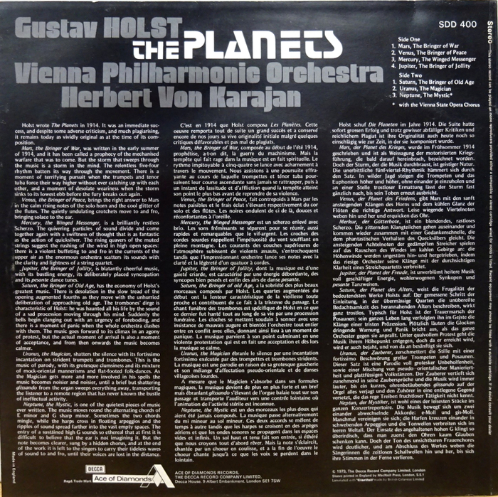
The trilingual liner notes on the back are set in IBM’s Theme proportional typewriter face.
This post was originally published at Fonts In Use