Restaurant babae
Source: www.langdonlorraine.com.au License: All Rights Reserved.


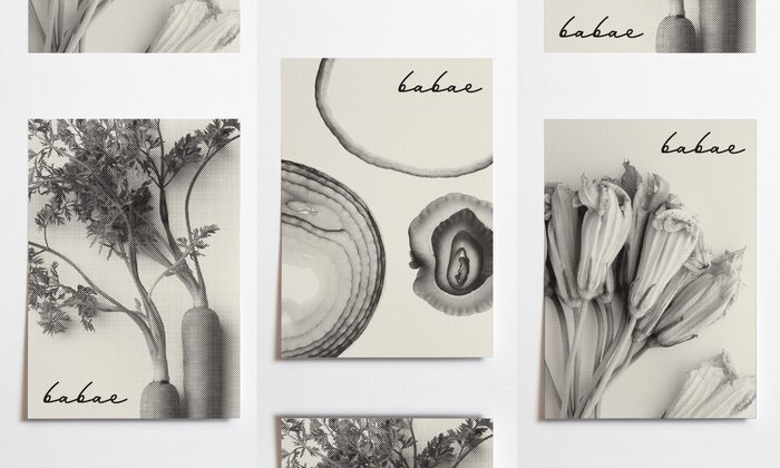
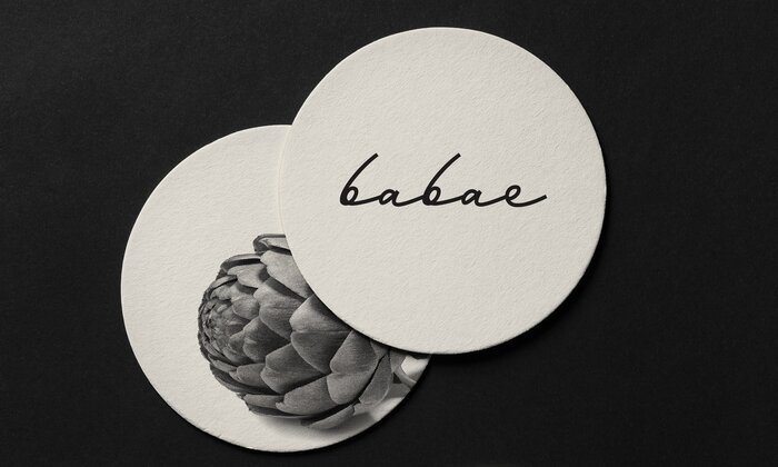
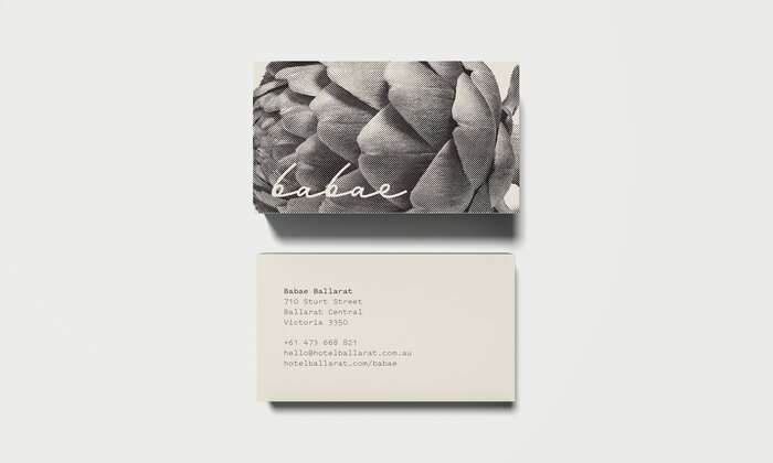
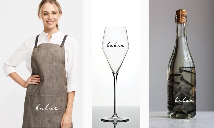
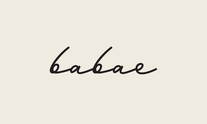
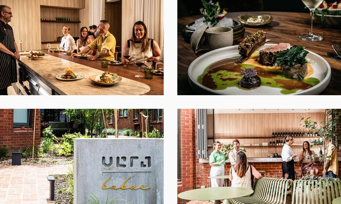
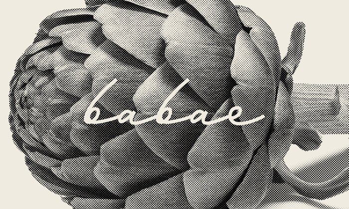
Restaurant Babae’s branding encapsulates the essence of authentic hospitality while embracing modern sophistication. The visual identity is anchored by its logo, which features a lyrical, handwritten aesthetic using Mina. This choice adds a personal, inviting touch that contrasts beautifully with the highly stylized imagery of produce and raw ingredients that form the backbone of Babae’s visual language.
This duality in design reflects the restaurant’s commitment to blending tradition with innovation, perfectly mirroring its dynamic, seasonal menu that showcases the best of contemporary Australian cuisine. Nestled within the historic Hotel Vera at 710 Sturt Street, Ballarat, Babae offers a dining experience that is as visually engaging as it is flavorful, with branding that evokes a sense of warmth, authenticity, and refined elegance. Mina is paired with Pitch Sans, one of the brand fonts for Hotel Vera.
Source: www.langdonlorraine.com.au License: All Rights Reserved.
Source: www.langdonlorraine.com.au License: All Rights Reserved.
Source: www.langdonlorraine.com.au License: All Rights Reserved.
Source: www.langdonlorraine.com.au License: All Rights Reserved.
Source: www.langdonlorraine.com.au License: All Rights Reserved.
Source: www.langdonlorraine.com.au License: All Rights Reserved.
This post was originally published at Fonts In Use