Reminiscences of Lenin by N.K. Krupskaya

Source: jellobiafrasays.tumblr.com License: All Rights Reserved.

A cenotaph literally means “empty grave”, and as such it’s quite the opposite of Lenin’s Mausoleum in which the Soviet leader’s bodily remains are preserved to this day. And yet that’s the name of the typeface chosen for the cover of Reminiscences of Lenin by Nadezhda Krupskaya, Lenin’s wife of 25 years.
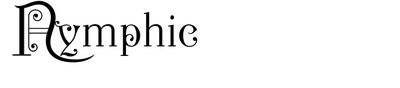
Strictly speaking, it’s not Cenotaph, but lettering based on it: the angle is not as dramatic as in Photo-Lettering’s skewed variation of Calendar. Also, the letterforms were accentuated by a bold outline at the left, and the E got a stem and larger apertures. While the red, left-leaning letters stand for the revolutionary, the second typeface with its old-fashioned, ornamented shapes is very different in style. It might have been chosen to represent Lenin’s life in the Russian Empire before his coming to power – which is the scope of the book that ends in 1919. Herman Ihlenburg’s Nymphic was first cast by MacKellar, Smiths & Jordan in 1889.
Originally published as Memories of Lenin in 1930, this 1970 edition was issued by New World Paperbacks, an imprint of International Publishers.
This post was originally published at Fonts In Use