RBC
Published March 5, 2025
By FontsInUse
Contributed by Rick Raby

Source: themodernworld.co.uk The Modern World. License: All Rights Reserved.


Source: themodernworld.co.uk The Modern World. License: All Rights Reserved.

Source: themodernworld.co.uk The Modern World. License: All Rights Reserved.

Source: themodernworld.co.uk The Modern World. License: All Rights Reserved.
Source: themodernworld.co.uk The Modern World. License: All Rights Reserved.

Source: themodernworld.co.uk The Modern World. License: All Rights Reserved.
This post was originally published at Fonts In Use
Source: themodernworld.co.uk The Modern World. License: All Rights Reserved.
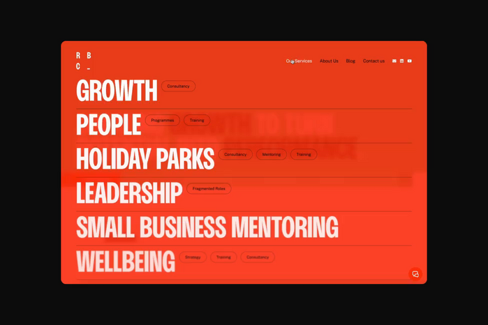
Best known for finishing as a runner-up in the The Apprentice (2006, UK edition), Ruth Badger has spent the almost two decades since quietly building one of the most effective and revered business consultancies in the country. To coincide with a new strategic direction for the business and the expansion of the senior leadership team to four equal partners, a new, refined brand was created, sporting an abbreviated name, RBC, that placed more emphasis on the business as a whole and spread the spotlight to beyond just Ruth.
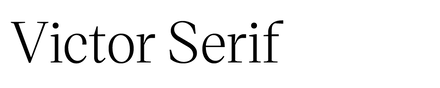
The primary brand typeface is Bueno, used in all caps from the Semi Bold. It’s supported by Public Sans and Victor Serif Italic.
Source: themodernworld.co.uk The Modern World. License: All Rights Reserved.
Source: themodernworld.co.uk The Modern World. License: All Rights Reserved.
Source: themodernworld.co.uk The Modern World. License: All Rights Reserved.
Source: themodernworld.co.uk The Modern World. License: All Rights Reserved.
Source: themodernworld.co.uk The Modern World. License: All Rights Reserved.
This post was originally published at Fonts In Use
Read full story.
WRITTEN BY
FontsInUse
An independent archive of typography.
More from FontsInUse