Railtrack and Network Rail identity and signs (1998–)
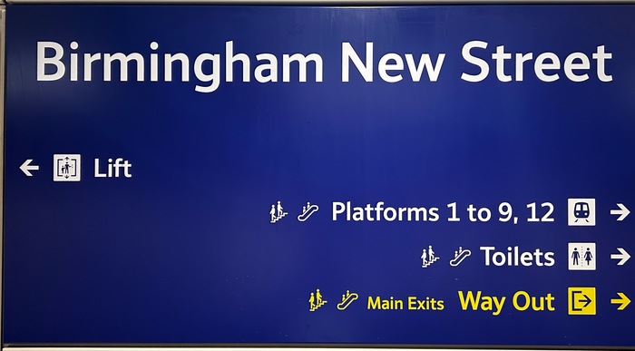
Photo: james millner. License: All Rights Reserved.
Sign at Birmingham New Street, photograph taken 20 September 2024

In 1994, Britain’s conservative government started dismantling the country’s railway network as part of their privatization policy. A new company called Railtrack was given the task of maintaining the railway infrastructure – the tracks, signals, bridges, the major stations – while other new companies (the ‘train operating companies’) were created to provide services on various routes and to pay money to Railtrack for the right to access the tracks.
These new companies were able to move away from the classical British Railway branding – that famous Rail Alphabet typeface in stark black and white established in the 1960s. For example, Great Western Railway Company adopted Adrian Frutiger’s Glypha typeface.
The brand design for Railtrack was developed by leading agency Citigate Lloyd Northover (founded by John Lloyd and Jim Northover). Northover writes:
When commissioned to update the UK rail system signs (in part for digital application), we proposed alignment with the continental use of blue grounds with white lettering in preference to the earlier black on white, thus making the words and pictograms stand out more clearly. The new type design, which we called Brunel, saved space and improved clarity. Brunel was carefully realised by typographers David Quay and Freda Sack from our design brief, with different weights to accommodate illuminated and non-illuminated messages. The typeface was envisaged for use across the UK rail network, but as individual rail operators adopted their own designs Brunel became restricted to the major stations managed by Network Rail.
Freda Sack, David Quay’s partner in The Foundry, talks about the development of Brunel:
We seemed to get a run of transport projects. Working with consultancy Citigate Lloyd Northover we developed the typeface Brunel (1998). It was commissioned for use in mainline UK railway stations, and was a favorite project for me, again because of the strict parameters. For that project, though, we were, on the whole, designing for much larger use on signage, including some of the first plasma screens. It was a great brief. The typeface had to look English – although of course it is used all over the UK – and had to have authority. In addition to its basic information/directional functions, the type was also required to bring some visual consistency to station environments, countering the confusion of the prevalence of visual identities adopted by the various new train operating companies then being formed, and the visual noise of station concourse shopping.
David Quay comments:
Railtrack too was a challenge, but a pleasant one [...] that I named the font ‘Brunel’ after my childhood hero, Isambard Kingdom Brunel.
The Brunel font was never released commercially. If it had been, the name might have been reconsidered, because there was already a typeface called Brunel – an English Modern serif typeface designed by Paul Barnes in 1995 with later input from Christian Schwartz in 2005. Schwartz describes their Brunel as “an anthology of the late eighteenth and nineteenth century English foundries.”
At some point Railtrack's Brunel font became known as NR Brunel (NR for Network Rail). This was because, after a string of disasters and poor decisions, the Railtrack company had been renationalized and renamed Network Rail in 2002.
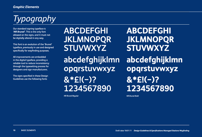
Thanks to a post on Daniel Wright’s excellent The Beauty of Transport blog, we can follow the results of a freedom of information (FOI) request which leads us eventually to a copy of Network Rail’s design manual: Design Guidelines 2010, developed by Steer Davies Gleave. This shows specimens for NR Brunel Regular and NR Brunel Bold and asserts that:
This is the only font allowed on signs.
This font is an evolution of the ‘Brunel’ typeface, previously in use and designed specifically for wayfinding purposes.
(This FOI response also provides a copy of the Brunel font, now named as NewBrunel and dated 2010, in TTF format. I expect that including this was an administrative oversight on the part of the FOI responder.)
Originally the tops of the ascenders of letters such as b, d, h, k, and l were flat, but at some point (perhaps also in 2002, or as part of the ‘evolution’) they were given sloping tops. Also, the 1 digit was given a base to stand on.
Usage of NR Brunel has been steadily increasing across the network since it was introduced nearly thirty years ago, with new and refurbished stations boldly going full Brunel. It might even have become the new official standard font for all UK railways if the Chris Green/Peter Hall ‘Better Rail Stations’ report had been implemented in full. The advice on page 30 of this 2009 report was:
Station Signage
To ensure network consistency and reduced franchise costs, all signage should be in standard ‘Brunel’ script with white letters on a dark blue background. Thereafter, name signs should not be changed when train company ownership changes.
However, the newly-nationalized British Railways has decided that in the future all railway signage should use Rail Alphabet 2:
Great British Railways will introduce Rail Alphabet 2 across the rail network, replacing the many different fonts used on railway signage.
So the Rail Alphabet will gradually replace the Brunel font which had originally ousted it back in 1998. But it’s likely to be many years before the final traces of Brunel disappear from our stations. Until then, you can happily spend a few minutes contemplating the convoluted history of the UK rail network – both as political football and as a succession of design choices – while you’re waiting for your train.
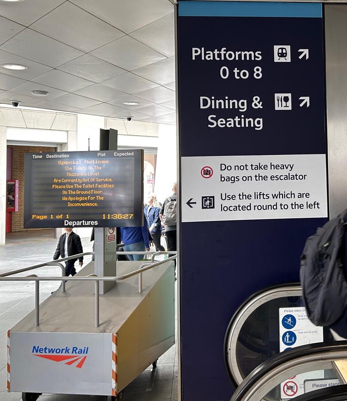
Photo: james millner. License: All Rights Reserved.
Photograph taken at Kings Cross 29 May 2025; type in both white on dark blue and black on white
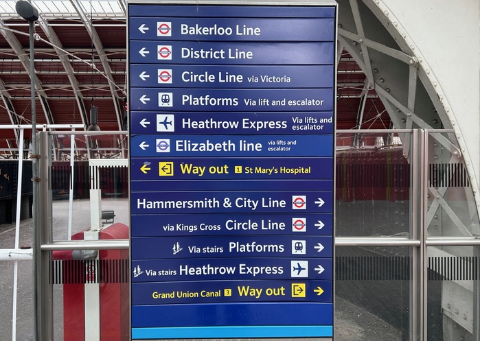
Photo: james millner. License: All Rights Reserved.
Photograph taken at Paddington Station on 29 May 2025. Colour matching is hard…
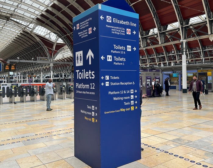
Photo: james millner. License: All Rights Reserved.
Photograph taken at Paddington Station on 29 May 2025
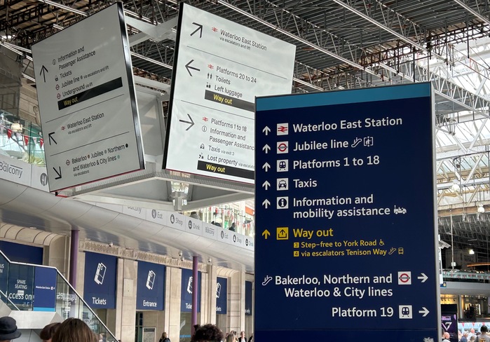
Photo: james millner. License: All Rights Reserved.
Photograph taken at Waterloo Station on 29 May 2025; the new standard Rail Alphabet 2 is used for the big signs in the background, while the previous standard Brunel is still used for other signage (at the time of writing)
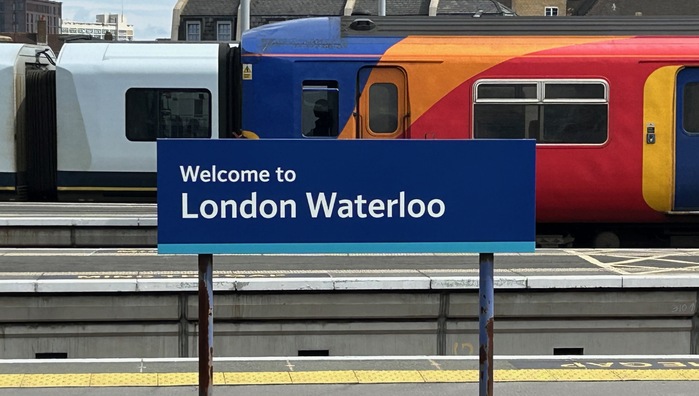
Photo: james millner. License: All Rights Reserved.
Photograph taken at Waterloo Station on 29 May 2025
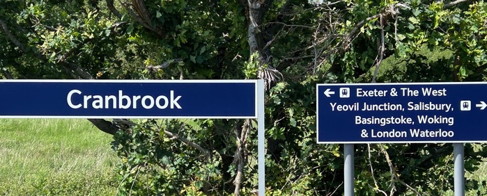
Photo: james millner. License: All Rights Reserved.
Photograph taken at Cranbrook Station on 2 June 2025; this station was built in 2015, but the version of the Brunel font used here has the flat-topped ascenders
Source: www.whatdotheyknow.com Network Rail. License: All Rights Reserved.
Network Rail’s design manual Managed Stations Wayfinding, developed by Steer Davies Gleave, 2010
This post was originally published at Fonts In Use