La ferme Pradenn
Published July 5, 2025
By FontsInUse
Contributed by Simon Calvet
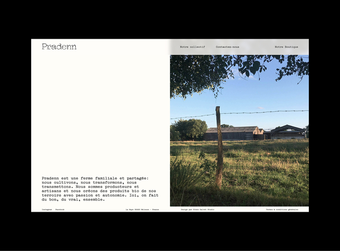
Photo: Simon Calvet. License: All Rights Reserved.

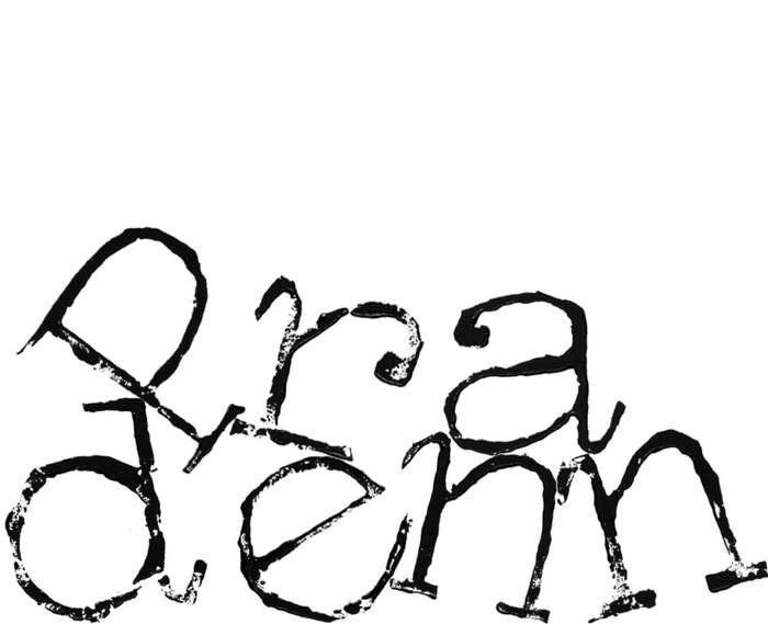
Photo: Simon Calvet. License: All Rights Reserved.
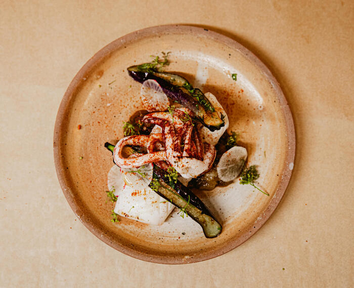
Photo: Simon Calvet. License: All Rights Reserved.
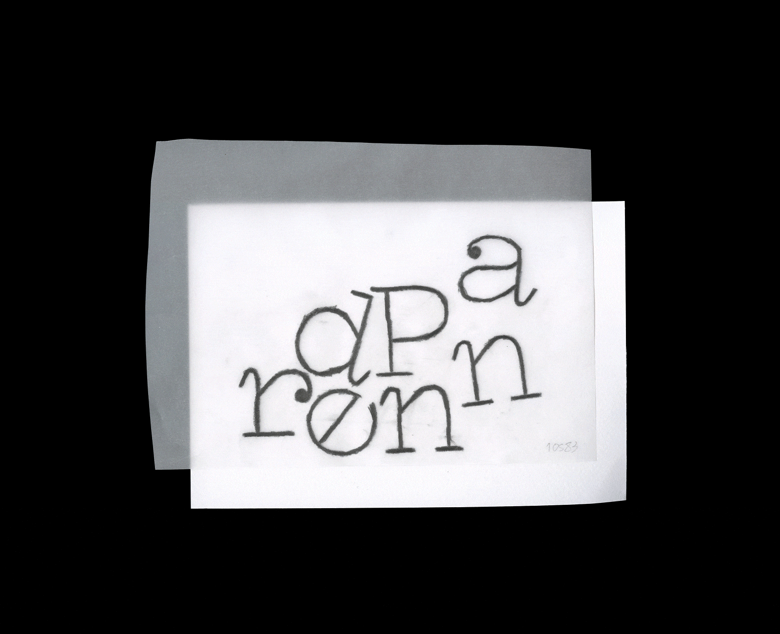
Photo: Simon Calvet. License: All Rights Reserved.
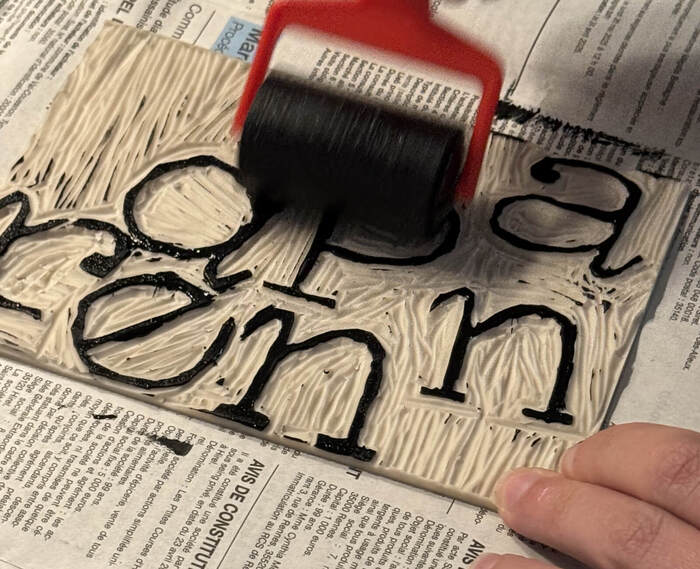
Photo: Simon Calvet. License: All Rights Reserved.
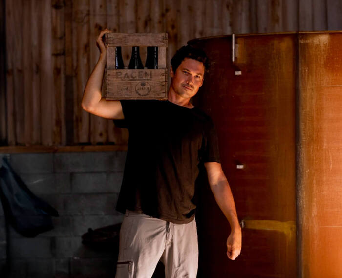
Photo: Simon Calvet. License: All Rights Reserved.
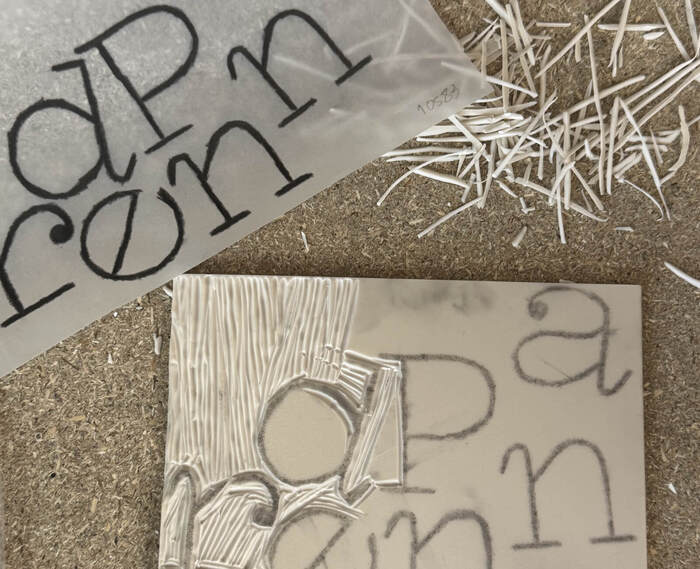
Photo: Simon Calvet. License: All Rights Reserved.
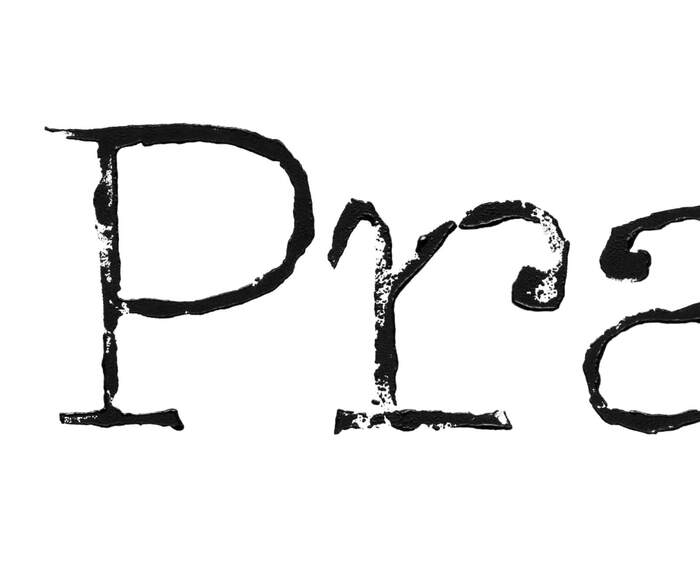
Photo: Simon Calvet. License: All Rights Reserved.
This post was originally published at Fonts In Use
Photo: Simon Calvet. License: All Rights Reserved.
The project aims to reflect Pradenn’s collective energy through a simple and authentic visual identity inspired by rural craftsmanship. This includes the redesign of a clear, lively website, that aligns with the collective's image.
Pradenn defends a collective, artisanal approach to agriculture and food, through its farm, bakery and canteen. To convey these values, the graphic identity is based on strong, sensitive choices: linocut work evoking manual gestures and raw materials, and Compagnon typography, the central element of the project. With its frank, expressive design, it aptly embodies the authenticity, rural roots and human dimension that run through all of the collective’s activities.
Photo: Simon Calvet. License: All Rights Reserved.
Photo: Simon Calvet. License: All Rights Reserved.
Photo: Simon Calvet. License: All Rights Reserved.
Photo: Simon Calvet. License: All Rights Reserved.
Photo: Simon Calvet. License: All Rights Reserved.
Photo: Simon Calvet. License: All Rights Reserved.
Photo: Simon Calvet. License: All Rights Reserved.
This post was originally published at Fonts In Use
Read full story.
WRITTEN BY
FontsInUse
An independent archive of typography.
More from FontsInUse