Propel (2024 rebrand)

Source: www.propel.app License: All Rights Reserved.


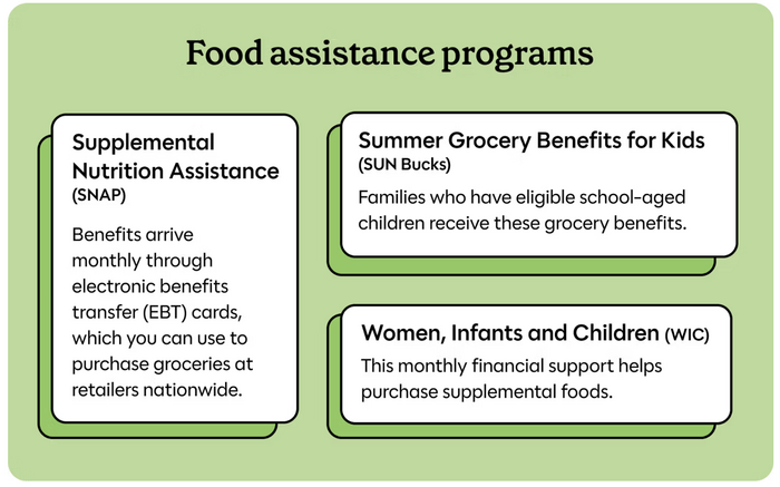
Propel, formerly known as the Providers app, has rebranded with a fresh visual identity centered on empathy and trust. The redesign features Grenette (Colophon) for display typography, lending a bold, yet inviting presence that reflects the company’s commitment to dignity and accessibility. For body text, Polymath (OH no Type Co.) was chosen, offering a clean, geometric structure that conveys clarity and reliability—qualities essential for users navigating important information.
This typographic pairing aligns seamlessly with Propel’s goals: a welcoming interface where users feel understood and secure. Vivid colors and authentic imagery of real people further emphasize the hardworking spirit of the community Propel serves. The rebrand is more than aesthetic—it signals the company’s ongoing dedication to enhancing features and safeguarding users’ benefits.

Source: www.propel.app License: All Rights Reserved.

Source: www.propel.app License: All Rights Reserved.

Source: www.propel.app License: All Rights Reserved.

Source: www.propel.app License: All Rights Reserved.
Source: www.propel.app License: All Rights Reserved.

Source: apps.apple.com License: All Rights Reserved.
This post was originally published at Fonts In Use