A Girl in Capri fragrance by Lanvin

Source: www.dutyfreehunter.com License: All Rights Reserved.

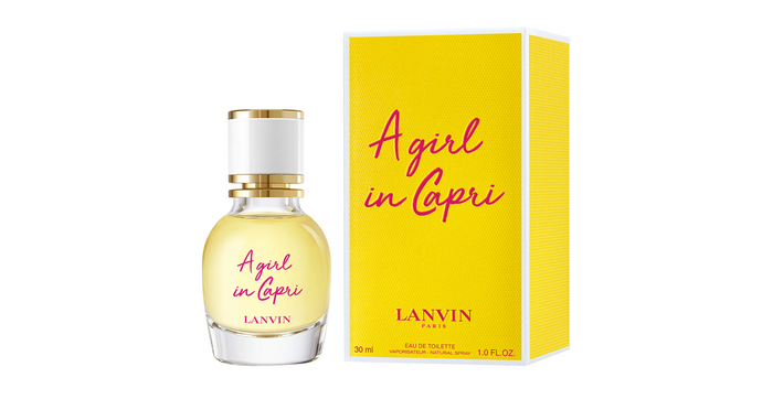
A Girl in Capri fragrance by French fashion house Lanvin conveys the carefree atmosphere of Mediterranean summer holidays. It’s the scent of playful, daring femininity, where citrus and bergamot reign supreme.
Golden Plains, created by BLKBK, used for both the bottle’s logo and packaging, beautifully reflects the essence of the fragrance. The font is defined by lighthearted strokes and imperfect contours, bringing to mind the authenticity of a handwritten note or a casual journal entry. This informal elegance tells the fragrance’s story – walking under the Capri sun, feeling the sea breeze, and reveling in the scent of fresh citrus fruits.
The pairing of Golden Plains with the modern sans-serif typography of the Lanvin logotype adds a layer of sophistication to the design. The script’s curves balance the more structured elements of the logo, emphasizing the fragrance’s dual nature: youthful spontaneity and quiet luxury.
Source: en.zalando.de License: All Rights Reserved.
This post was originally published at Fonts In Use