Prince Douglas – Dub Roots album art
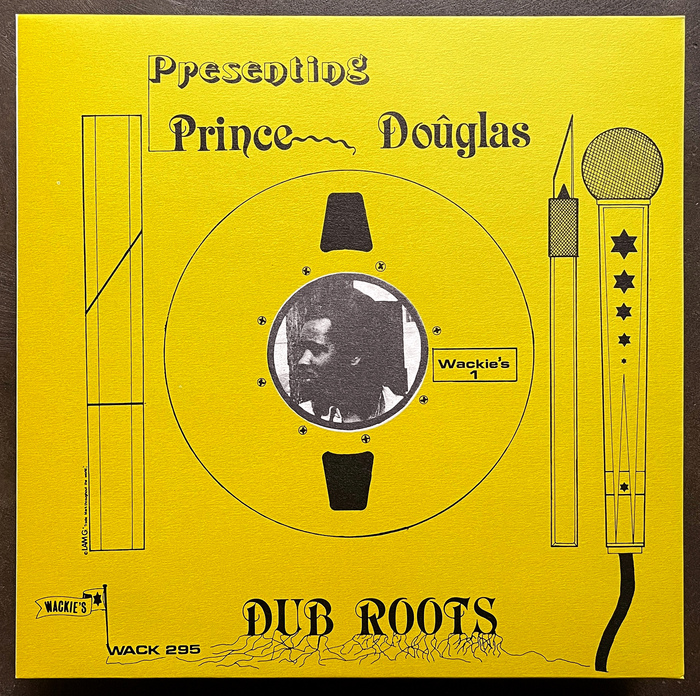
Source: allnightflightrecords.com License: All Rights Reserved.


An album from the legendary Wackie’s record label based in the Bronx, active in the late 1970s and 1980s. Helmed by Lloyd Barnes, it became an important place for roots reggae and dub productions with many artists coming from Jamaica to get the special Bullwackie treatment.
The album’s typography is constructed using dry-transfer lettering, mainly Letraset. It’s interesting to see an X-Acto knife reproduced on the cover. It’s shown next to a microphone, a reel-to-reel tape, and what looks like a ruler. Perhaps, a nod to the way the cover is made? The bulk of Wackie’s album covers were very much in the pared down, lo-fi style, appropriate to the sound of the label itself.
The Presenting line is set in Tintoretto. the rest of the type on the front is set in Raphael, and Eurostile.
Note that the images shown are from the reissue from 2005, which scanned the original covers and reproduced them. Early 2000s saw a big interest in the Wackie’s label and many reissues were published in Germany by Basic Channel at that time.
The album was designed Leslie A. Moore, who ran LAM Graphics International design studio, specializing in album covers. You can see more of Leslie’s work at discogs.com
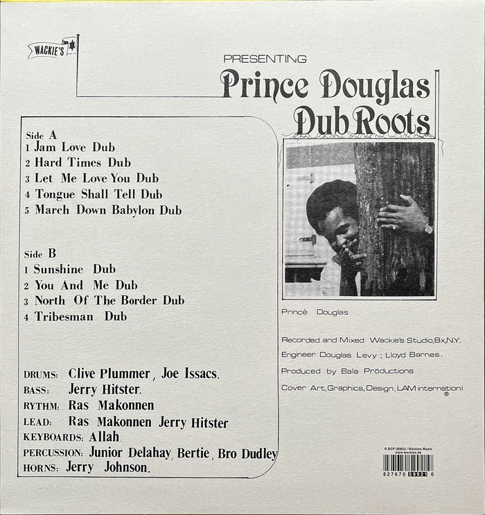
Source: allnightflightrecords.com License: All Rights Reserved.
Back of the album is dominated by Bodoni Bold, Times New Roman, and Eurostile. The credits of musicians on the back are curious in that they use the caps from Bodoni, and lowercase from Times New Roman. This certainly is easy to do with dry-transfer lettering.
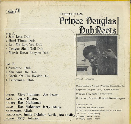
Source: cornerstone.shop-pro.jp License: All Rights Reserved.
Original back cover with the distribution credits to Wackie’s and the year at bottom right
This post was originally published at Fonts In Use