Plain Text 1
Source: text.plain-form.com Lucas Descroix, Benjamin Dumond. License: All Rights Reserved.


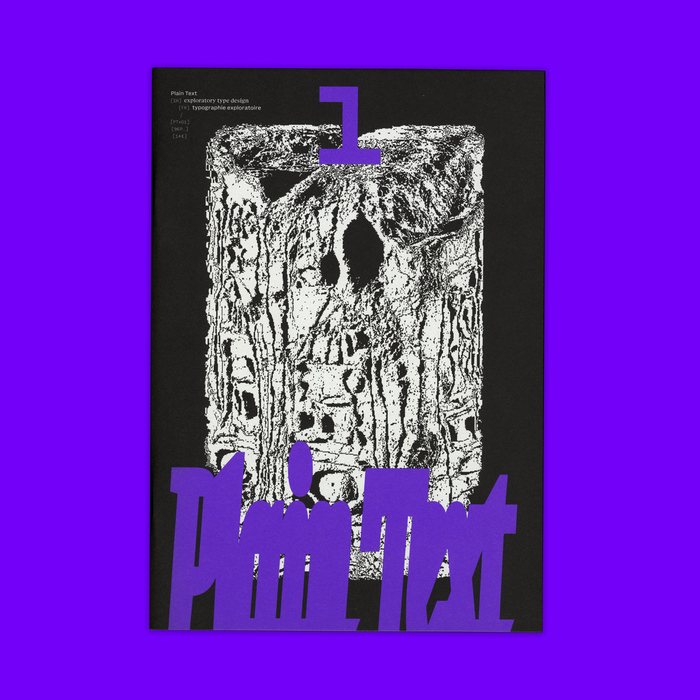
Plain Text is a printed publication for exploratory type design, edited and designed by Lucas Descroix and Benjamin Dumond, and published by type foundry Plain Form in January 2025.
From fiction to theory, from mystical analyses to visual works, Plain Text aims at exploring typographic imaginaries, moving beyond a strictly historical and technical framework, with a taste for the unknown and the dormant potential of writing. The first issue of Plain Text features voices from various backgrounds and generations, many offering a personal, even intimate or spiritual, approach to letters.
With contributions by Anne-Dauphine Borione, Lucas Descroix, Benjamin Dumond, Kirsten D. Dzwiza, Stefan Ellmer, Ayasha Khan, Zuzana Licko, Arman Mohtadji, William Skeen, Verso Wurm and Eager Zhang.
The texts of this black-and-white, bilingual publication are all set in the unreleased duo Basically Serif for the English and Basically Sans for the French. Additional information is set in Baskemo, also Serif and Sans, an automatically monospaced-and-skelefont'ed companion to Basically.
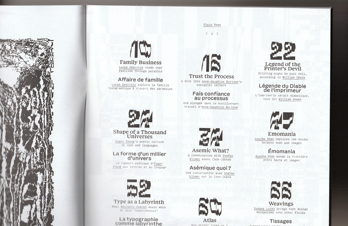
A number of display typefaces designed by Lucas Descroix and/or Benjamin Dumond are used throughout, for the title of each contribution as well as various emphasis moments. These include: Jester (in several styles), Michaux, Nostra Sett and Stream, Ready Active, Bygone and Clouded. Some unreleased display typefaces, either old or future, are also used but not shown here in the pictures.
Source: text.plain-form.com Lucas Descroix, Benjamin Dumond. License: All Rights Reserved.
The page numbers are set in Jester Hermit.
Source: text.plain-form.com Lucas Descroix, Benjamin Dumond. License: All Rights Reserved.
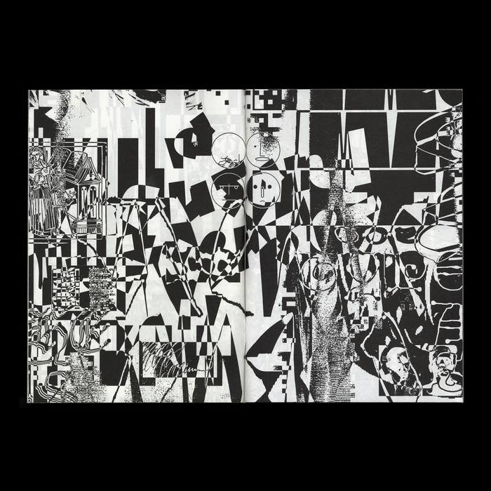
The publication opens with a number of dense pages showing hints of all upcoming contributions in their order of appearance.
Source: text.plain-form.com Lucas Descroix, Benjamin Dumond. License: All Rights Reserved.
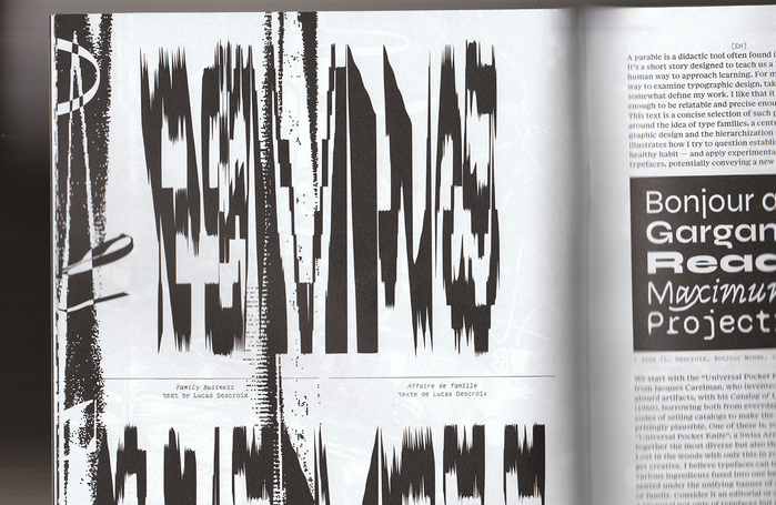
Title set in largely squeezed Jester Hermit. The illustration on the right page shows Bonjour Monde’s Syne.
Source: text.plain-form.com Lucas Descroix, Benjamin Dumond. License: All Rights Reserved.
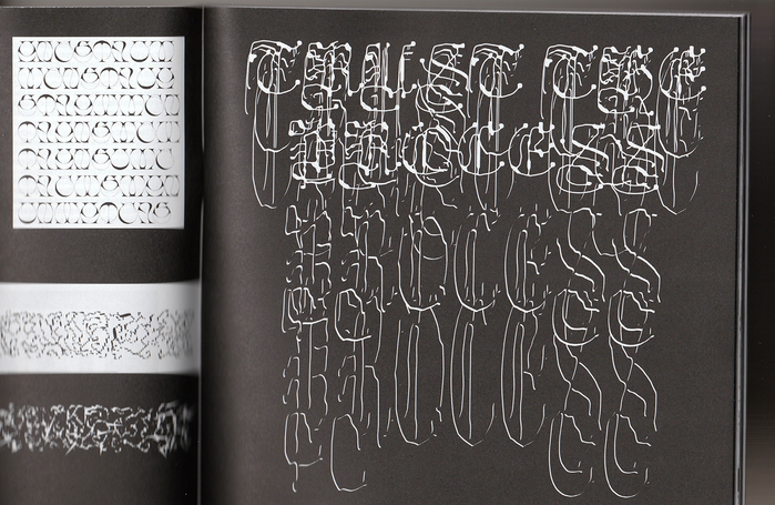
Title set in several layers of Ready Clouded Light. The article showcases the work of Anne-Dauphine Borione aka Daytona Mess, including her typefaces Sichem and Baleze, visible on the left page.
Source: text.plain-form.com Lucas Descroix, Benjamin Dumond. License: All Rights Reserved.
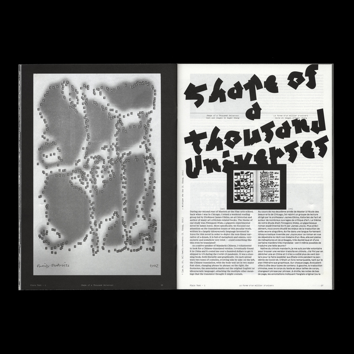
Title set in Michaux Bold. Left page shows a lettering by Eager Zhang, part of her series “Family Portraits”.
Source: text.plain-form.com Lucas Descroix, Benjamin Dumond. License: All Rights Reserved.
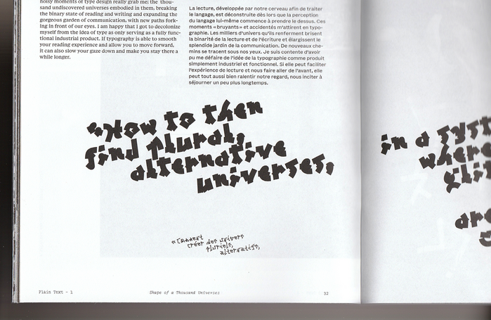
Quote from Eager Zhang’s essay set in Michaux Bold for the English and Michaux Light for the French.
Source: text.plain-form.com Lucas Descroix, Benjamin Dumond. License: All Rights Reserved.
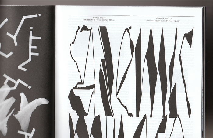
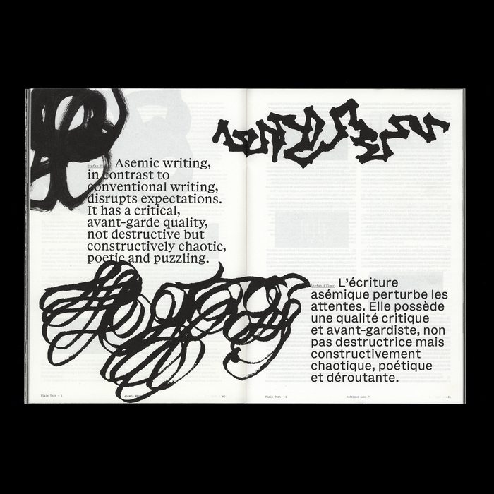
Title set in a generously squeezed Jester World. On the left we can spot bits of Stefan Ellmer’s asemic writing research.
Source: text.plain-form.com Lucas Descroix, Benjamin Dumond. License: All Rights Reserved.
Quotes from a conversation on asemic writing with type designer Stefan Ellmer (The Pyte Foundry).
Source: text.plain-form.com Lucas Descroix, Benjamin Dumond. License: All Rights Reserved.
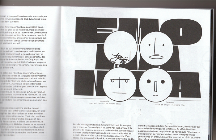
Title set in all-caps Nostra Sett.
Source: text.plain-form.com Lucas Descroix, Benjamin Dumond. License: All Rights Reserved.
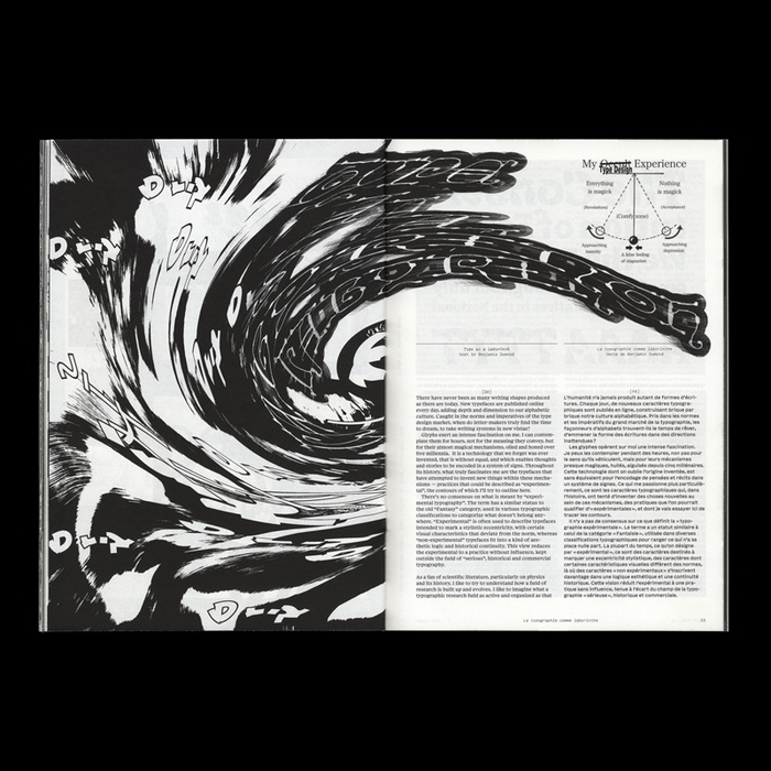
Title set in warped Ready Bygone Light, with a few floating outlined glyphs from Michaux Bold.
Source: text.plain-form.com Lucas Descroix, Benjamin Dumond. License: All Rights Reserved.
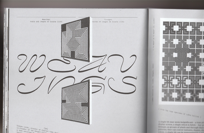
Title set in all-caps Nostra Stream, together with works from Zuzana Licko.
Source: text.plain-form.com Lucas Descroix, Benjamin Dumond. License: All Rights Reserved.
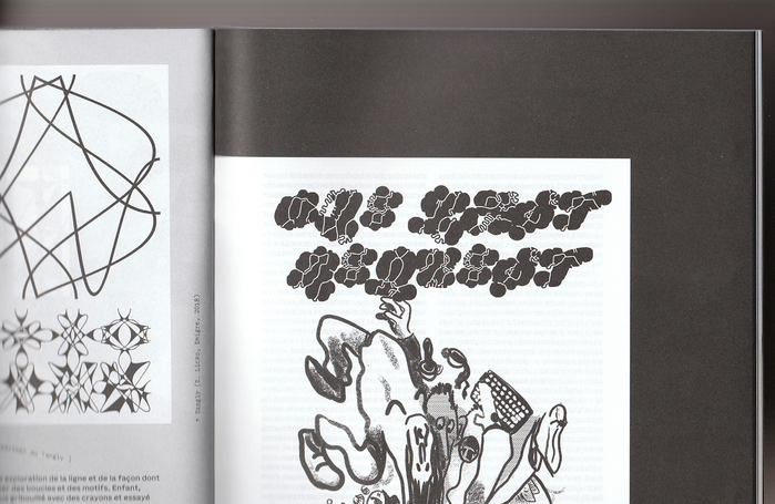
Title set in Ready Active Bold, with illustration by Arman Mohtadji. Left page shows bits of Tangly by Zuzana Licko / Emigre.
Source: text.plain-form.com Lucas Descroix, Benjamin Dumond. License: All Rights Reserved.
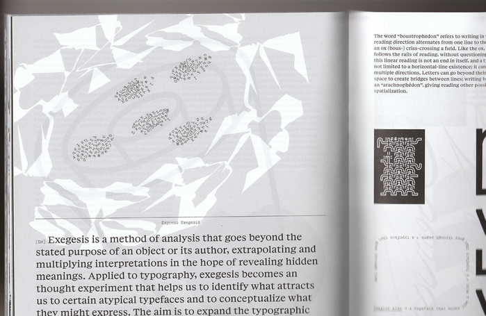
“Express Exegesis”, set on a circle in Jester Sun with a whole lot of negative tracking. The right page features the work of Julien Priez, aka Boogy Paper, with the unreleased Montreuil, his diploma project from Estienne ESAIG back in 2011.
This post was originally published at Fonts In Use