Pirkkalan
Published February 1, 2024
By FontsInUse
Contributed by VJ-Type
Source: www.behance.net Werklig. License: All Rights Reserved.


Source: www.behance.net Werklig. License: All Rights Reserved.
Source: www.behance.net Werklig. License: All Rights Reserved.
Source: www.behance.net Werklig. License: All Rights Reserved.

Source: www.behance.net Werklig. License: All Rights Reserved.
Source: www.behance.net Werklig. License: All Rights Reserved.

Source: www.behance.net Werklig. License: All Rights Reserved.
Source: www.behance.net Werklig. License: All Rights Reserved.
This post was originally published at Fonts In Use
Source: www.behance.net Werklig. License: All Rights Reserved.
From design studio Werklig:
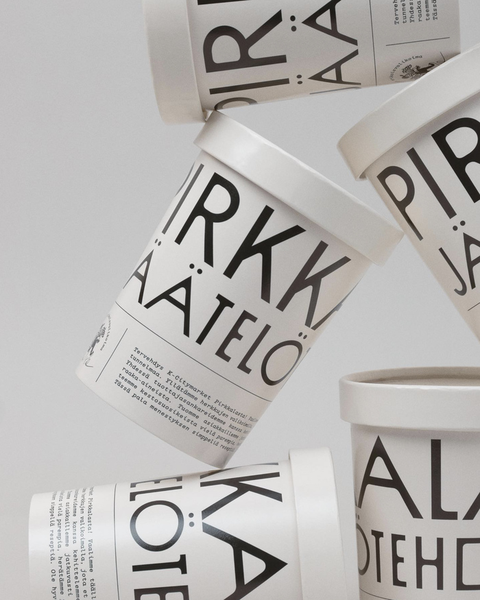
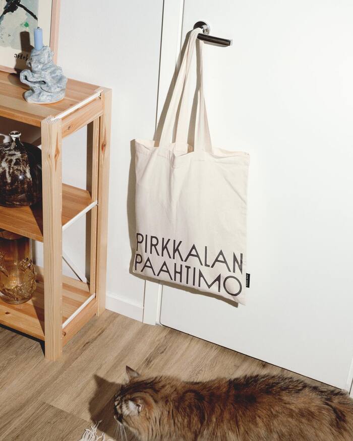
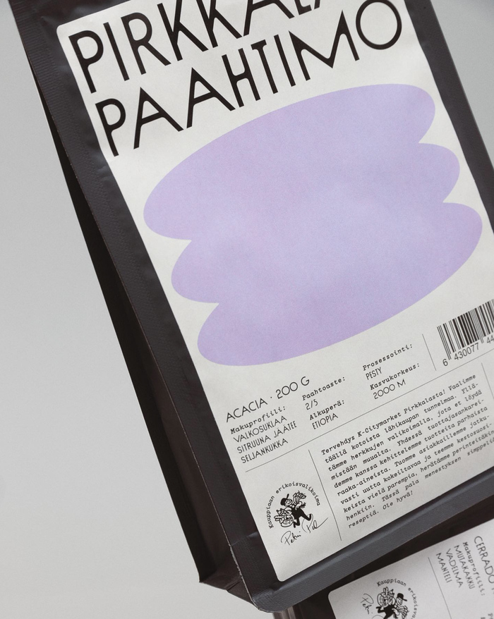
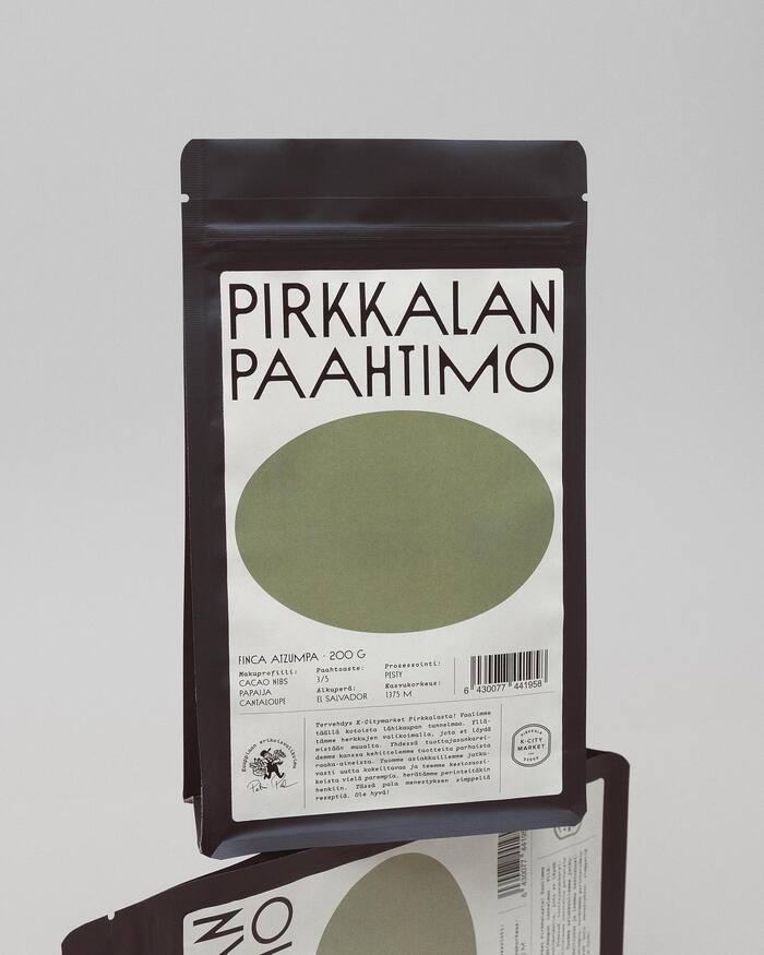
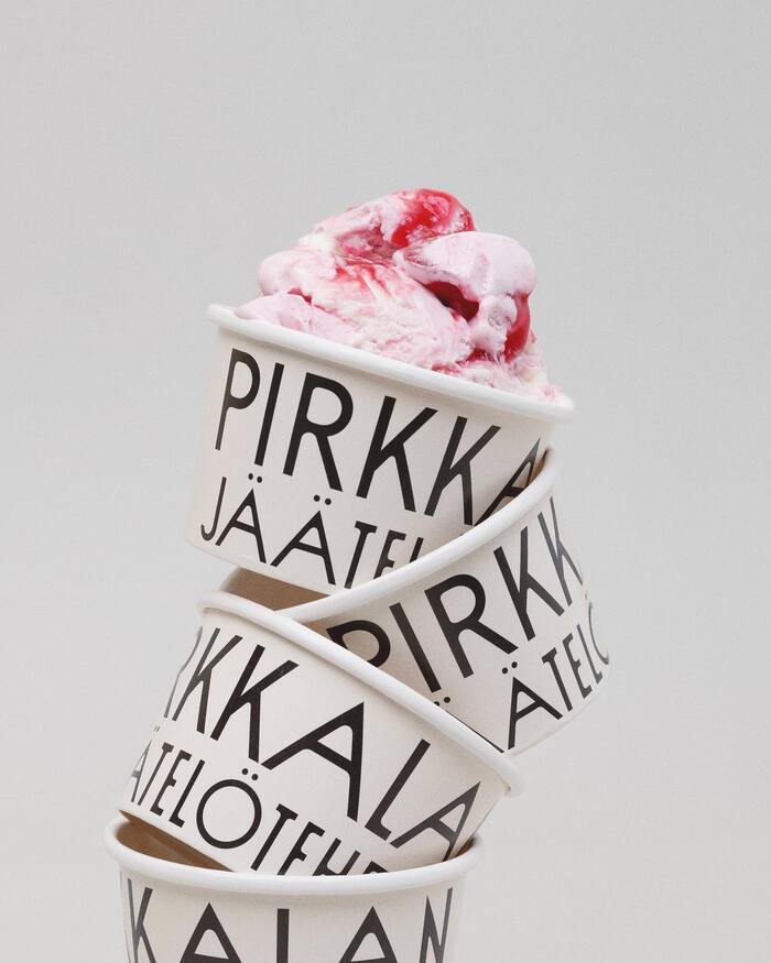
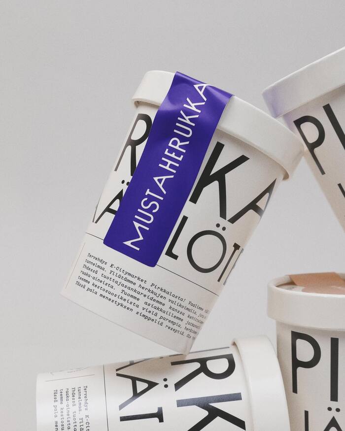
The Pirkkalan-range stands for cooperation with local producers and a hand-picked range of high-quality products. Owner of K-Citymarket Pirkkala, Petri Putila, constructed the product line to distinguish it from the hypermarket’s other products and to always bring new delightful things for customers to try and taste. Preparing the products and having a coffee roastery and an ice cream factory on the premises, was a must. Werklig created a private label brand and packaging to stand out from the wide range of other brands on offer. To inject some artisan food culture into the aisles of a hypermarket.
The logotype is set in Sud. Text on the packages uses Garton Italic.
Source: www.behance.net Werklig. License: All Rights Reserved.
Source: www.behance.net Werklig. License: All Rights Reserved.
Source: www.behance.net Werklig. License: All Rights Reserved.
Source: www.behance.net Werklig. License: All Rights Reserved.
Source: www.behance.net Werklig. License: All Rights Reserved.
Source: www.behance.net Werklig. License: All Rights Reserved.
Source: www.behance.net Werklig. License: All Rights Reserved.
This post was originally published at Fonts In Use
Read full story.
WRITTEN BY
FontsInUse
An independent archive of typography.
More from FontsInUse