Pink Chilli in a Bowl book and website
Source: practicetheory.com.sg ©Daryl Tan. License: All Rights Reserved.


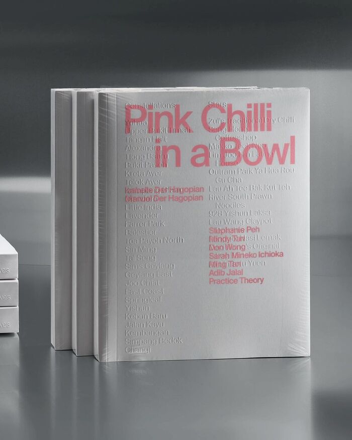
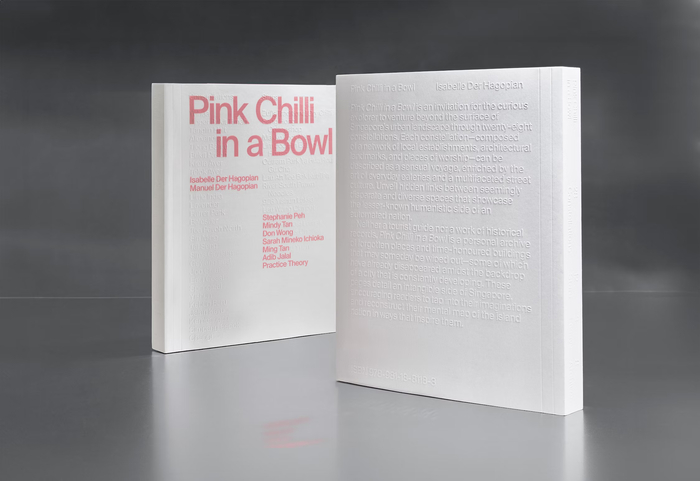
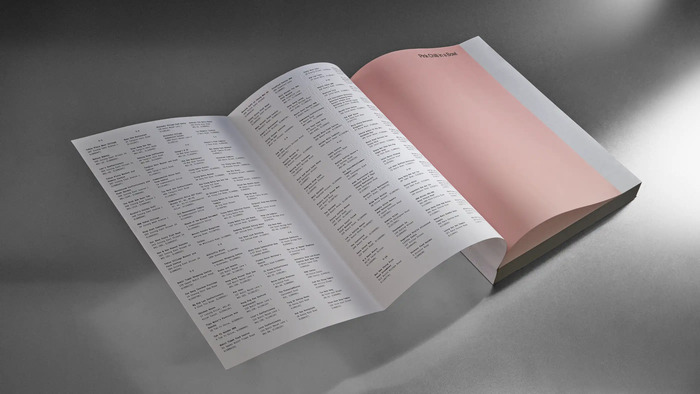
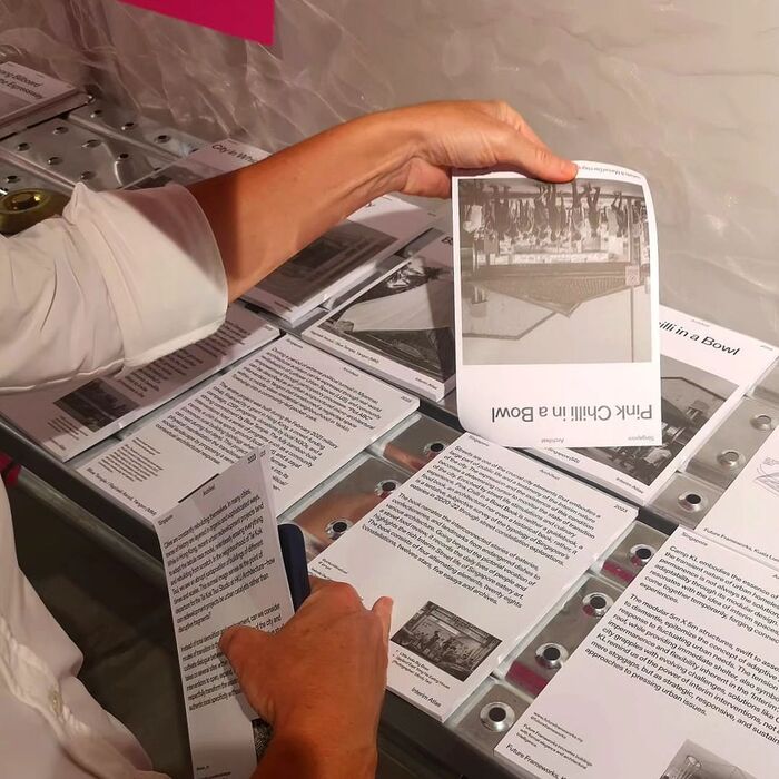
Published in 2024, Pink Chilli in a Bowl is a book co-written by Manuel and Isabelle Der Hagopian, archiving views, places and local cuisine of Singapore in the form of photographs, addresses or writings; challenging both imagination and senses of the readers. In the words of the authors:
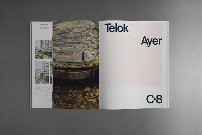
Neither a tourist guide nor a work of historical records, Pink Chilli in a Bowl is a personal archive of forgotten places and time-honoured buildings that may someday be wiped out—some of which have already disappeared amidst the backdrop of a city that is constantly developing. These pages detail an intangible side of Singapore, encouraging readers to tap into their imaginations and reconstruct their mental map of the island nation in ways that inspire them.
For the design of the book, the authors collaborated with Singapore based branding studio Practice Theory. From the studio’s Instagram post:
Faced with the task of translating the contrasting raw material—Isabelle’s spontaneous observations and her meticulously organised list—what emerges is the palpable tension between chaos and structure that permeates form and content. This push and pull echoes that of the wandering flâneur and the cataloguing archivist.
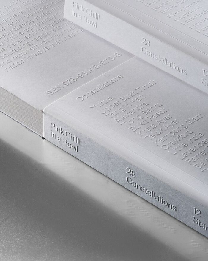
Such dichotomy governs the flow of the book, the visual interplay amidst light, paper, and space traversing between its strong typography and structured layout. Readers may now envision themselves as flâneurs, navigating through the abundance of pages at their own pace.
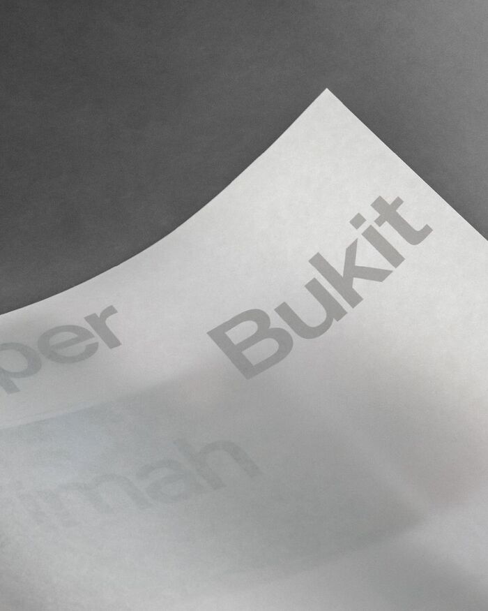
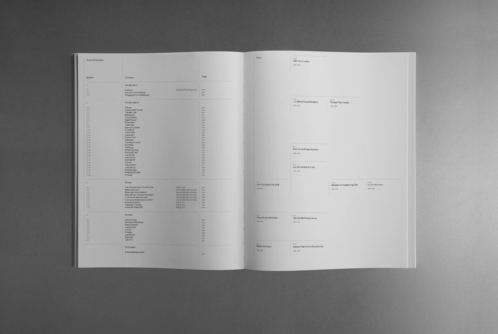
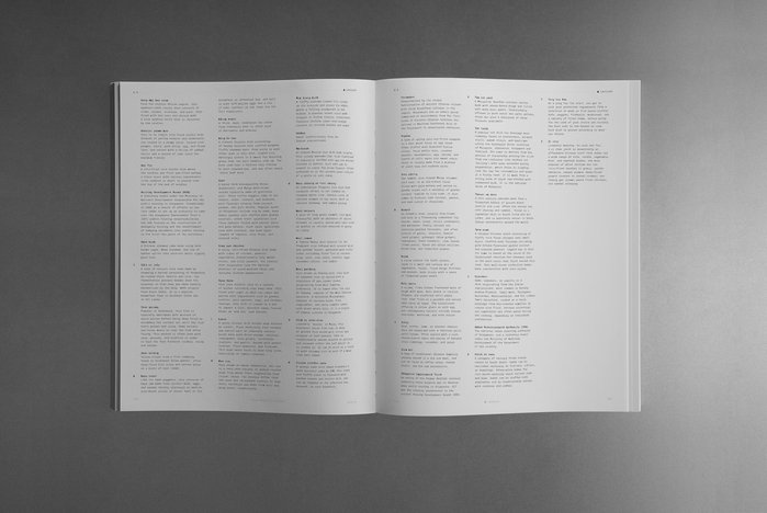
This tension is mirrored in its grid-based design, juxtaposed with varying paper stocks, including translucent pages that engage with light and space through reverse printing. Subtle lines further demarcate the grid, forming tangible “stars” that interconnect throughout.
The book’s removable plastic sleeve features a “hidden” list of all the Stars and Constellations, symbolising the fleeting nature of Singapore's heritage. Upon unwrapping, the book’s credits are physically removed, allowing readers to assume authorship and reconstruct their mental map of the island-nation in their own creative vision.
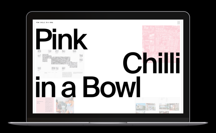
A combination of Swiss Typefaces' Suisse Int’l and Suisse Int’l Mono are used for the book cover and contents, as well as the dedicated website co-designed with the web agency Good Work. Both in the book and online, Suisse Int’l appears set with tightened letterspacing.
Source: practicetheory.com.sg ©Daryl Tan. License: All Rights Reserved.
Source: practicetheory.com.sg ©Daryl Tan. License: All Rights Reserved.

Source: practicetheory.com.sg ©Daryl Tan. License: All Rights Reserved.
Source: practicetheory.com.sg ©Daryl Tan. License: All Rights Reserved.
Source: practicetheory.com.sg ©Daryl Tan. License: All Rights Reserved.
Source: practicetheory.com.sg ©Daryl Tan. License: All Rights Reserved.
Source: practicetheory.com.sg ©Daryl Tan. License: All Rights Reserved.
Source: practicetheory.com.sg ©Daryl Tan. License: All Rights Reserved.
Source: www.instagram.com ©Pink Chilli in a Bowl. License: All Rights Reserved.
Source: www.pinkchilli.sg Photo: Swiss Typefaces. Isabelle & Manuel Der Hagopian. License: All Rights Reserved.

Source: www.pinkchilli.sg Photo: Swiss Typefaces. Isabelle & Manuel Der Hagopian. License: All Rights Reserved.
This post was originally published at Fonts In Use