Pentel ad: “I told Pentel what to do with their pens.”


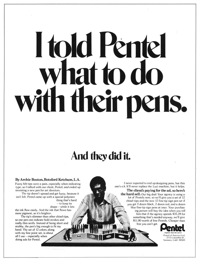
Photo: Stephen Coles. Communication Arts 73, Collection of Letterform Archive. License: All Rights Reserved.
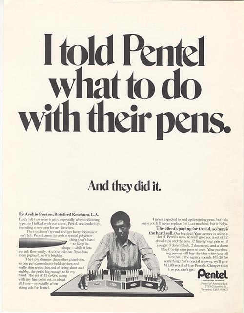
Archie Boston Jr. was one of the first African American art directors, and in 1967, he co-founded one of the first Black-owned creative agencies in the US. His prominence soon led to this partnership with Pentel in which he designed not only the ads, but the pens themselves.
The headline is set in tight-not-touching ITC Bernase Roman, by that time one of the hotter phototype display faces. Bernase was frequently used in this layout style, with a large one- or two-sentence headline. (See “Make America a Better Place” Peace Corps posters, “Smirnoff...the light drink that’s heavy” ad, and “The frost won’t bite!” – Gilbey’s Gin ad.)
Shown above is a reprint from Communication Arts which is missing a photo of a pen that was inset in the second paragraph in the ad as it was appeared in the wild.
This post was originally published at Fonts In Use