Pelican bar identity

Source: pauleslage.de Photo: Paul Eslage. License: All Rights Reserved.


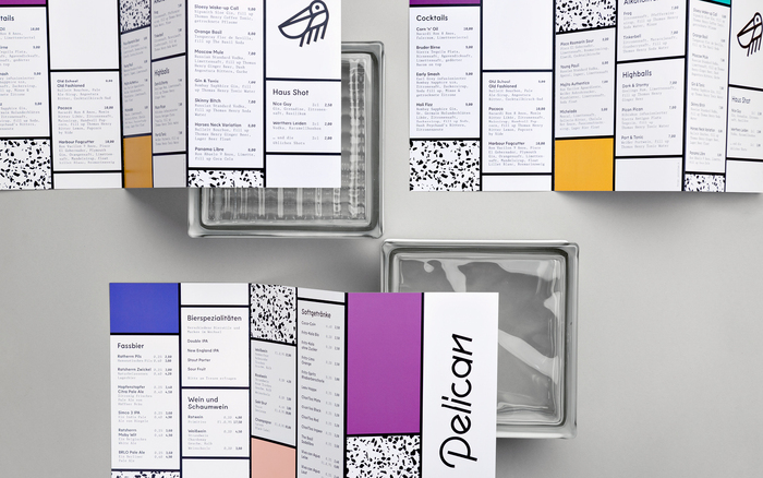
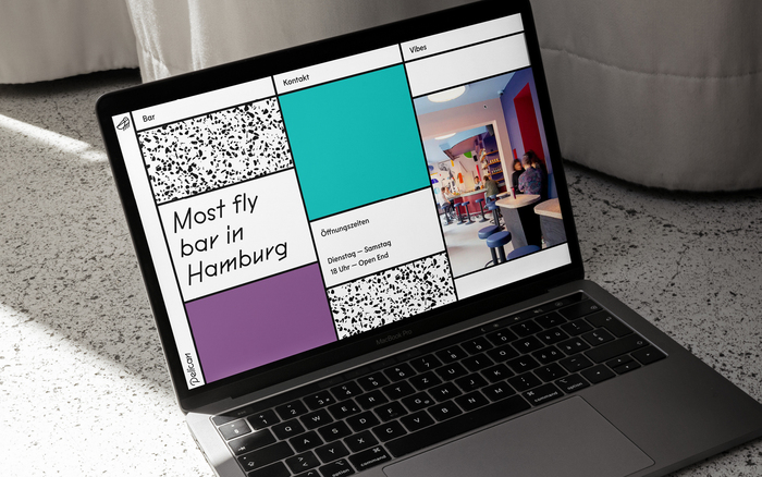
Pelican is a bar in the heart of Hamburg’s iconic St. Pauli. Conceived as Sonny Crockett’s favourite place the Miami Vice inspired bar serves fruity cocktails and longdrinks in a Memphis Design spatiality.
Pelican Poster is the bespoke typeface, designed by Paul Eslage, that defines the identity of the bar. Its combination of circular shapes and runic strokes gives it a clear yet playful character. Taking you back to Miami in the 1980s, this typeface embodies the unconventionality and clarity of that design era in a contemporary manner. It was developed from the wordmark and is used in any display usage in the menu, on the website and as signage inside the bar. Lemur is the main typeface for any informational text and is accompanied by Knif mono for second hierarchy texts like ingredient lists inside the beverage menu.

Source: pauleslage.de Photo: Paul Eslage. License: All Rights Reserved.

Source: pauleslage.de Photo: Paul Eslage. License: All Rights Reserved.
Source: pauleslage.de Photo: Paul Eslage. License: All Rights Reserved.
Source: pauleslage.de Photo: Paul Eslage. License: All Rights Reserved.

Source: pauleslage.de Photo: Paul Eslage. License: All Rights Reserved.
Source: pauleslage.de License: All Rights Reserved.
This post was originally published at Fonts In Use