Outs Pop-up #1 “Watch Outs!”
Published May 19, 2023
By FontsInUse
Contributed by Eliott Grunewald
Source: instagram.com outs.official. License: All Rights Reserved.


Source: instagram.com License: All Rights Reserved.
Source: instagram.com License: All Rights Reserved.
Source: instagram.com License: All Rights Reserved.
Source: instagram.com License: All Rights Reserved.
This post was originally published at Fonts In Use
Source: instagram.com outs.official. License: All Rights Reserved.
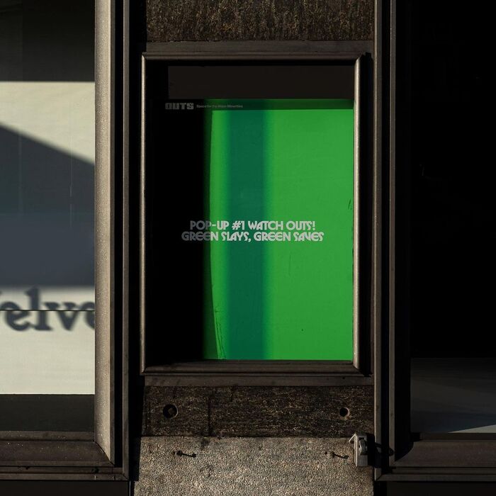
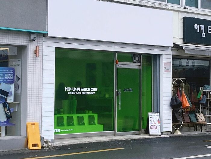
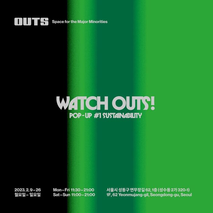
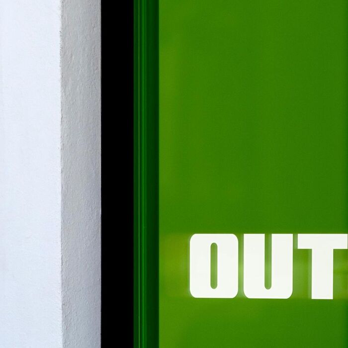
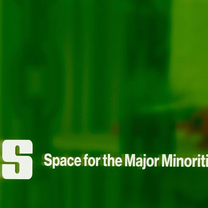
Poster and storefront designed by the Seoul-based designer Im Hayoung of TO.A.T for a pop-up store organised by Outs in Seoul, displaying several sustainable brands, selling objects and clothes.
The primary typeface is Herbus, supported by Helvetica and an unidentified Korean counterpart. The Outs logo appears to be custom. FF Softsoul and Director Heavy are somewhat similar.
Source: instagram.com License: All Rights Reserved.
Source: instagram.com License: All Rights Reserved.
Source: instagram.com License: All Rights Reserved.
Source: instagram.com License: All Rights Reserved.
This post was originally published at Fonts In Use
Read full story.
WRITTEN BY
FontsInUse
An independent archive of typography.
More from FontsInUse