OÖKunstverein
Source: mooi-design.com Andrea Eiber. License: All Rights Reserved.

Founded in 1851, the Oberösterreichischer Kunstverein (“Upper Austrian Art Association”) is Austria’s second-oldest art association. While rooted in history, its mission today is to promote and expand contemporary art. As a gallery and exhibition space, the OÖKV creates visibility and opportunities for artistic expression.
The rebranding captures both the historical and contemporary essence of the association, bridging past and future. These contrasts – heritage versus progression, tradition versus innovation – create a dynamic tension that tells the story of what defines the OÖKV and reveals its core identity.
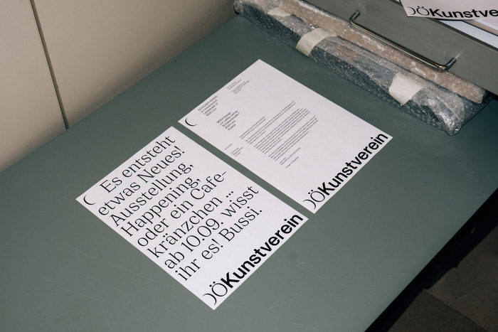
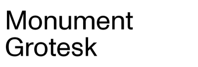
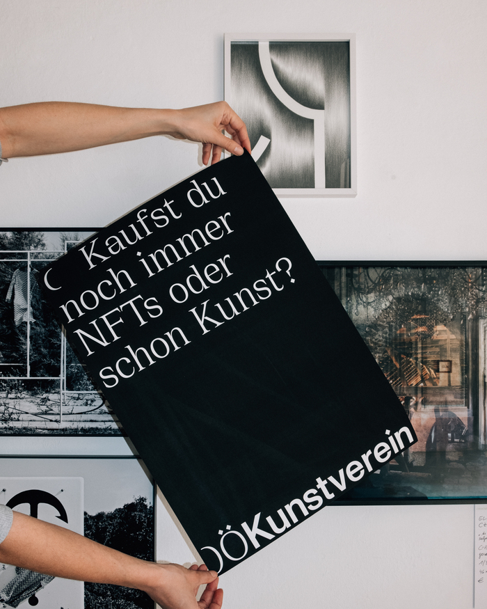
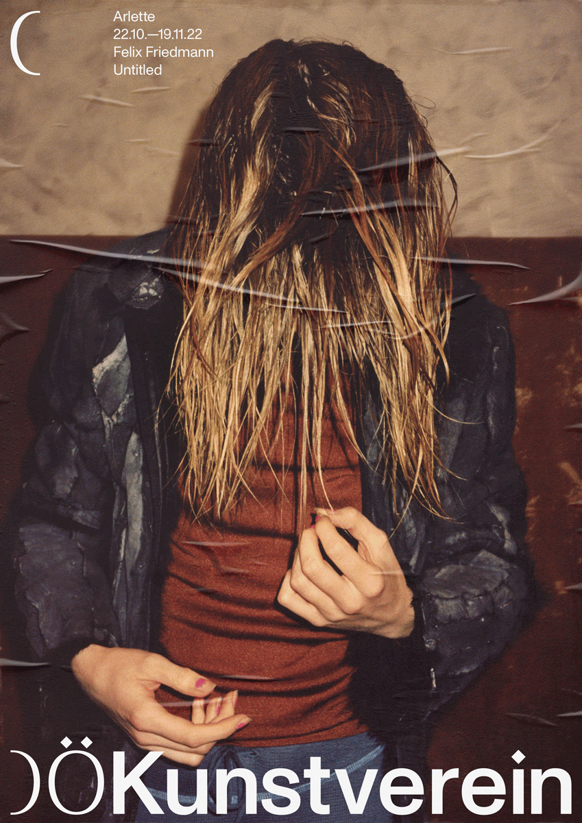
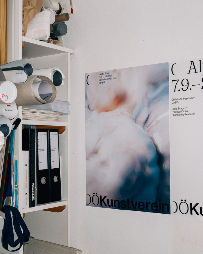
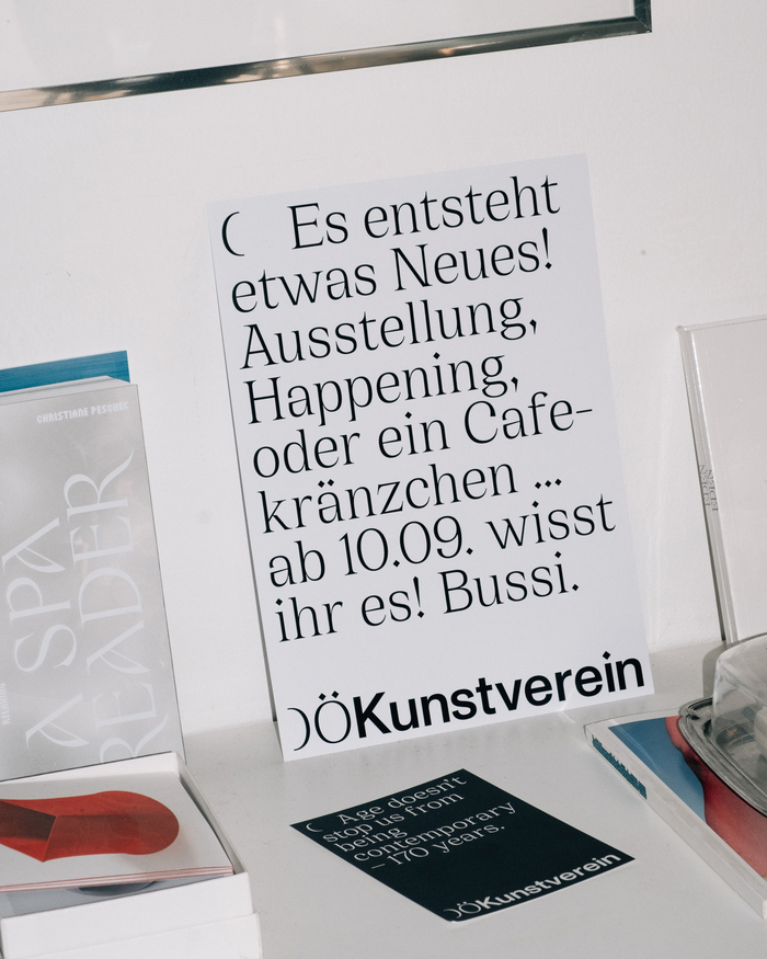
This transformation is visually expressed through a bold typographic approach. Typography plays a pivotal role in shaping the association’s new identity, where its name is stylized as OÖKunstverein. The combination of the serif typeface Cirka and the sans-serif Monument Grotesk embodies another essential contrast: past and present.
Cirka, with its elegant serifs, references the association’s historical depth, while Monument Grotesk, with its strong, contemporary character, anchors it in the present. The interplay of serif and sans-serif typography visually narrates the OÖKV’s journey from its origins to today. This typographic tension creates a dialogue between tradition and modernity. In application, the design balances confident individuality with subtle lightness, ensuring both flexibility and a strong, recognizable identity.
The contemporary branding reflects the association’s mission of being an open space for art, providing a framework that structures, challenges, and opens new possibilities.
Source: mooi-design.com Andrea Eiber. License: All Rights Reserved.
Source: mooi-design.com Andrea Eiber. License: All Rights Reserved.
Source: mooi-design.com Andrea Eiber. License: All Rights Reserved.
Source: mooi-design.com Andrea Eiber. License: All Rights Reserved.

Source: mooi-design.com Andrea Eiber. License: All Rights Reserved.
This post was originally published at Fonts In Use