Ombestem tattoo removal
Source: www.instagram.com License: All Rights Reserved.

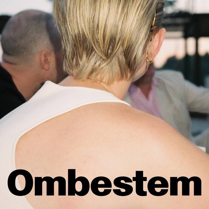
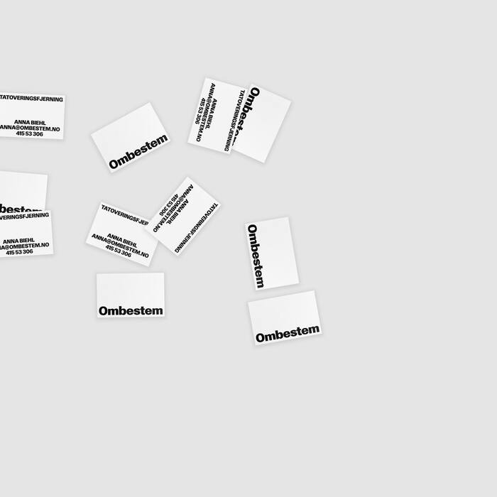
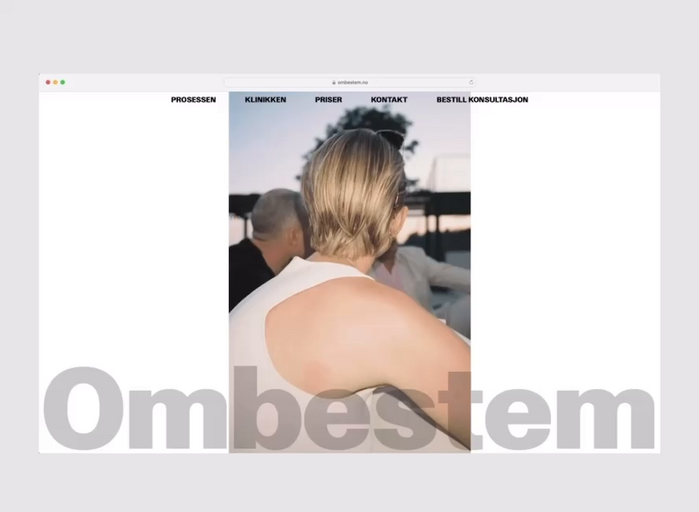
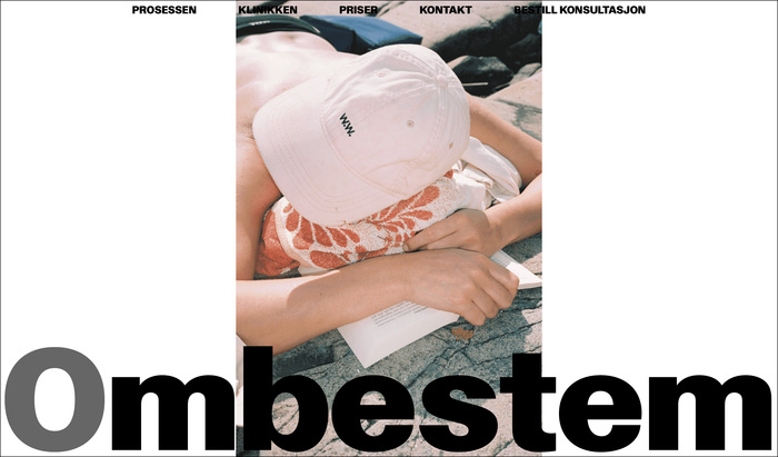
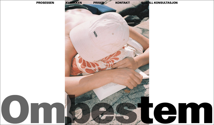
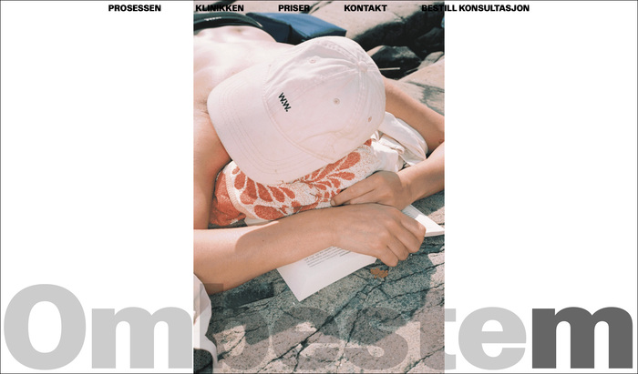
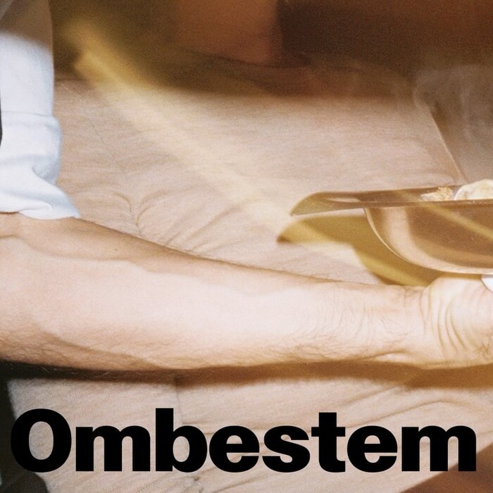
Feed Oslo have designed a small identity and website for tattoo removal studio Ombestem, using the black cut of Store Norske Jazz from Skriftkompani. Description from their Instagram post:
Ombestem (“Change of mind” in Norwegian) is a brand that communicates moderate self-confidence. The name itself does not hide the fact that the treatment is a change of mind, and that it is okay to change your mind. We wanted to communicate this reassurance through a clear identity that does not sugarcoat the truth, but rather embraces it.
The typeface used as a core element of the identity is Store Norske Jazz. The typography is meant to be a direct reference to late 70s cultural elements, where tattoos are a central symbol of raw individualism and self-expression. The idea is to associate the clinic with a contemporary graphic style linked to tattooing and at the same time honour the underground subcultures that it belongs to. The photography captures skin where a tattoo is no longer present, and this imagery together with the graphic direction aims to distinguish Ombestem from other clinics that prioritize and promote cosmetic treatments.
Photography: Andreea Tecusan
Source: www.instagram.com License: All Rights Reserved.
Source: www.instagram.com License: All Rights Reserved.
Source: www.instagram.com License: All Rights Reserved.
Source: www.instagram.com License: All Rights Reserved.
Source: www.instagram.com License: All Rights Reserved.
Source: www.instagram.com License: All Rights Reserved.
This post was originally published at Fonts In Use