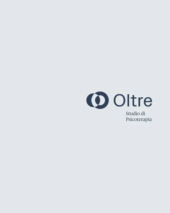
Oltre

Source: www.bharatharappali.com Photo: Bharath Arappali. License: All Rights Reserved.

Oltre cares to become a reference for those who want to put change, personal growth, overcoming difficulties related to emotional suffering and wellbeing at the center of their lives.
In a market where psychotherapy offerings are increasingly being positioned in terms of accessibility, Oltre positions itself in the opposite vertex, formulating the best possible path to their clients.
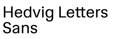
The developed visual imagery consists of a color palette with hues of blues, inspired from the interiors of the space, complemented by a serif/sans serif typography using Hedvig Letters Serif and Sans by Kanon Foundry. To reflect the nature of their offering, an ample amount of whitespace is used as a key design element across all communication
Web development by Filippo Buresta. Made in collaboration with Studio MOST.
Source: www.bharatharappali.com License: All Rights Reserved.

Source: www.bharatharappali.com License: All Rights Reserved.

Source: www.bharatharappali.com License: All Rights Reserved.

Source: www.bharatharappali.com License: All Rights Reserved.

Source: www.bharatharappali.com License: All Rights Reserved.

Source: www.bharatharappali.com License: All Rights Reserved.

Source: www.bharatharappali.com License: All Rights Reserved.

Source: www.bharatharappali.com License: All Rights Reserved.
This post was originally published at Fonts In Use