New York Review of Architecture
Source: www.instagram.com License: All Rights Reserved.
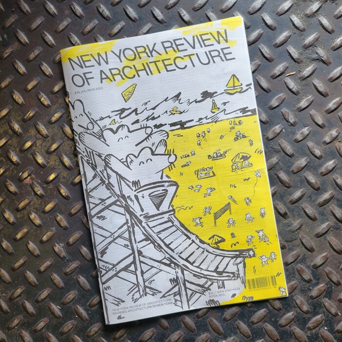
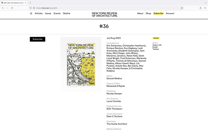
Issue #36, Jul/Aug 2023, with cover illustration by Sean Suchara


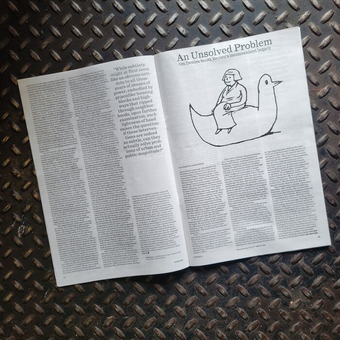
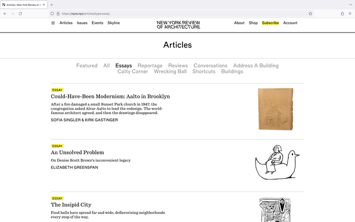
The New York Review of Architecture is a bi-monthly architecture review journal, published in newspaper form. The print edition’s illustrations share the common theme of rats (a mainstay in New Yorkers’ lives), and their rough line-work style cleverly leans into the raw nature of cheap newsprint. The yellow accent is not only cost-effective to print but also creates a strong and flexible visual identity element.
NYRA’s headlines are set in HB Type’s HB Margin, designed by Berton Hasebe. This typeface apparently is loosely based on Dick Dooijes’ Mercator, but with a curiously back-slanted italic. Body text uses Quadrant Text from Matter of Sorts, designed by Vincent Chan.
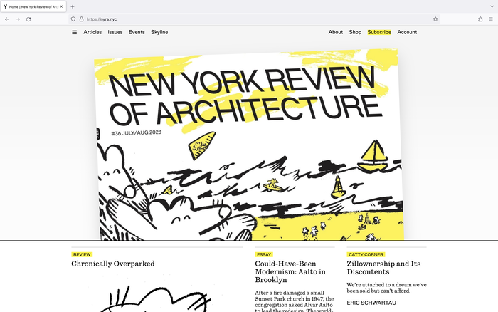
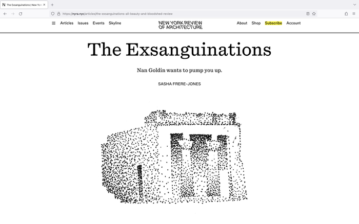
The NYRA website was recently expanded to include richer information and an online article reading experience, in addition to subscription management, extending the same illustration and typography to the digital screen.
Art direction by Laura Coombs, with web development by Seth Thompson of A Lot of Moving Parts.
Source: www.instagram.com License: All Rights Reserved.
Source: nyra.nyc ©️NYRA 2023. License: All Rights Reserved.
Source: nyra.nyc ©️NYRA 2023. License: All Rights Reserved.
Source: nyra.nyc ©️NYRA 2023. License: All Rights Reserved.
Source: nyra.nyc ©️NYRA 2023. License: All Rights Reserved.
This post was originally published at Fonts In Use