Pomalo
Published September 14, 2023
By FontsInUse
Contributed by Studio Size

Source: studio-size.com License: All Rights Reserved.


Source: studio-size.com License: All Rights Reserved.
Source: studio-size.com License: All Rights Reserved.

Source: studio-size.com License: All Rights Reserved.
Source: studio-size.com License: All Rights Reserved.
Source: studio-size.com License: All Rights Reserved.
Source: studio-size.com Photo: Studio Size. License: All Rights Reserved.
Source: studio-size.com License: All Rights Reserved.
Source: studio-size.com License: All Rights Reserved.
Source: studio-size.com License: All Rights Reserved.

Source: studio-size.com License: All Rights Reserved.

Source: studio-size.com Photo: Studio Size. License: All Rights Reserved.
This post was originally published at Fonts In Use
Source: studio-size.com License: All Rights Reserved.
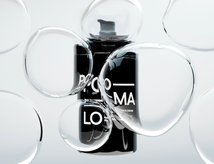
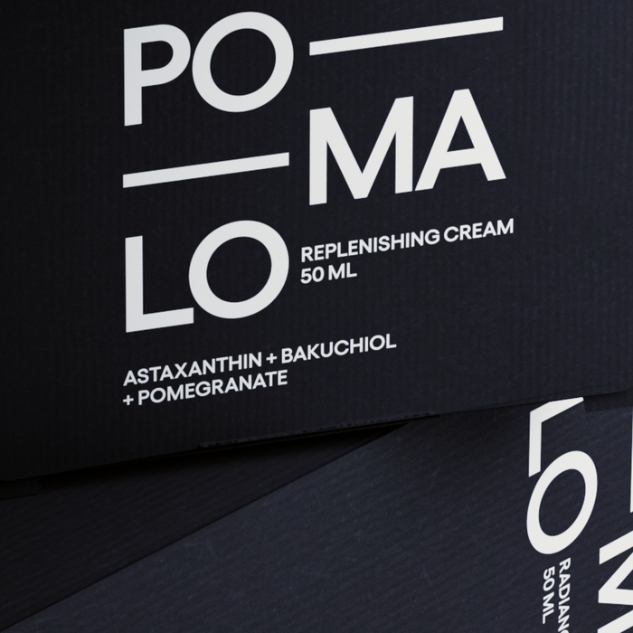
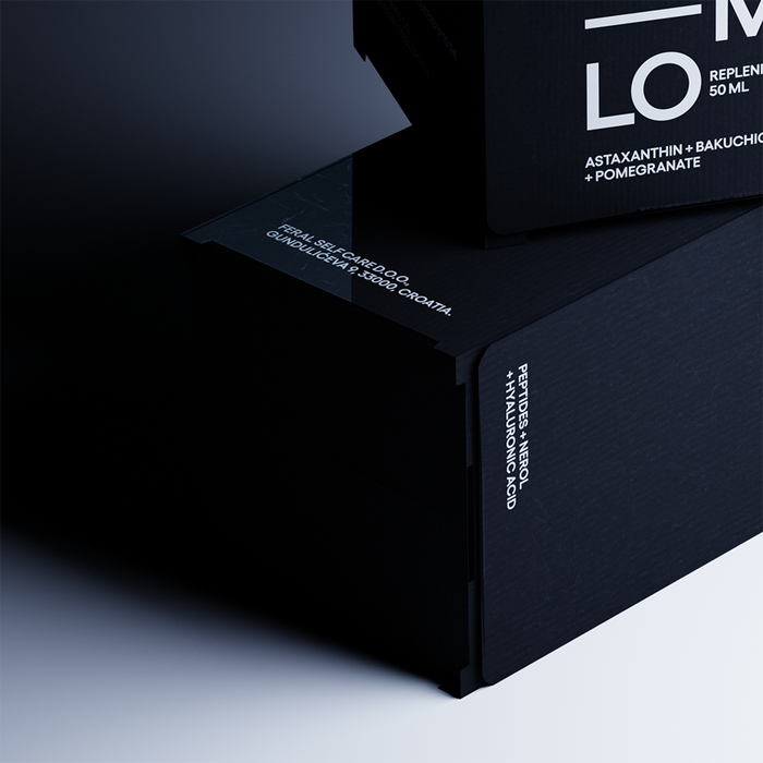
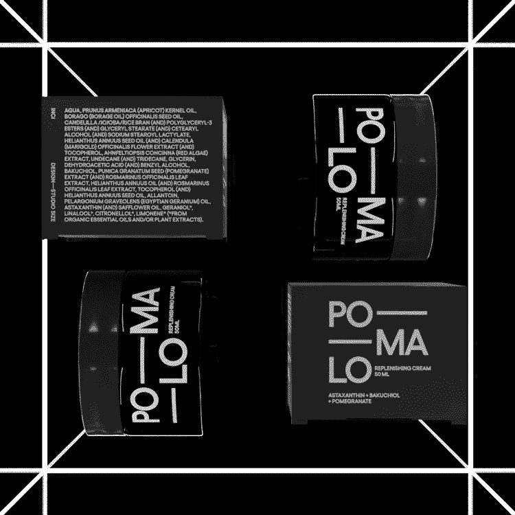
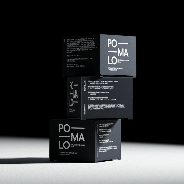
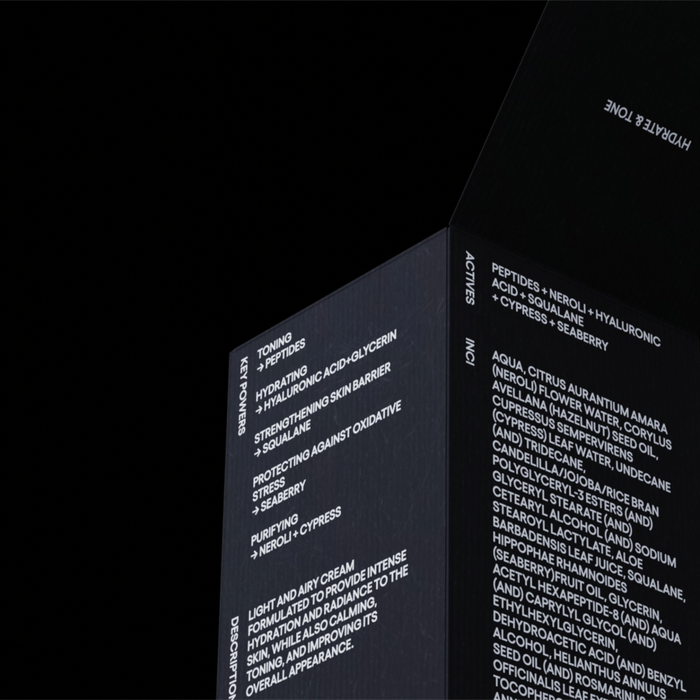
Studio Size designed the visual identity and packaging for Pomalo, a skincare brand that promotes a flexible and stress-free approach to skincare routines. Pomalo believes in breaking free from strict schedules and usage instructions, offering a line of products that can be combined in any order according to individual preferences.
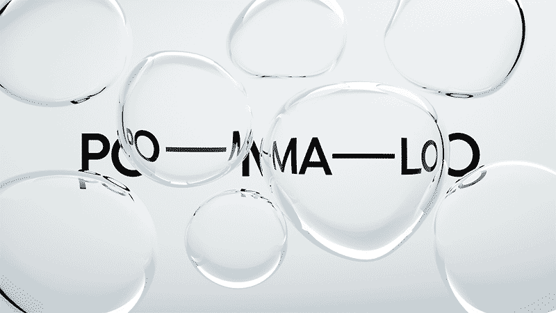
The brand name, Pomalo, derives from the Croatian word for “slowly” and encapsulates a relaxed and laid-back mindset. To visually capture this philosophy of adaptability, we designed an identity system that seamlessly adjusts to various contexts. By incorporating deliberate pauses within the brand name (Po—ma—lo), we invite readers to take a moment and appreciate the brand’s unhurried essence.
Source: studio-size.com License: All Rights Reserved.
Source: studio-size.com License: All Rights Reserved.
Source: studio-size.com License: All Rights Reserved.
Source: studio-size.com License: All Rights Reserved.
Source: studio-size.com License: All Rights Reserved.
Source: studio-size.com Photo: Studio Size. License: All Rights Reserved.
Source: studio-size.com License: All Rights Reserved.
Source: studio-size.com License: All Rights Reserved.
Source: studio-size.com License: All Rights Reserved.
Source: studio-size.com License: All Rights Reserved.
Source: studio-size.com Photo: Studio Size. License: All Rights Reserved.
This post was originally published at Fonts In Use
Read full story.
WRITTEN BY
FontsInUse
An independent archive of typography.
More from FontsInUse