New Identities
Konst & Teknik. License: All Rights Reserved.
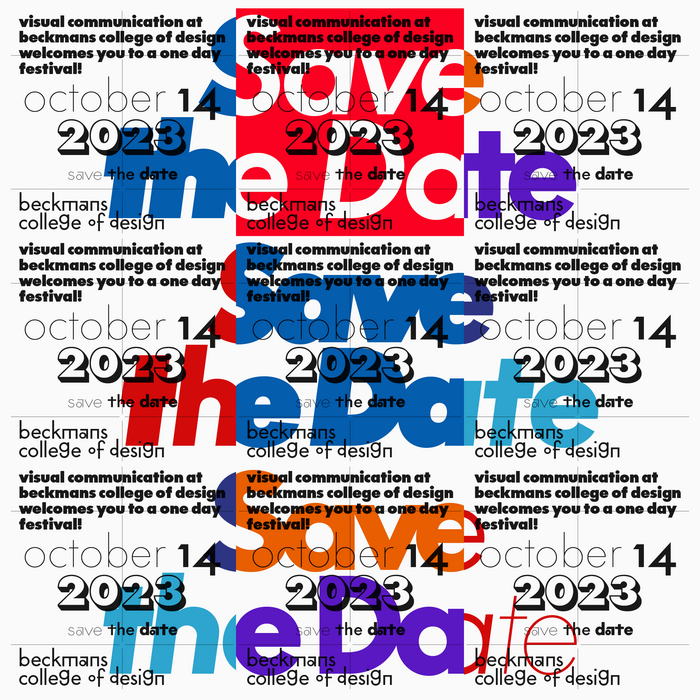
Save the date announcement, referencing famous logotypes set in Futura


New Identities (or ⓝє𝕨 Ɨdεη丅𝔦𝔱ίẸ𝓢) was the first encounter of the recurring festival on visual communication at Beckmans College of Design in Stockholm, Sweden, on October 14, 2023.
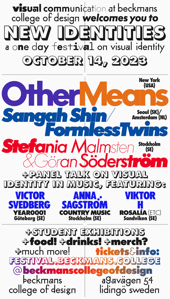
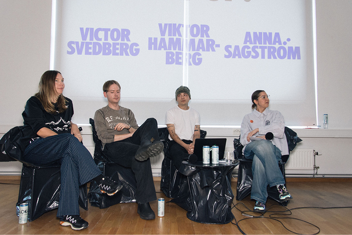
The festival ends a course on identity design with the third-year students at the program, led by senior lecturer Peter Ström, and exhibited work by all students at the department parallel to the main program: lectures by Other Means (US), Sangha Shin of Formless Twins (SK/NL), Göran Söderström & Stefania Malmsten (SE), as well as a panel on visual identity in Swedish music, with Victor Svedberg of Year0001, Anna Sagström of Country Music, Viktor Hammarberg, and moderator Lisa Ehlin.
The festival’s visual identity was designed by me, Peter Ström of Konst & Teknik, one of the initiators of the festival and part of the faculty at the school.
It takes its departure in the current visual identity of Beckmans, designed by Henrik Nygren in 2008 and especially its extensive use of the typeface Futura. The visual identity is often debated within the program as some frustration sometimes is voiced due to its modernistic and minimal black-and-white-lowercase-only use might communicate the opposite of the vibrant and visually exciting work that takes place on inside the school.
The solution is a more maximalist approach by using every other version of Futura but the one used by Beckmans available to me.
The result is a visual identity that is an expressive mashup of design history, referencing everything from local and international usages of that very typeface, via its designer Paul Renner’s early sketches from 1926 and digitized versions rooted in the 1960s to ultra modern reinterpretations.
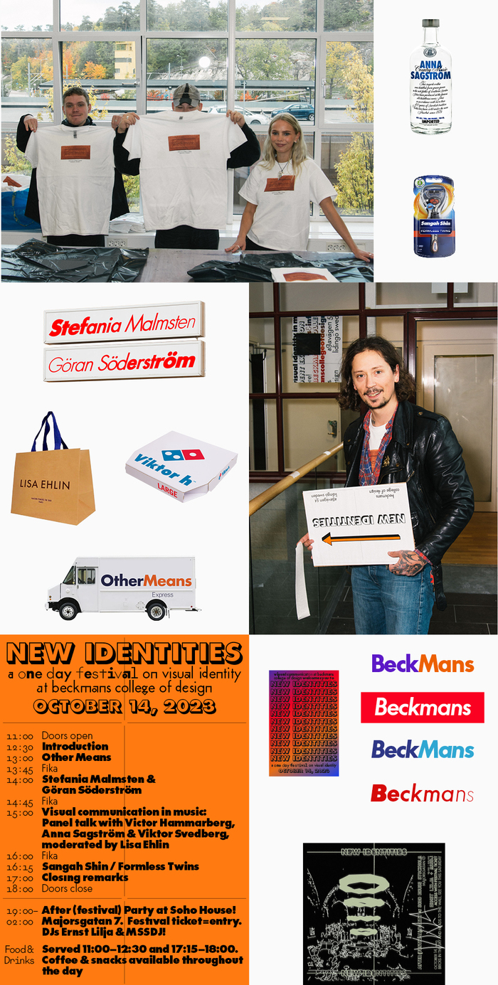
The identity has been further developed into everything from T-shirts, laser engraved bricks (!), a signage system, and other things by the students over the weeks leading up to the festival.
Photo by Jonas Hemlin.
Konst & Teknik. License: All Rights Reserved.
Poster and Instagram story-announcement
Konst & Teknik. License: All Rights Reserved.
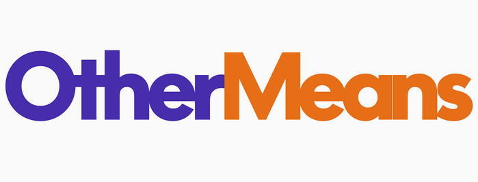
The announcement treatment was later turned into “logotypes” for each lecturer, with a hint of their geographical location: Other Means from the US referring to FedEx.

Konst & Teknik. License: All Rights Reserved.
Sangah Shin / Formless Twins from South Korea and the Netherlands referencing the global brand Gillette
License: All Rights Reserved.
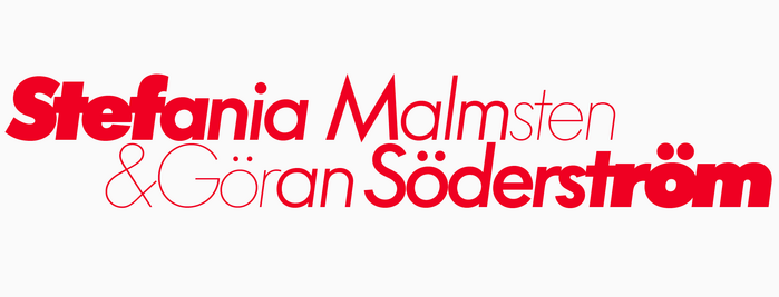
Stefania Malmstren & Göran Söderström from Sweden referring to local grocery store Ica Supermarket.

Konst & Teknik. License: All Rights Reserved.
The panel on music and visual identity referenced Absolute Vodka and their use of a custom Futura (because you know... booze).
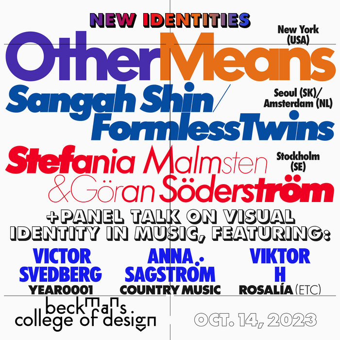
Konst & Teknik. License: All Rights Reserved.
Social media announcement
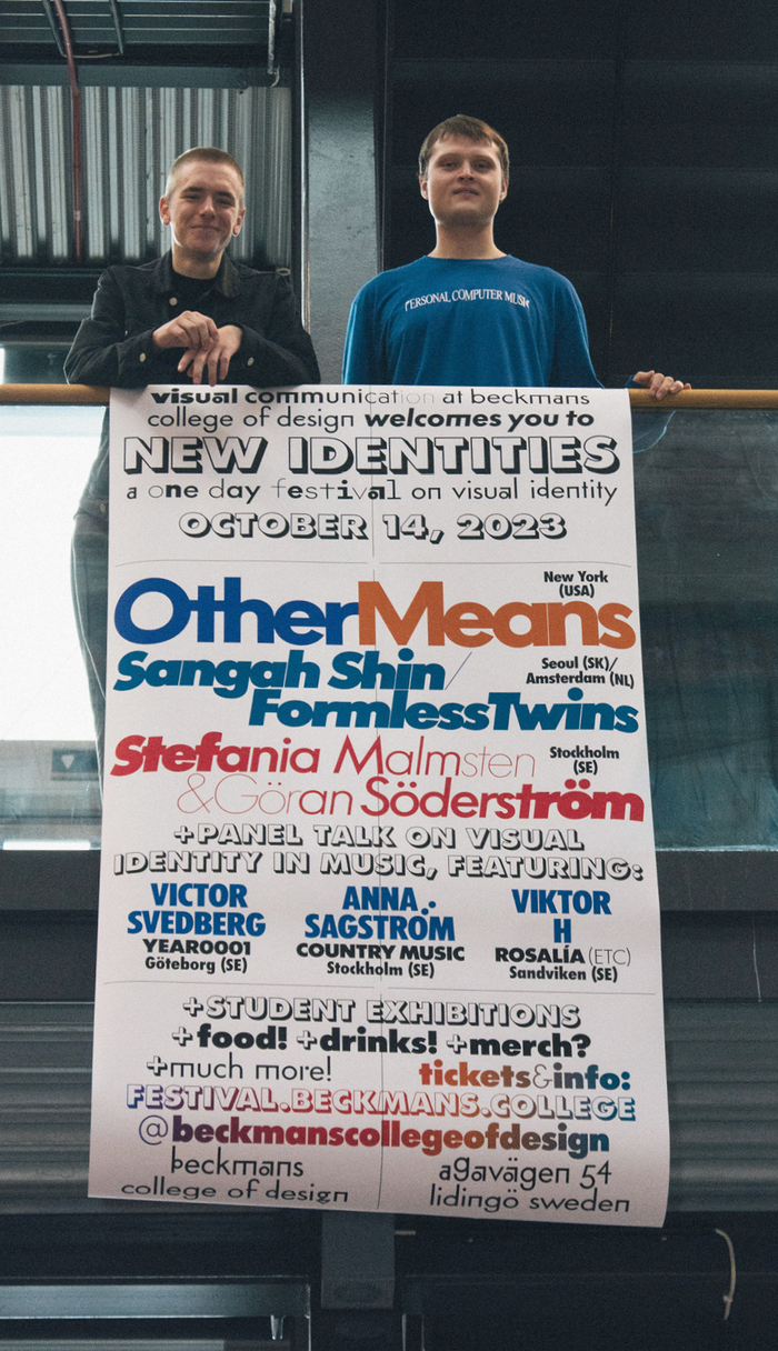
Jonas Hemlin. License: All Rights Reserved.
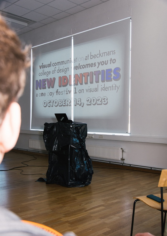
Jonas Hemlin. License: All Rights Reserved.
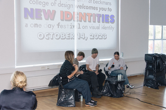
Jonas Hemlin. License: All Rights Reserved.
Jonas Hemlin. License: All Rights Reserved.
Konst & Teknik / photos: Jonas Hemlin. License: All Rights Reserved.
Collage of units produced by Peter and the students: photoshopped Futura products for and on a T-shirt by Mauritz Larsson and Caroline Hallersjö, afterparty invite by Linnea Arminda Birkelund, signage system by Andreas Rehnberg
This post was originally published at Fonts In Use