OEI #84/85, “Våtmarker & Experiment” and #86/87, “Publiceringspraktiker, Publiceringspoetiker”
Konst & Teknik. License: All Rights Reserved.
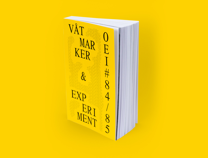
OEI #84/85: cover


From the OEI website:
OEI is a Stockholm-based magazine for extra-disciplinary spaces and de-disciplinizing moments – experimental forms of thinking, montages between poetry, art, philosophy, film, and documents; critical investigations, editorial enunciations, aesthetic technologies, non-affirmative writing, speculative archaeologies, new ecologies and counter-historiographies.
For each issue, a new typographic treatment is commissioned by different (typo)graphic designers, with the actual production of each issue being done by the OEI editors themselves.
For the two double issues #84/85 (2019) and #86/87 (2020), the same treatment was – for the first time – uses twice, as the issues originally were supposed to be one issue — but as the number of pages by far exceeded the maximum it was split into two issues. Both issues end up at around 640 pages each.
For #84/85 and #86/87, Konst & Teknik / Peter Ström was commissioned. Below is a text that was included in OEI #86/87 on the typography, translated into English from its original Swedish.
14 TIMES TIMES — On the typography in OEI #84/85 and #86/87
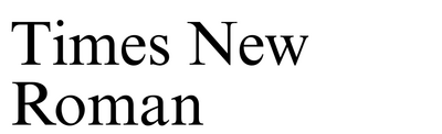
Times New Roman is one of the most well known Roman typefaces in current times, originally drawn in 1931 by Stanley Morison for the Times newspaper in London.
During the century that has passed since, the technical conditions of typesetting and type design have drastically changed on multiple occasions. From the metal type that Times New Roman originally was drawn for, via phototypesetting, to the digital typography of the computer era.
Today typefaces are drawn and programmed to work straight on digital screens, either in layout software such as Adobe InDesign (for later reproduction on, for example, paper), or to work exclusively within the computer; in software, on web pages, and apps.
Times New Roman found its way into the personal computer quite early, as it was distributed with the operating system Microsoft Windows 3.11 in 1993. Since then a number of new versions and interpretations have surfaced: Everything from hand-drawn and mirrored versions, via conceptually interesting sans serif versions, to professional interpretations by established typeface designers. Worth noting here are Tiempos by Kris Sowersby (2010), LL Bradford by Laurenz Brunner (2018) and GT Alpina by Reto Moser (2020).
Times New Roman has in a way become as close to a “non typeface” as a typeface can ever be — rivaled only by other Microsoft-distributed typefaces such as Arial and Courier New.
Or, as the typographer (and lawyer) Matthew Butterick phrases it:
When Times New Roman appears in a book, document, or advertisement, it connotes apathy. It says, “I submitted to the font of least resistance.” Times New Roman is not a font choice so much as the absence of a font choice, like the blackness of deep space is not a color. To look at Times New Roman is to gaze into the void.
Today there are more than 20 digital typeface families that, in one way or another, draw references to Times New Roman. The initial idea for OEI #84/85 and 86/87 was to use all of them as a way to create an index of the evolution of printed matter over the last one hundred years. But as many of the fonts lack Swedish (or Danish) characters, are incomplete for other reasons, or are simply illegible, the amount was reduced to 14. All 14 come in both Regular and Italic versions, with a few selected exceptions where the italics have been emulated by manually slanting in the layout software — a homage to the era of early digital typography where italics weren’t always available.
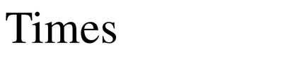
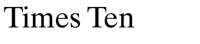
The different versions of Times New Roman used are everything from professional versions, such as Times Ten, to unpublished interpretations used in earlier projects by Konst & Teknik, such as Times MMM Roman, a remix version of Moderna Museet’s own Times MM Roman, to free amateur versions like Tiny Times, a pixelated version based on the appearance of Times New Roman when rendered on low-resolution screens.
The 14 versions:
Times New Roman Regular & Italic
Dutch 801 BT Roman & Italic
Times Regular & Italic
Times MM Roman Regular & Italic
Times MMM Roman (K&T remix) Regular & Italic
Pantasia Regular & Italic
Times Ten Regular & Italic
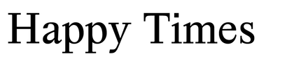
Happy Times at the IKOB Regular & Italic
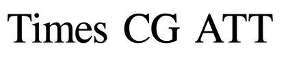
Times CG ATT Regular & Faux Italic (13 deg)
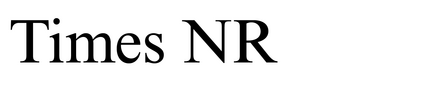
Times NR MT Pro Regular & Italic
#PCMyungjo (K&T edit) Regular & Faux Italic (13 deg)
Tiny Times (K&T edit) Regular & Faux Italic (13 deg)
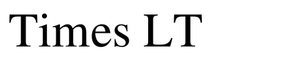
Times LT Regular & Italic
Times ET Regular & Italic
In every project we take on as Konst & Teknik, the research and final decision of the typeface selection is crucial – often to such an extent that we have difficulties returning to the same typefaces more than once. The typeface selections reflect the project and its content so much that it becomes difficult to apply the same typeface selection on later projects.
Times New Roman in its different versions seem to be an exception, a typeface family we have returned to more times than once. Maybe thanks to its rich technical and visual history, making it easy to apply conceptually to different projects and commissioners. It is by far the typeface I have the most different versions of in my computer, making it easy to find a suiting visual expression within the framework of a "clear" typography. Because of this, it has for a long time been an interesting thought to apply all the different version at the same time to a bigger printed matter project thus making it possible to in detail compare the different version properly. OEI #84/85 and #86/87 offered that possibility, both content wise, conceptually and technically.
Peter Ström
Konst & Teknik
January 2020
Konst & Teknik. License: All Rights Reserved.
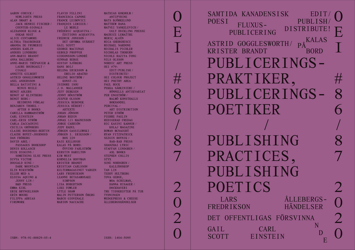
OEI #86/87: cover, spine, and back
Konst & Teknik. License: All Rights Reserved.
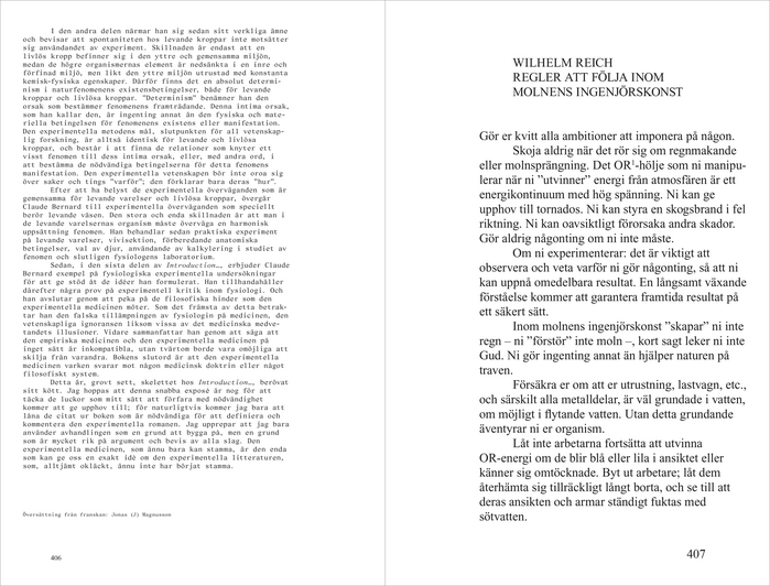
OEI #84/85: spread
Konst & Teknik. License: All Rights Reserved.
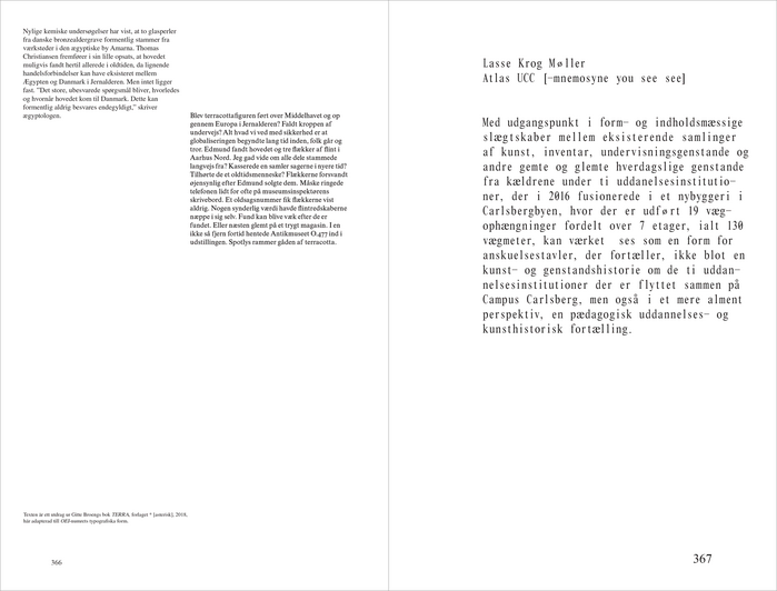
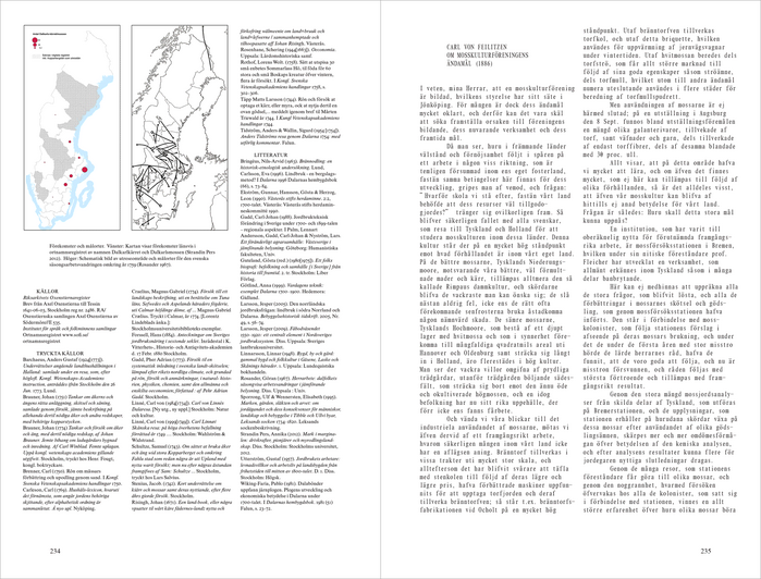
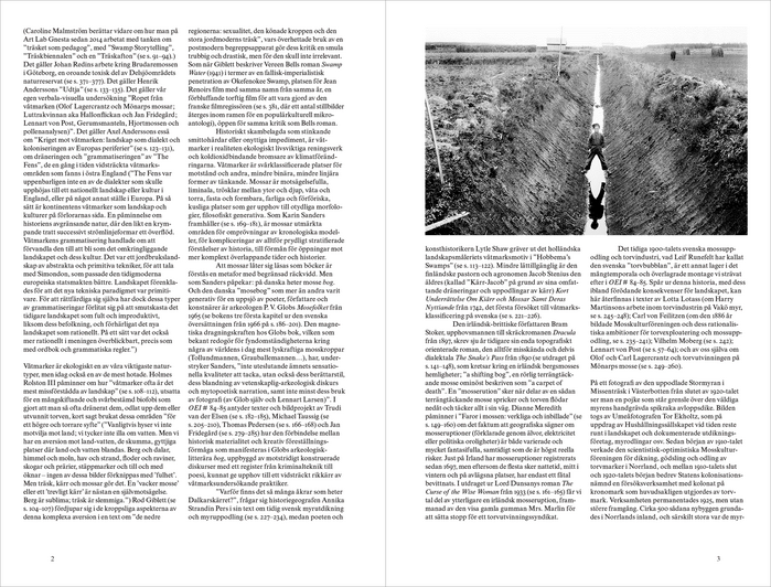
OEI #84/85: spread
Konst & Teknik. License: All Rights Reserved.
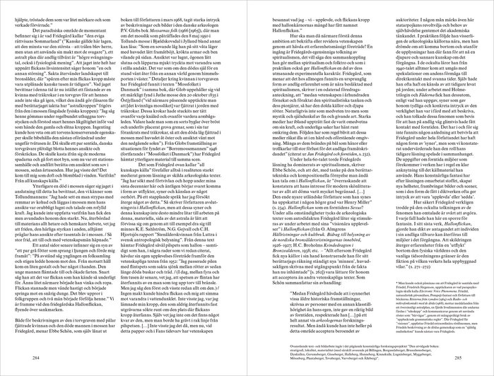
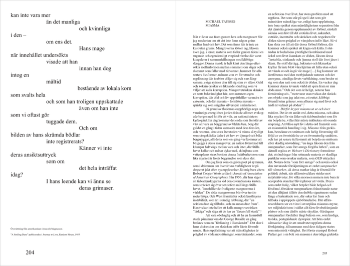
OEI #84/85: spread
Konst & Teknik. License: All Rights Reserved.
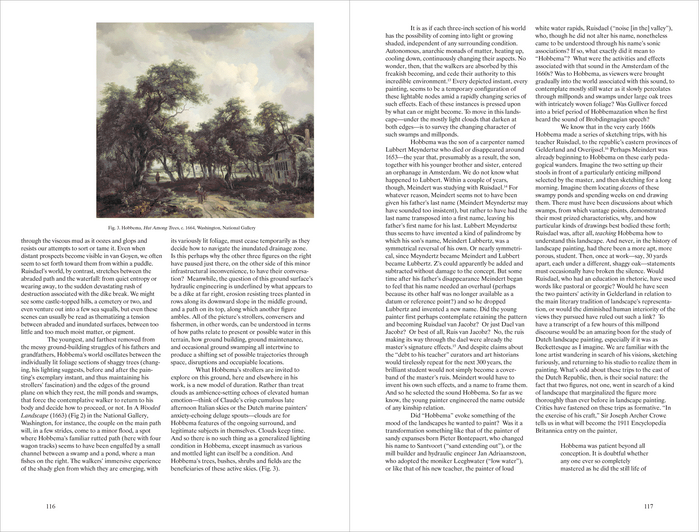
OEI #84/85: spread
Konst & Teknik. License: All Rights Reserved.
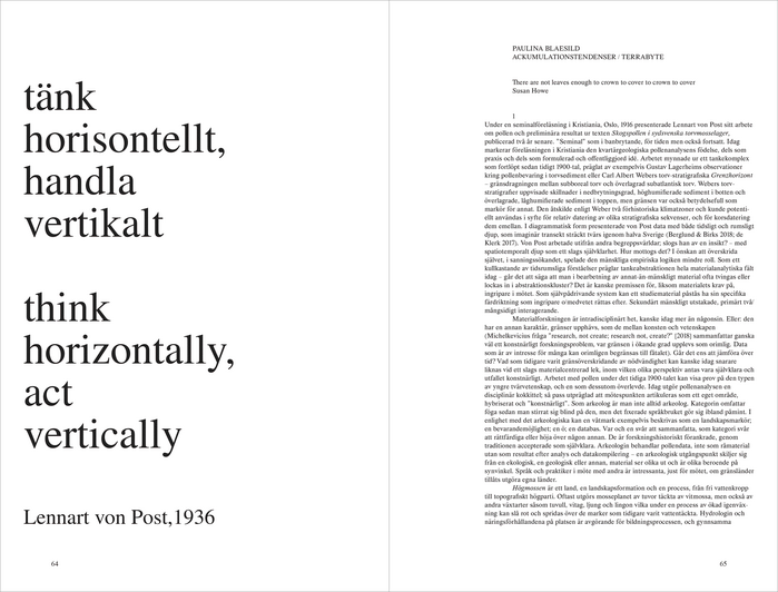
OEI #84/85: spread

Konst & Teknik. License: All Rights Reserved.
OEI #84/85: spread

Konst & Teknik. License: All Rights Reserved.
OEI #84/85: spread
Konst & Teknik. License: All Rights Reserved.
OEI #84/85: spread

Konst & Teknik. License: All Rights Reserved.
OEI #84/85: spread
Konst & Teknik. License: All Rights Reserved.
OEI #84/85: spread
Konst & Teknik. License: All Rights Reserved.
OEI #84/85: spread
This post was originally published at Fonts In Use