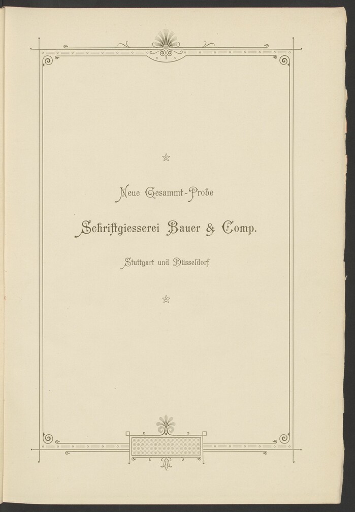
Neue Gesammt-Probe, Schriftgiesserei Bauer & Co.
Source: berlin.museum-digital.de License: All Rights Reserved.
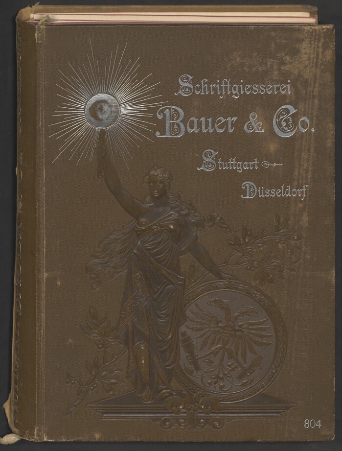
The cover depicts Germania holding a torch in her right hand and a shield with a double-headed eagle in her left. The silver text uses Preciosa with its decorated capitals.


Bauer was a German type foundry established by Friedrich W. Bauer and Karl Rupprecht in Stuttgart in 1880. It’s not to be confused with the Bauer (or Bauersche) foundry in Frankfurt am Main, which was started in 1837 by Friedrich’s father, Johann Christian Bauer. Bauer jr. left the company in 1887, but the established Bauer & Co. name was continued. Rupprecht added a branch in Düsseldorf in 1892. On 9 November 1897, Bauer & Co. was acquired by H. Berthold AG in Berlin.
This is their 1895 type specimen book titled Neue Gesammt-Probe (“New comprehensive specimen”). Stiftung Deutsches Technikmuseum Berlin digitized a copy from their Günter Gerhard Lange Collection. Shown here are the cover, the title pages, the foreword, and the opening pages for the four sections.
The main typefaces used for the book design are Preciosa and Carmen, two typefaces that were released by Bauer & Co. shortly before.
In 2022, I made a digital interpretation of Carmen named Amabilis Veneriana. It covers the two original weights plus an open Hollow style. I found the base character set in the third edition of Ludwig Petzendorfer’s Schriften-Atlas from 1898.
Source: berlin.museum-digital.de License: All Rights Reserved.
The half-title page features Carmen in regular and bold.
Source: berlin.museum-digital.de License: All Rights Reserved.
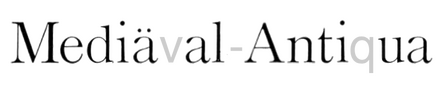
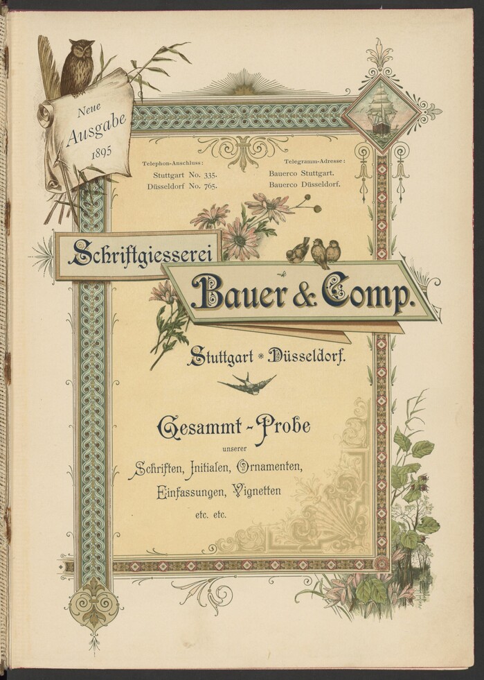
The ornate title page combines Preciosa and Carmen. The small type at the top is set in the English cut of Mediäval-Antiqua, with oldstyle figures. “Neue Ausgabe 1895” uses the corresponding Kursiv.
Source: berlin.museum-digital.de License: All Rights Reserved.
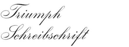
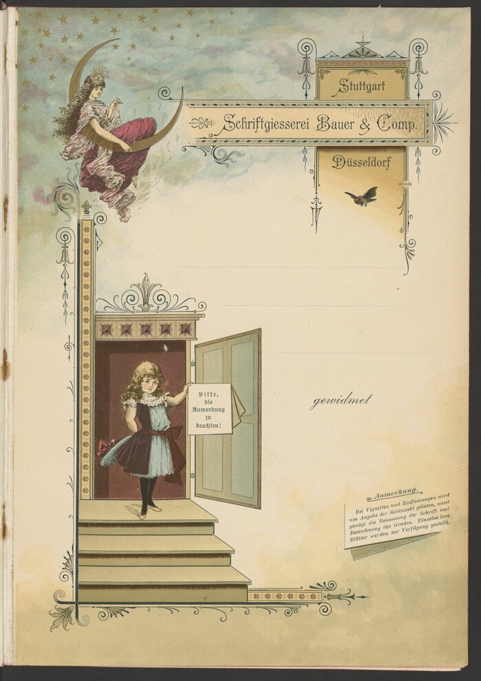
Page with room for a dedication. The company name at the top is in Carmen again. The text integrated in the sign held by the girl on the stairs is set in Gutenberg-Gotisch, “gewidmet” is in Triumph-Schreibschrift, and “Anmerkung” in Mercantil-Kursiv.
Source: berlin.museum-digital.de License: All Rights Reserved.
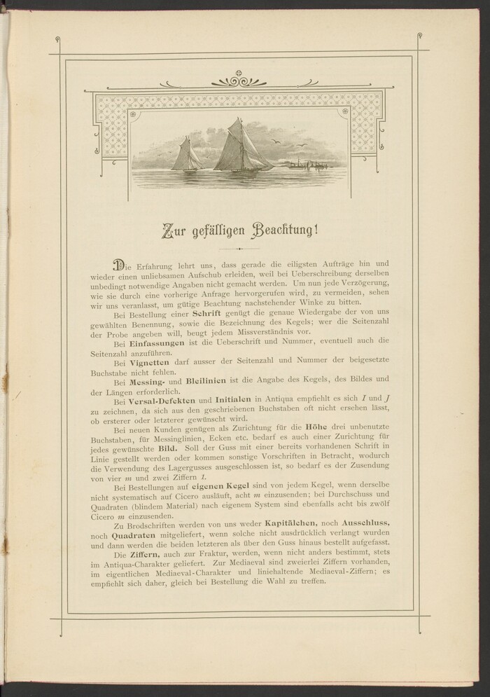
Foreword with a headline in Carmen and text in Mediäval-Antiqua with halbfett. The initial D is taken from Preciosa.
Source: berlin.museum-digital.de License: All Rights Reserved.
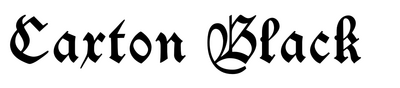
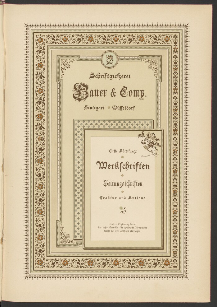
Title page for the first section with Werkschriften (“work[horse] typefaces”) and Zeitungsschriften (“newspaper typefaces”), in Fraktur and Antiqua styles. The typography pairs Enge verzierte Altdeutsch and Altdeutsch. The latter is Bauer & Co.’s recutting of Caxton Black. The small text uses their Schwabacher.
Source: berlin.museum-digital.de License: All Rights Reserved.
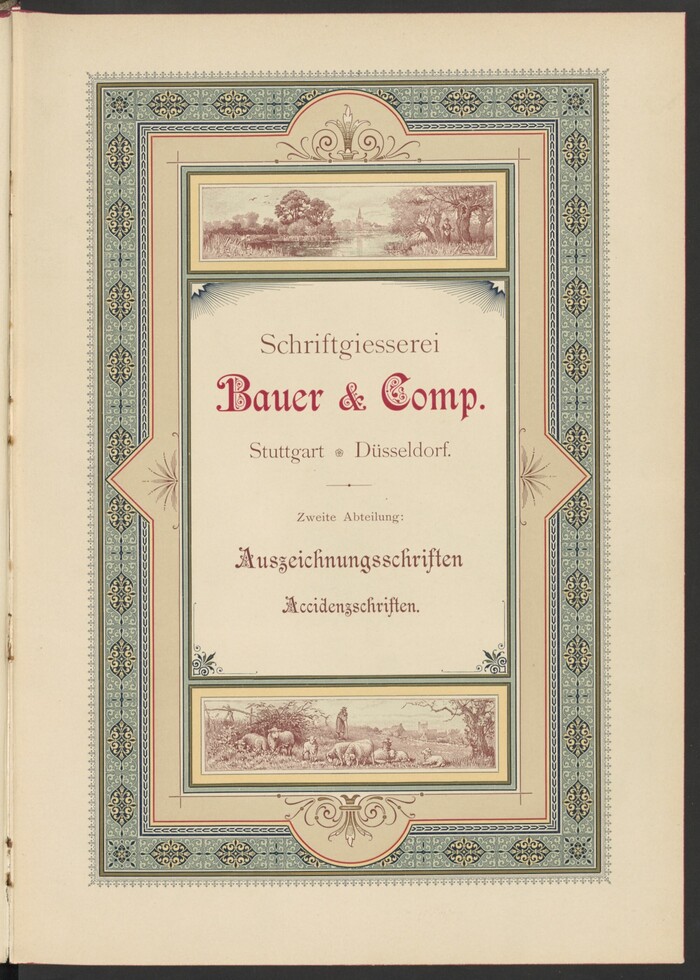
Title page of the second section with Auszeichnungsschriften (“typefaces for emphasis”, i.e, display type) and Accidenzschriften (“jobbing typefaces”), with more Mediäval-Antiqua and Preciosa
Source: berlin.museum-digital.de License: All Rights Reserved.
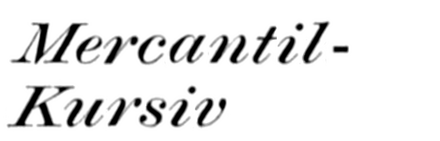
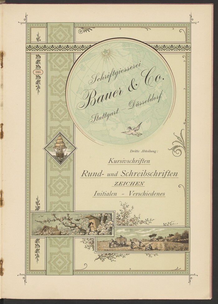
The third section comprises Kursivschriften (“italic typefaces”), Rund- und Schreibschriften (“typefaces for circulars and script typefaces”), Zeichen (“symbols”), Initialen (“initials”) and Verschiedenes (“misc.”). The featured typefaces include Triumph-Schreibschrift, Mediäval-Kursiv, and Mercantil-Kursiv.
Source: berlin.museum-digital.de License: All Rights Reserved.
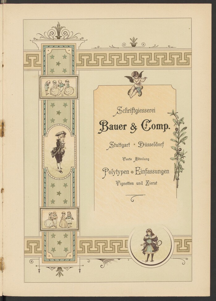
The fourth and final section deals with Polytypen (″polytypes”), Einfassungen (“borders”), Vignetten (“vignettes”) and Zierat (“ornaments”).
This post was originally published at Fonts In Use