Nessie

Photo: Gabriela Baka. License: All Rights Reserved.


Get a first look at the refreshed brand and website for Nessie Research Lab, a consulting firm specializing in lead management, sales training, and process optimization.
The redesign focuses on enhancing website usability and improving the clarity of the logo and communication materials. The updated logo features wider, bolder letters for better legibility and removes the circle for a cleaner look, establishing a stronger relationship between “Nessie” and “Research Lab.” This new logo is based on ABC Gravity by Dinamo, known for its modern, clean lines and versatility.
Our design approach balances readability and modernity. For longer texts, we've chosen TWK Lausanne 400 by Weltkern, a clear sans-serif font, complemented by Wulkan Headline Regular by Jan Estrada-Osmycki for headings. This pairing ensures both legibility and style.
Design by Gabriela Baka, with development by Krzysztof from Dannnk.
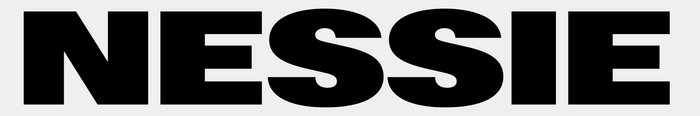
Photo: Gabriela Baka. License: All Rights Reserved.

Photo: Gabriela Baka. License: All Rights Reserved.

Photo: Gabriela Baka. License: All Rights Reserved.

Photo: Gabriela Baka. License: All Rights Reserved.

Photo: Gabriela Baka. License: All Rights Reserved.
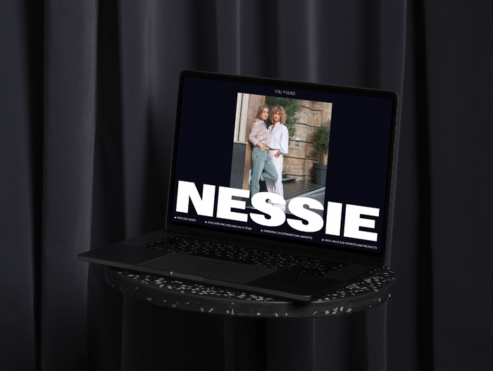
Photo: Gabriela Baka. License: All Rights Reserved.
This post was originally published at Fonts In Use