Neptune Lines

Specter Design Group. License: All Rights Reserved.


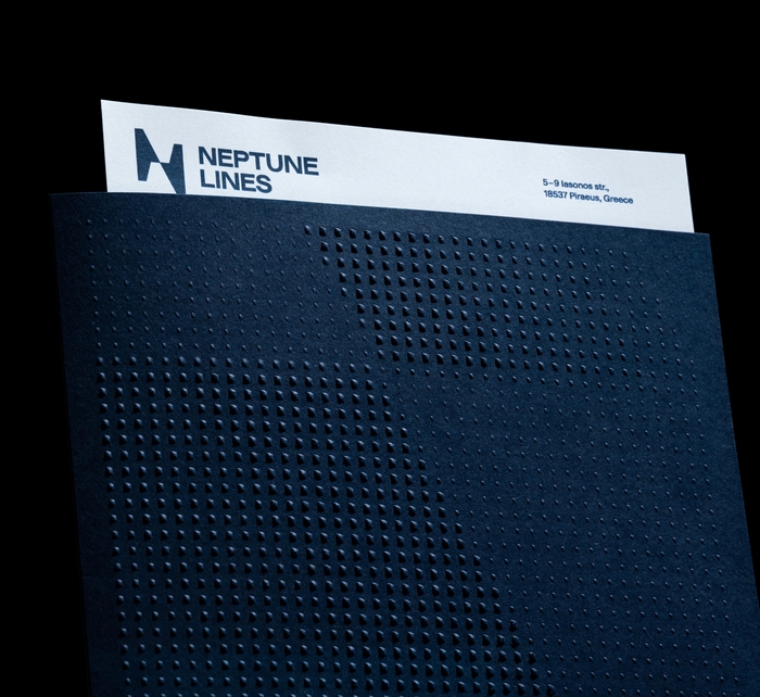
The new look of Neptune Lines had to respect its past and the legacy of the founder, but, above all, it had to respond to the contemporary challenges that a shipping company faces today.
Guided by this direction, Specter Design Group developed an original narrative that emphasizes Neptune’s differentiation from the competition in terms of technological advancement, employee safety, and ecological awareness. Three creative concepts lead to a common message: We always look forward to our destination, but we never forget what we leave behind.
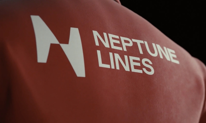
The logo uses a custom version of Rework from Sociotype Foundry. This choice has a visual connection to the large modern car manufacturers, who are the company’s primary customers. In the Neptune Lines identity, Rework is supported by Fatype’s Beausite Classic for all text.
Specter Design Group. License: All Rights Reserved.
Specter Design Group. License: All Rights Reserved.

Specter Design Group. License: All Rights Reserved.
Specter Design Group. License: All Rights Reserved.

Source: specter.gr Specter Design Group. License: All Rights Reserved.
Source: www.neptunelines.com License: All Rights Reserved.
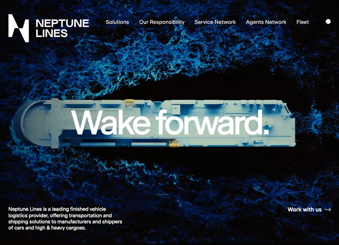
Homepage
Source: www.neptunelines.com License: All Rights Reserved.
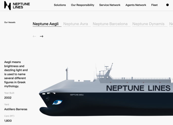
Fleet page on the website
This post was originally published at Fonts In Use