Museum H’ART
Published May 22, 2026
By FontsInUse
Contributed by Lucas Le Bihan
Source: studioberryslok.nl Studio Berry Slok. License: All Rights Reserved.


Source: www.instagram.com Studio Berry Slok. License: All Rights Reserved.
Source: www.hartmuseum.nl H’ART Museum. License: All Rights Reserved.
Source: www.hartmuseum.nl H’ART Museum. License: All Rights Reserved.
Source: studioberryslok.nl Studio Berry Slok. License: All Rights Reserved.
Source: studioberryslok.nl Studio Berry Slok. License: All Rights Reserved.
Source: studioberryslok.nl Studio Berry Slok. License: All Rights Reserved.
This post was originally published at Fonts In Use
Source: studioberryslok.nl Studio Berry Slok. License: All Rights Reserved.
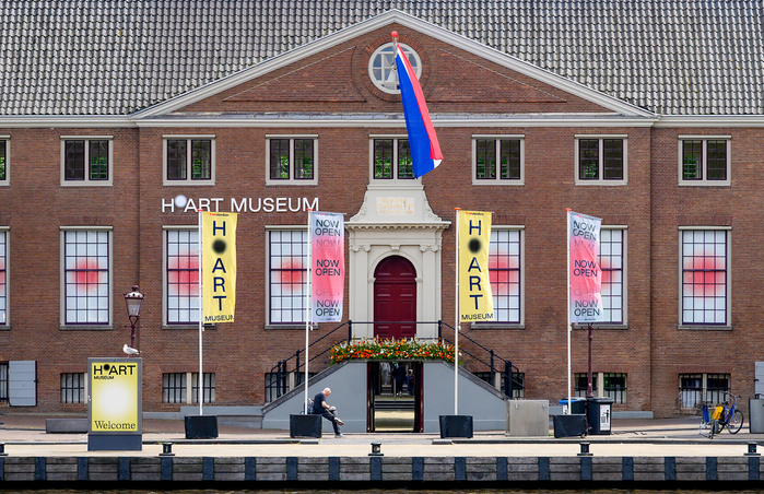
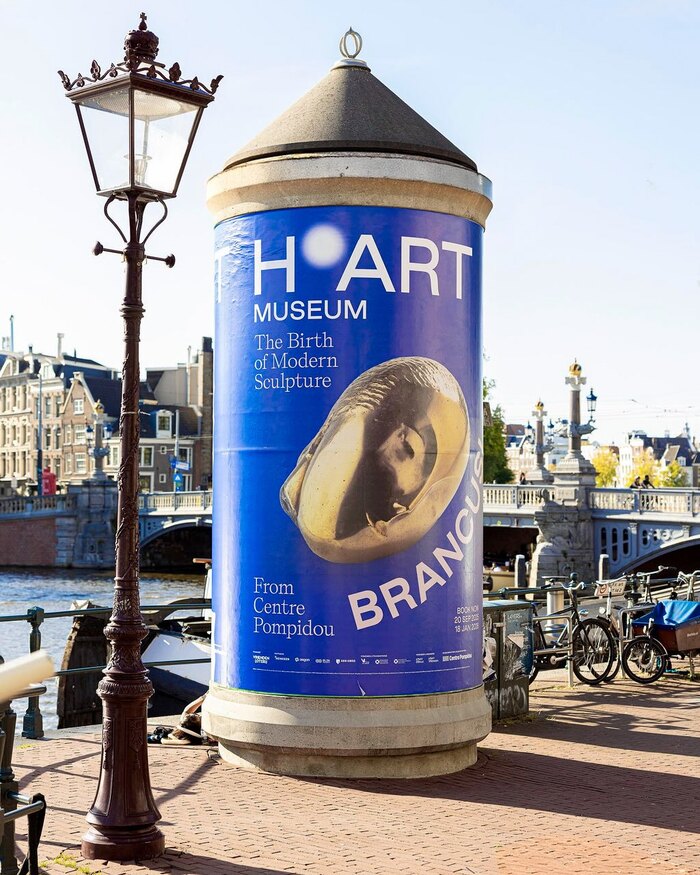
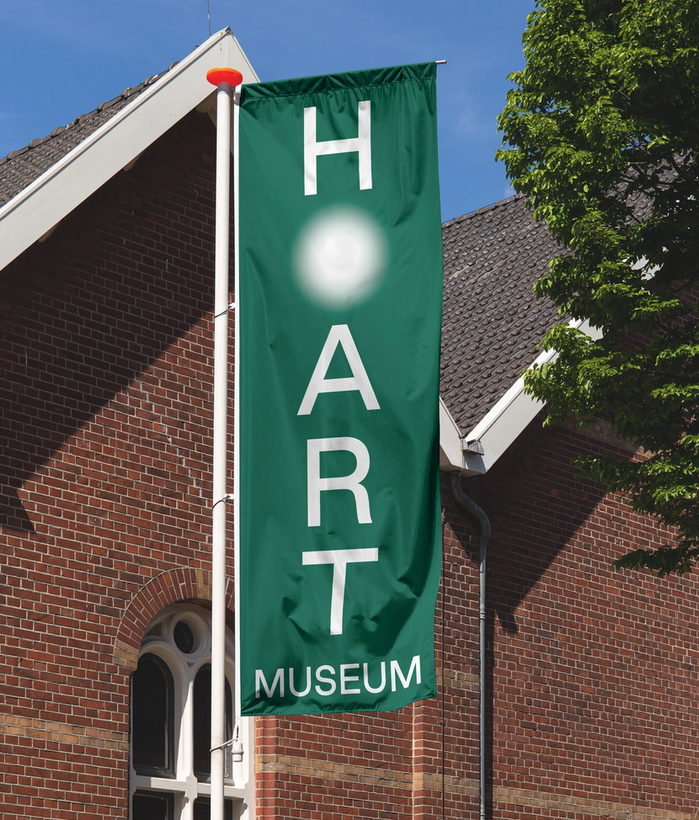
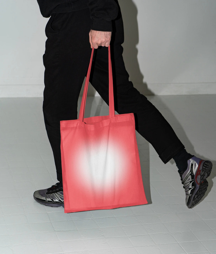
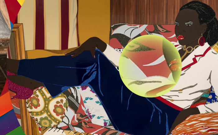
The new branding for Museum H’ART (formerly the Hermitage Amsterdam), designed by Studio Berry Slok, features Good Sans by Good Type Foundry and Self Modern by Bretagne. The identity draws around a blurred circle used as a symbol, for animation transitions, backgrounds, etc.
Source: www.instagram.com Studio Berry Slok. License: All Rights Reserved.
Source: www.hartmuseum.nl H’ART Museum. License: All Rights Reserved.
Source: www.hartmuseum.nl H’ART Museum. License: All Rights Reserved.
Source: studioberryslok.nl Studio Berry Slok. License: All Rights Reserved.
Source: studioberryslok.nl Studio Berry Slok. License: All Rights Reserved.
Source: studioberryslok.nl Studio Berry Slok. License: All Rights Reserved.
This post was originally published at Fonts In Use
Read full story.
WRITTEN BY
FontsInUse
An independent archive of typography.