Museum Bezau
Source: www.super-bfg.com Super Büro für Gestaltung. License: All Rights Reserved.


Design between yesterday and tomorrow – branding for the Museum Bezau.
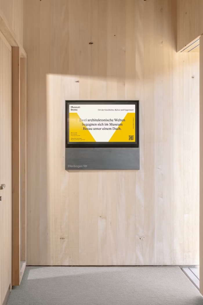
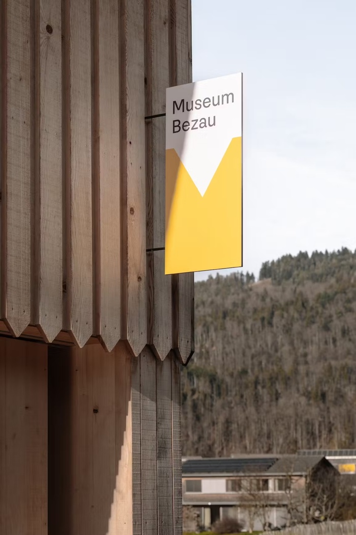
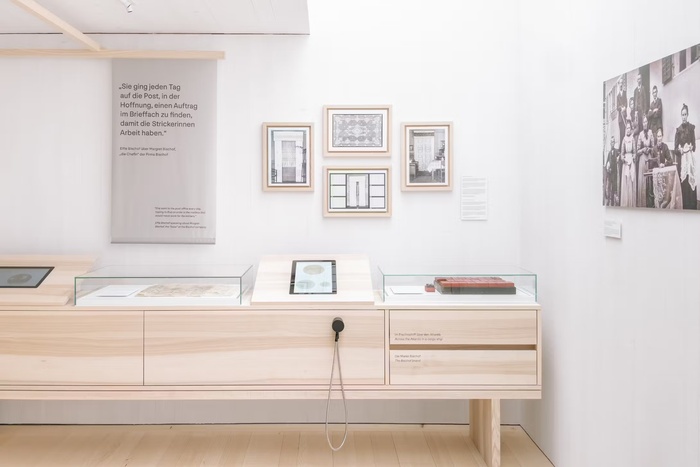
A new chapter for an old building: the former Bezau Local History Museum has been completely redesigned, both architecturally and in terms of content. Past and present now meet in the historic Bregenzerwald farmhouse dating from 1555. A modern extension, designed by Innauer Matt Architects, complements the listed building with great sensitivity. A bridge to the present day has also been built in terms of communication.
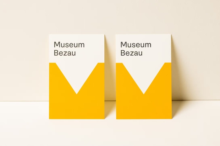
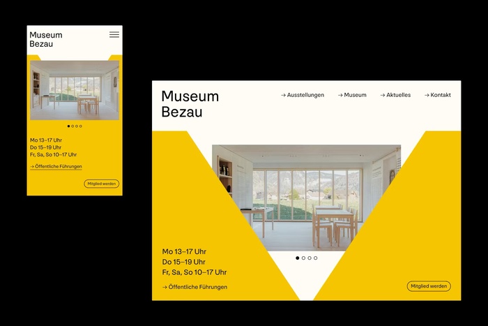
Super BfG worked closely with the Bezau Museum Association to develop the new name, image and all communication materials for the museum. The new look is not a loud break with the past, but a quiet opening – respectful of history, but with a clear view to the future. The design picks up on the architectural language: sections, corners and curves of the new wooden façade become a graphic principle. The lettering remains functional and calm – carried by two typographic voices that combine history and modernity. GT Alpina adds narrative depth, while the neutral NN Nouvelle Grotesk lends clarity and simplicity to the overall picture.
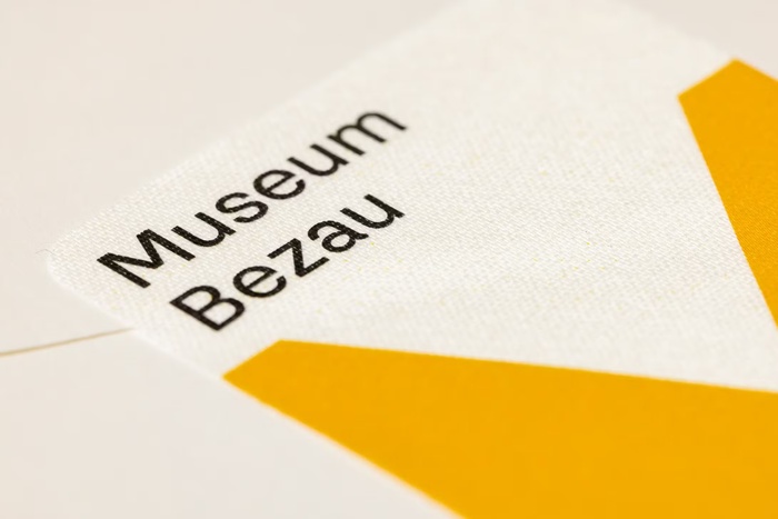
A special shade of yellow is at the heart of the colour scheme – symbolising the dawn of a new era. Combined with natural tones such as wood, milk and honey, it creates a visual connection between built space and creative expression. The striking recess in the letter M becomes a recurring element: as a support, frame and point of orientation.
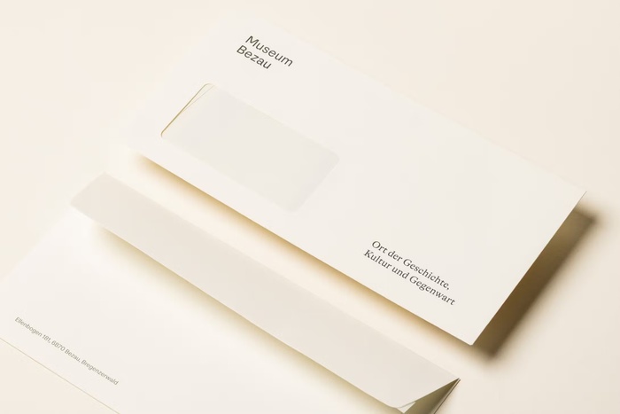
The branding has been consistently applied to a wide variety of media – from folders, postcards and envelopes to exhibition sliders, stickers and tea packaging. The new website rounds off the project digitally: it not only makes the stories of the Bregenzerwald visible, but also brings them to life.

Source: www.super-bfg.com Super Büro für Gestaltung. License: All Rights Reserved.
Source: www.super-bfg.com Super Büro für Gestaltung. License: All Rights Reserved.

Source: www.super-bfg.com Super Büro für Gestaltung. License: All Rights Reserved.
Source: www.super-bfg.com Super Büro für Gestaltung. License: All Rights Reserved.
Source: www.super-bfg.com Super Büro für Gestaltung. License: All Rights Reserved.
Source: www.super-bfg.com Super Büro für Gestaltung. License: All Rights Reserved.
Source: www.super-bfg.com Super Büro für Gestaltung. License: All Rights Reserved.
Source: www.super-bfg.com Super Büro für Gestaltung. License: All Rights Reserved.
This post was originally published at Fonts In Use