Mucky Duck branding and website
Published May 24, 2024
By FontsInUse
Contributed by Mark Butchko
Traction. License: All Rights Reserved.


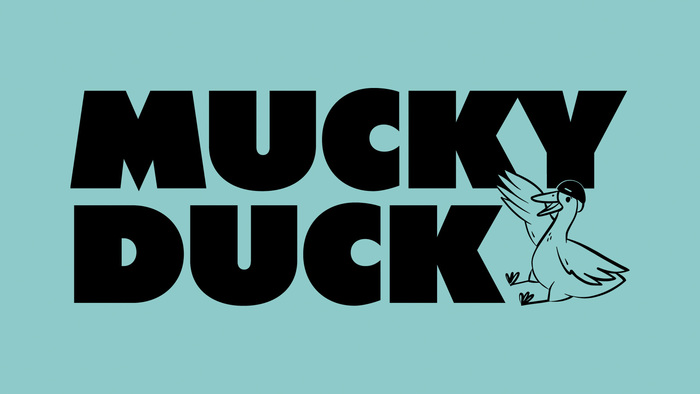
Photo: Mark Butchko. Traction. License: All Rights Reserved.
Source: tractionbrands.com Traction. License: All Rights Reserved.
Source: tractionbrands.com Traction. License: All Rights Reserved.
Source: tractionbrands.com Traction. License: All Rights Reserved.
Source: tractionbrands.com Traction. License: All Rights Reserved.
Source: tractionbrands.com Traction. License: All Rights Reserved.
Traction. License: All Rights Reserved.
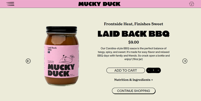
Source: morethanmustard.com Traction. License: All Rights Reserved.
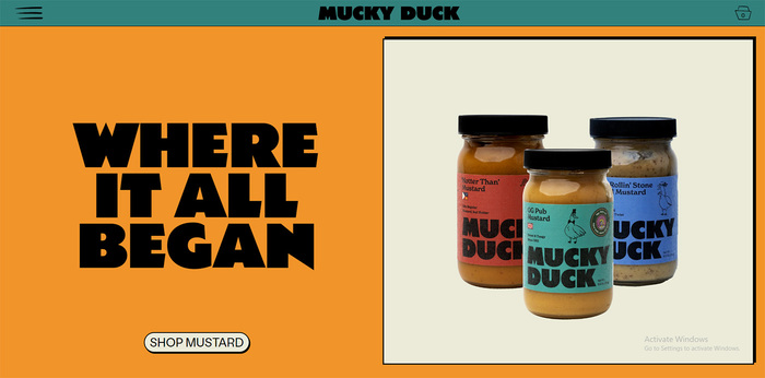
Source: morethanmustard.com Traction. License: All Rights Reserved.
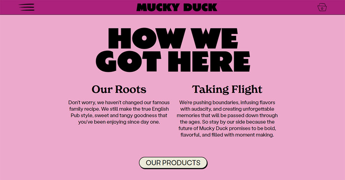
Source: morethanmustard.com Traction. License: All Rights Reserved.
This post was originally published at Fonts In Use

Traction. License: All Rights Reserved.


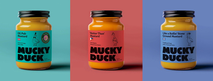
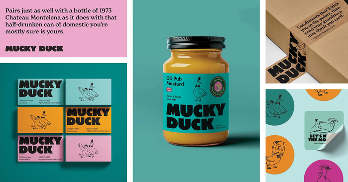
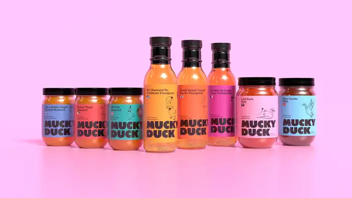
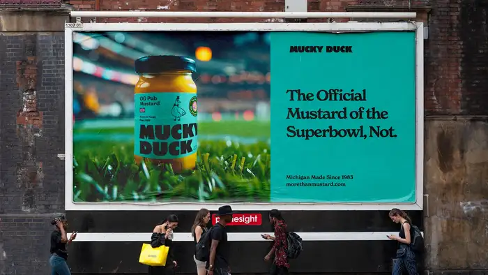
Mucky Duck is a Michigan based mustard brand that's been around for over 40 years. Though once available in 500 stores across 15 states, its distribution and availability had slowly waned. In an effort to breath new life into the brand, Traction was enlisted to completely overhaul the visual identity.
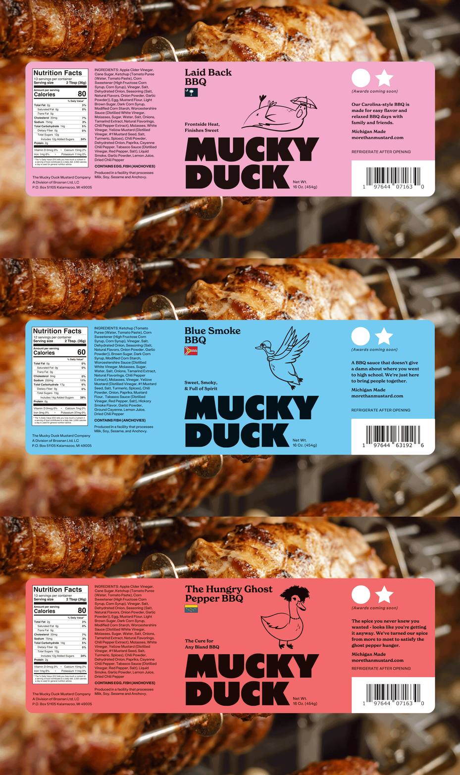
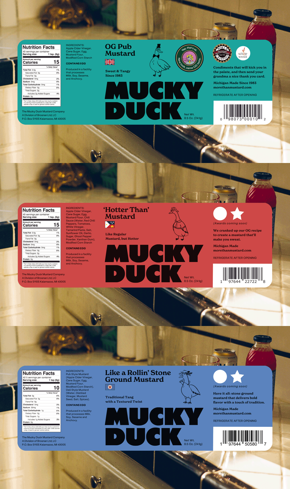
The Mucky Duck's logotype is set in a slightly modified version of Central Type's Zonk. The terminals of the C’s have been sheared vertically in order to create an more uniform space between C and K. The brand's headlines use the standard, unmodified Zonk Regular.
The secondary type is New Spirit, which contrasts nicely with the extra-bold, sans serif headlines. Labil Grotesk is used for the website's body type.

Photo: Mark Butchko. Traction. License: All Rights Reserved.

Source: tractionbrands.com Traction. License: All Rights Reserved.

Source: tractionbrands.com Traction. License: All Rights Reserved.

Source: tractionbrands.com Traction. License: All Rights Reserved.

Source: tractionbrands.com Traction. License: All Rights Reserved.

Source: tractionbrands.com Traction. License: All Rights Reserved.

Traction. License: All Rights Reserved.

Source: morethanmustard.com Traction. License: All Rights Reserved.

Source: morethanmustard.com Traction. License: All Rights Reserved.

Source: morethanmustard.com Traction. License: All Rights Reserved.
This post was originally published at Fonts In Use
Read full story.
WRITTEN BY
FontsInUse
An independent archive of typography.