Chatsworth and the Devonshire Group identity
Source: www.pentagram.com Pentagram. License: All Rights Reserved.


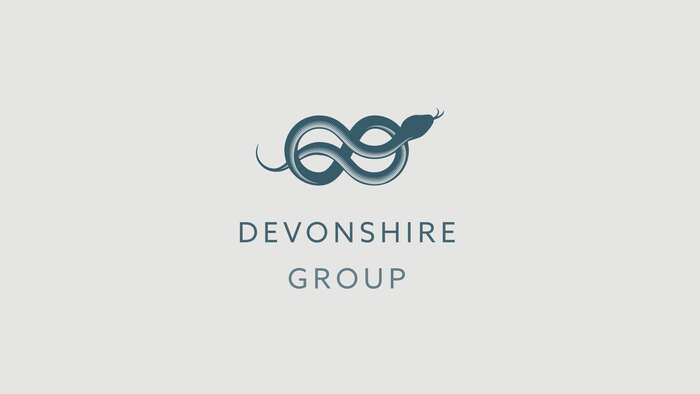
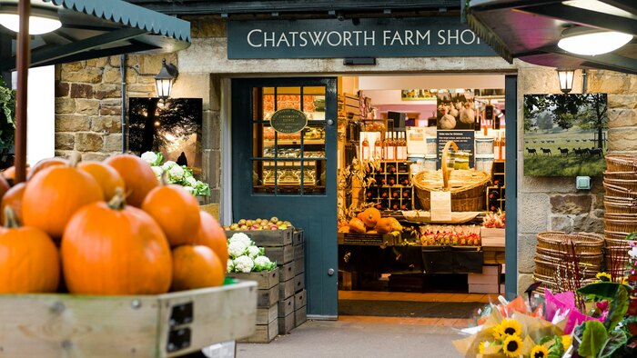
The Devonshire Group, comprising the Devonshire family’s charities, businesses, and estates, includes Chatsworth in Derbyshire, Bolton Abbey in North Yorkshire, and Lismore Estate in Ireland. It spans visitor services, retail, accommodation, property development, and sustainable forestry, employing over 1,400 people. Chatsworth, located in the Peak District, is a cultural destination hosting significant events and offering locally-made products. The group sought to refresh its brand to better reflect its cultural contributions and vision.
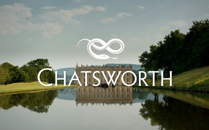
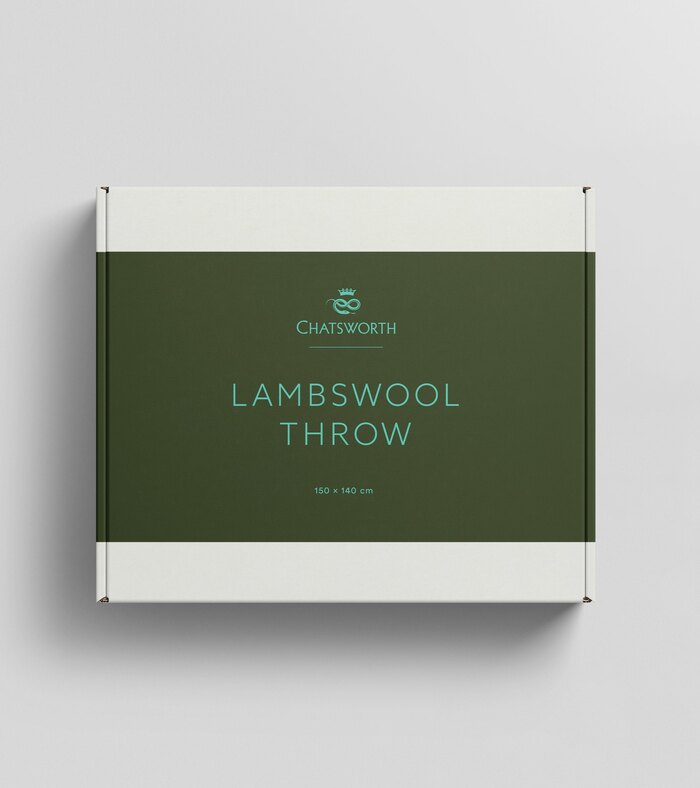
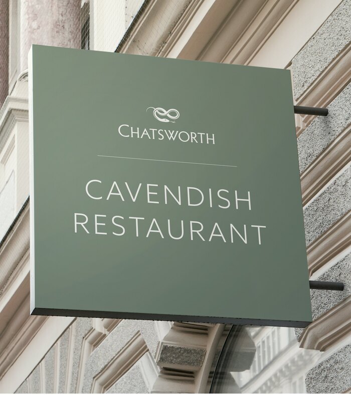
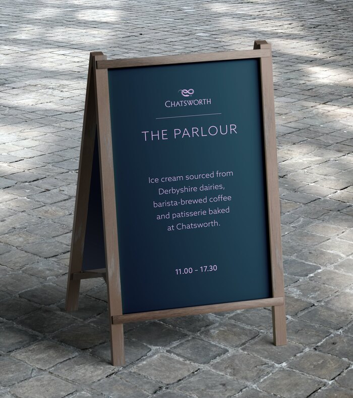
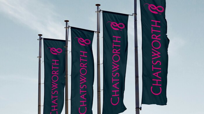
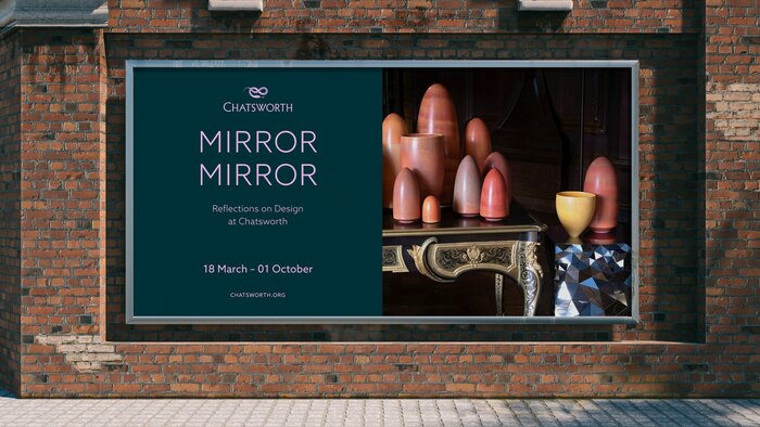
Pentagram developed Chatsworth’s new brand identity centred around a hand-drawn serpent motif. “The serpent is a family emblem found consistently across its heraldry, and stone-carved serpents are found in abundance at Chatsworth, Bolton Abbey and Lismore. As a heraldic symbol, the serpent stands for stewardship and wisdom, renewal and growth.”
The primary typeface used is Azo Sans, chosen for its clean and legible qualities. The secondary typeface is URW Baskerville, alongside Roboto Condensed as an additional typeface (not shown here).
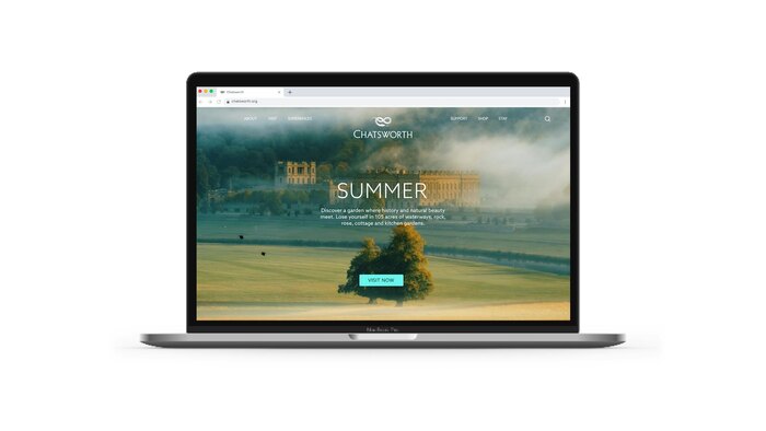
The Chatsworth wordmark is based on Albertus, with modifications.
Source: www.pentagram.com Pentagram. License: All Rights Reserved.
Source: www.pentagram.com Pentagram. License: All Rights Reserved.
Source: www.pentagram.com Pentagram. License: All Rights Reserved.
Source: www.pentagram.com Pentagram. License: All Rights Reserved.
Source: www.pentagram.com Pentagram. License: All Rights Reserved.
Source: www.pentagram.com Pentagram. License: All Rights Reserved.
Source: www.pentagram.com Pentagram. License: All Rights Reserved.
Source: www.pentagram.com Pentagram. License: All Rights Reserved.
This post was originally published at Fonts In Use