Mr. Papa

Studio Tempo. License: All Rights Reserved.


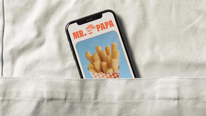
Mr. Papa, a fast food restaurant located in Lima, Peru, is the place where you find the perfect balance between delicious potatoes and culinary innovation. With a typically Peruvian flavor, Mr. Papa stands out for its sustainable approach, offering maximum flavor with minimal environmental impact.
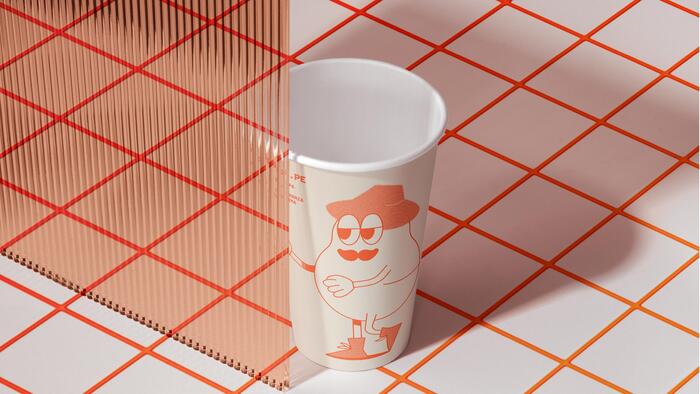
To reflect this joyful and sustainable essence, we created a fun and vibrant visual identity, using colorful illustrations and a careful combination of typefaces that bring rhythm and dynamism to the compositions. For the logo, we chose the Okkult typeface family from Good Type Foundry. Despite its roots in the seventies with influences from horror films, it has monumental characteristics that bring expressiveness and a bold touch to the brand, creating a striking contrast with the playful illustrations.
For titles and headlines, we opted for ABC Marfa Mono Black from Dinamo. This monospaced font creates interesting text blocks in larger sizes, adding a vernacular air that perfectly combines with the other graphic elements. Marfa Black Mono enriches the visual identity with modernity and originality.

Studio Tempo. License: All Rights Reserved.
Studio Tempo. License: All Rights Reserved.

Studio Tempo. License: All Rights Reserved.
Studio Tempo. License: All Rights Reserved.

Studio Tempo. License: All Rights Reserved.

Studio Tempo. License: All Rights Reserved.
This post was originally published at Fonts In Use