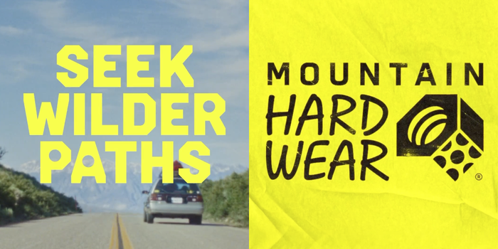
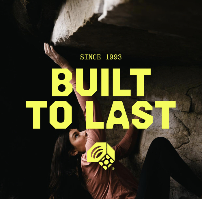
Mountain Hardwear rebrand and “Seek Wilder Paths” campaign
Source: www.instagram.com Mountain Hardwear. License: All Rights Reserved.


From Outdoor Retailer:
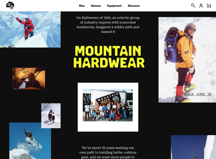
After three decades in business and in the mountains, Mountain Hardwear, leader in performance equipment and apparel for climbers, mountaineers and outdoor athletes, introduces a brand evolution centered around its purpose: Seek Wilder Paths. Kicking off the rebrand is a campaign of the same namesake, defining Mountain Hardwear’s wild and wise identity, rooted in the brand it has always been with updates to the logo, brand colors, and brand expression that speak to their progression and innovation in the ever evolving industry.
Montain Hardwear’s new identity was developed at Gretel. Together with Andrea Trabucco-Campos and Fabiola Mejía of Supercontinente, they developed a custom typeface series named Hardwear that “combines the rugged precision of technical engineering with the comforting confidence one feels when geared up in Mountain Hardwear.” It comes in four flavors: Display, Round, Round+Sharp, and Sharp, each in five weights. One source of inspiration was a wood typeface shown in a French specimen by H.W. Caslon & Cie as Nº 205, which is a version of Ancient Gothic.
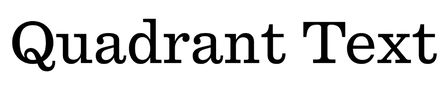
According to Gretel, “the supporting Quadrant Text and Mono are subtle references to maps and topographic notations, adding an important typographic texture that contrasts the boldness of Hardwear.”
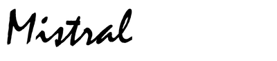
The logo combines the word “Mountain” typeset in the new custom typeface, paired with “Hardwear” in custom script caps based on Roger Excoffon’s Mistral, which were made simpler and more consistent in weight and proportion.
See the full case study on Gretel’s website.
Source: gretelny.com Gretel. License: All Rights Reserved.

Source: gretelny.com Gretel. License: All Rights Reserved.
Source: gretelny.com Gretel. License: All Rights Reserved.
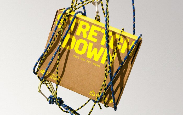
Packaging
Source: gretelny.com Gretel. License: All Rights Reserved.
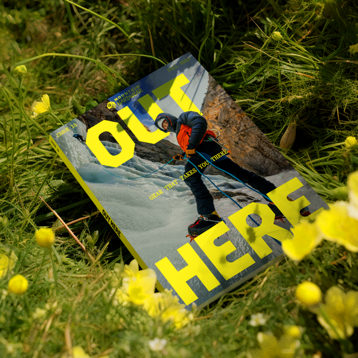
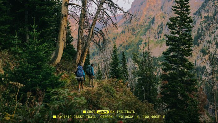
Out Here product catalog
Source: gretelny.com Gretel. License: All Rights Reserved.
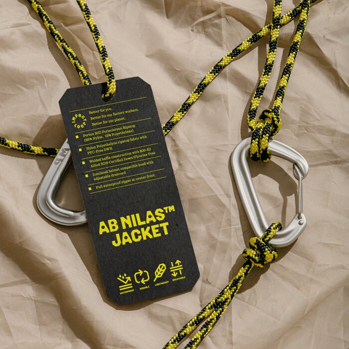
Label ft. Quadrant Text
Source: gretelny.com Gretel. License: All Rights Reserved.
Caption ft. Quadrant Text Mono
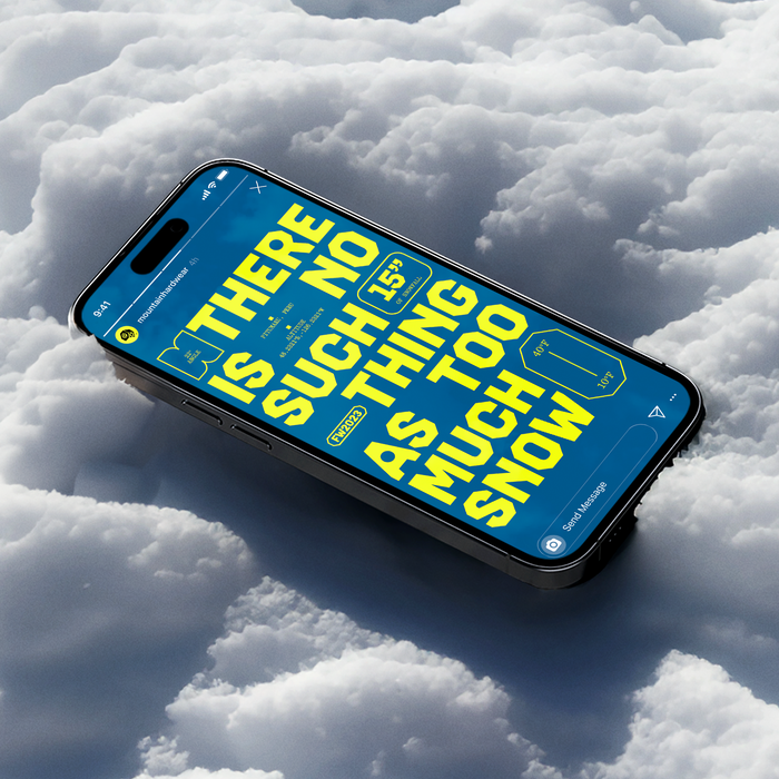
Source: gretelny.com Gretel. License: All Rights Reserved.
Source: gretelny.com Gretel. License: All Rights Reserved.
Source: gretelny.com Gretel. License: All Rights Reserved.
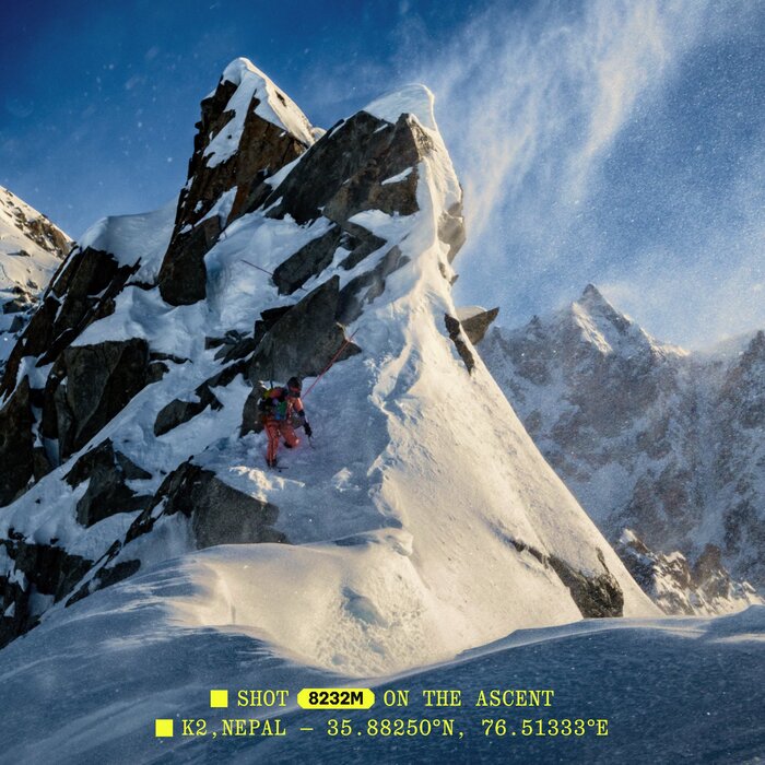
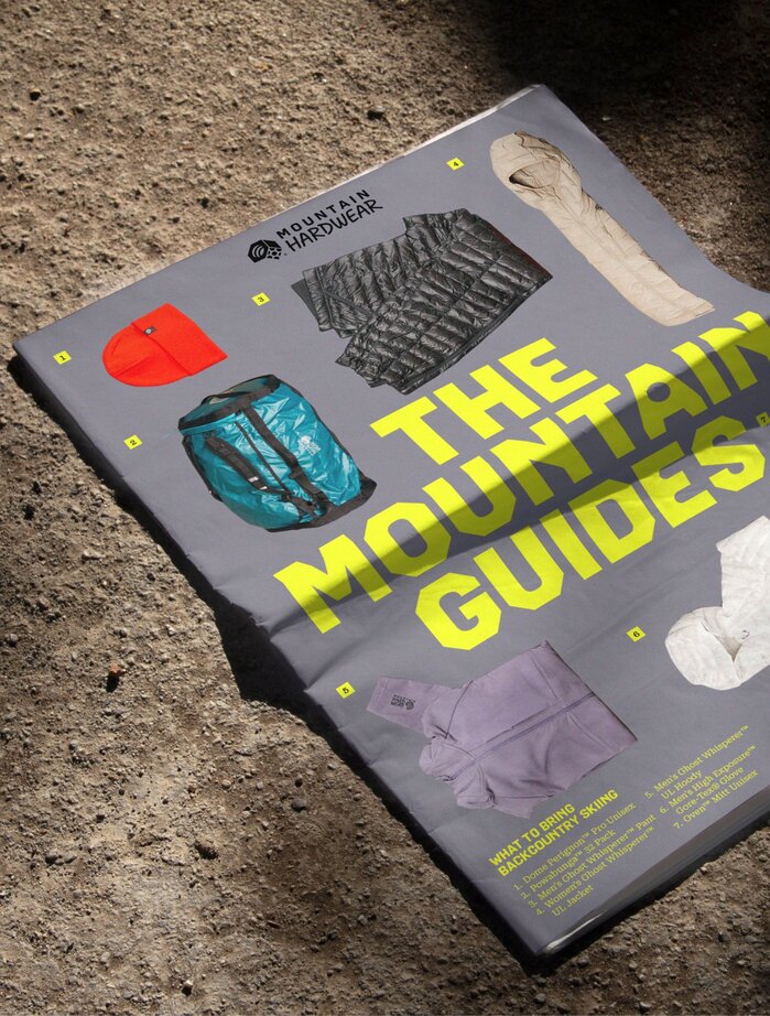
The Mountain Guides product brochure
Source: www.mountainhardwear.com Mountain Hardwear. License: All Rights Reserved.
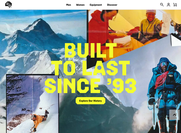
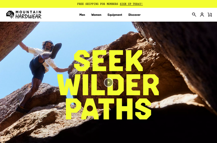
Homepage detail with Hardwear Display Extra Bold for the headline and Hardwear Round+Sharp Bold for the menu
Source: www.mountainhardwear.com Mountain Hardwear. License: All Rights Reserved.
Text on the website is rendered in Roboto Serif.
Source: www.mountainhardwear.com Mountain Hardwear. License: All Rights Reserved.
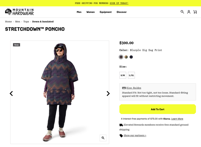
Product page
Source: www.mountainhardwear.com Mountain Hardwear. License: All Rights Reserved.
Campaign landing page with all-caps Quadrant Text Mono at the very top
This post was originally published at Fonts In Use