Felice Varini: Zwölf Punkte für sechs Geraden
Published October 5, 2023
By FontsInUse
Contributed by TYPE.WELTKERN®
Source: studiotillackknoell.com © Studio Tillack Knöll. License: All Rights Reserved.


Source: studiotillackknoell.com © Studio Tillack Knöll. License: All Rights Reserved.
Source: studiotillackknoell.com © Studio Tillack Knöll. License: All Rights Reserved.
Source: studiotillackknoell.com © Studio Tillack Knöll. License: All Rights Reserved.
Source: studiotillackknoell.com © Studio Tillack Knöll. License: All Rights Reserved.
Source: studiotillackknoell.com © Studio Tillack Knöll. License: All Rights Reserved.
Source: studiotillackknoell.com © Studio Tillack Knöll. License: All Rights Reserved.
Source: studiotillackknoell.com © Studio Tillack Knöll. License: All Rights Reserved.
Source: studiotillackknoell.com © Studio Tillack Knöll. License: All Rights Reserved.

Source: studiotillackknoell.com © Studio Tillack Knöll. License: All Rights Reserved.
Source: studiotillackknoell.com © Studio Tillack Knöll. License: All Rights Reserved.
Source: studiotillackknoell.com © Studio Tillack Knöll. License: All Rights Reserved.
This post was originally published at Fonts In Use
Source: studiotillackknoell.com © Studio Tillack Knöll. License: All Rights Reserved.
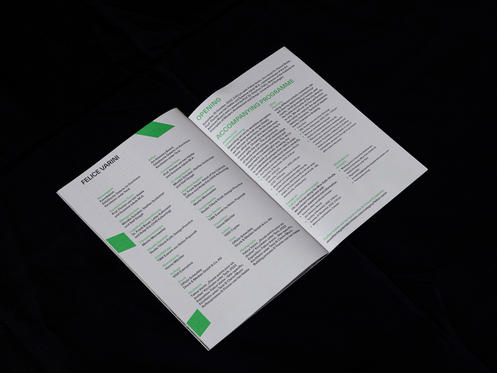
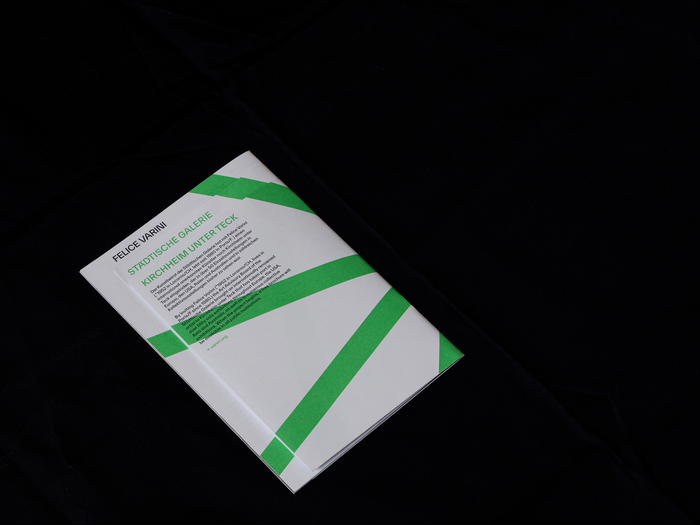
From Studio Tillack Knöll’s post:
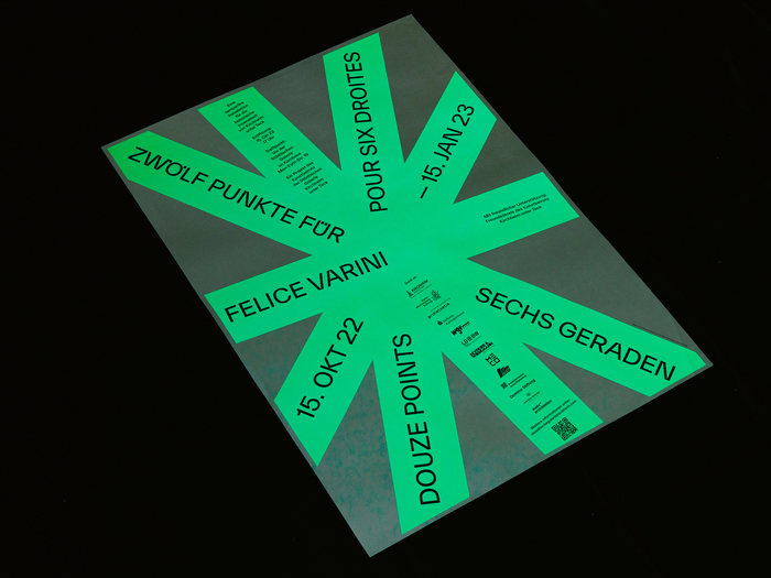
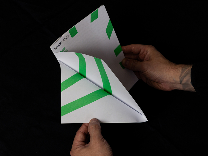
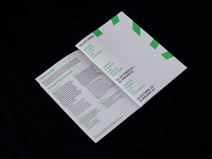
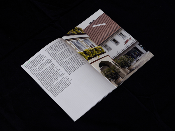
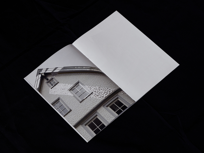
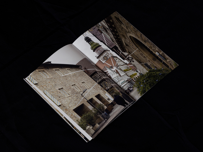
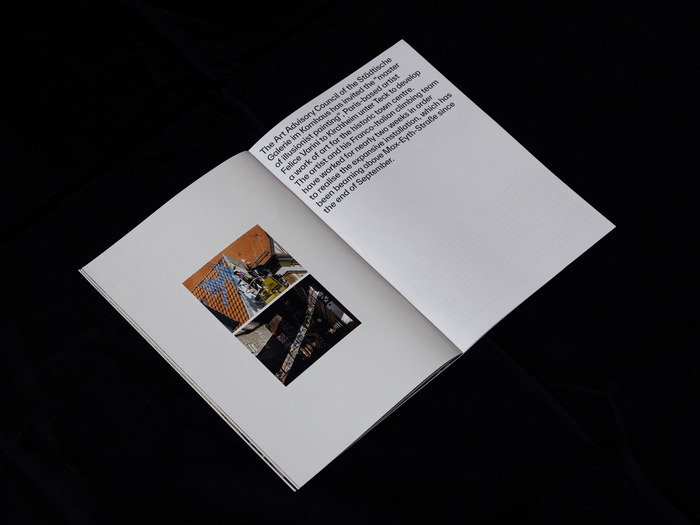
Small publication we’ve designed on the occasion of the Felice Varini’s opening at the Städtische Galerie Kirchheim [municipal gallery of Kirchheim]. Similar to Varini’s work the lines crossing the cover and the backcover are connected and visible from a special point of view, while continuing on the pages in between.
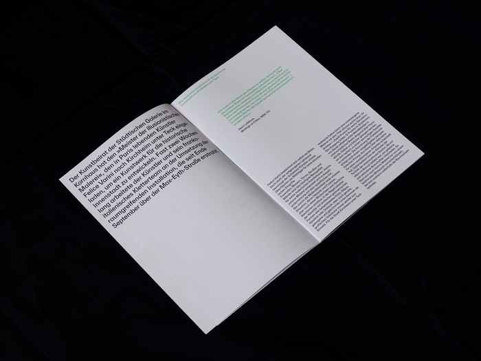
Graphic design by Sven Tillack, Steffen Knöll and Johannes Hucht from Studio Tillack Knöll using the TWK Everett typeface by Nolan Paparelli. Note the usage of the compact dieresis for the Ö and Ü on the German titles as well as the alternate G and single-storey a used throughout.
Source: studiotillackknoell.com © Studio Tillack Knöll. License: All Rights Reserved.
Source: studiotillackknoell.com © Studio Tillack Knöll. License: All Rights Reserved.
Source: studiotillackknoell.com © Studio Tillack Knöll. License: All Rights Reserved.
Source: studiotillackknoell.com © Studio Tillack Knöll. License: All Rights Reserved.
Source: studiotillackknoell.com © Studio Tillack Knöll. License: All Rights Reserved.
Source: studiotillackknoell.com © Studio Tillack Knöll. License: All Rights Reserved.
Source: studiotillackknoell.com © Studio Tillack Knöll. License: All Rights Reserved.
Source: studiotillackknoell.com © Studio Tillack Knöll. License: All Rights Reserved.
Source: studiotillackknoell.com © Studio Tillack Knöll. License: All Rights Reserved.
Source: studiotillackknoell.com © Studio Tillack Knöll. License: All Rights Reserved.
Source: studiotillackknoell.com © Studio Tillack Knöll. License: All Rights Reserved.
This post was originally published at Fonts In Use
Read full story.
WRITTEN BY
FontsInUse
An independent archive of typography.
More from FontsInUse