The Monthly

Source: www.mgiesser.com License: All Rights Reserved.


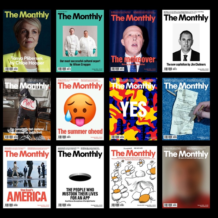
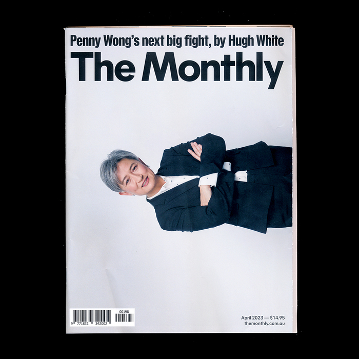
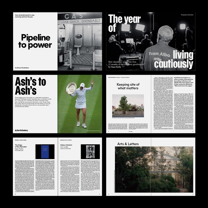
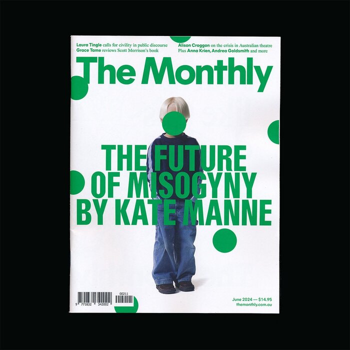
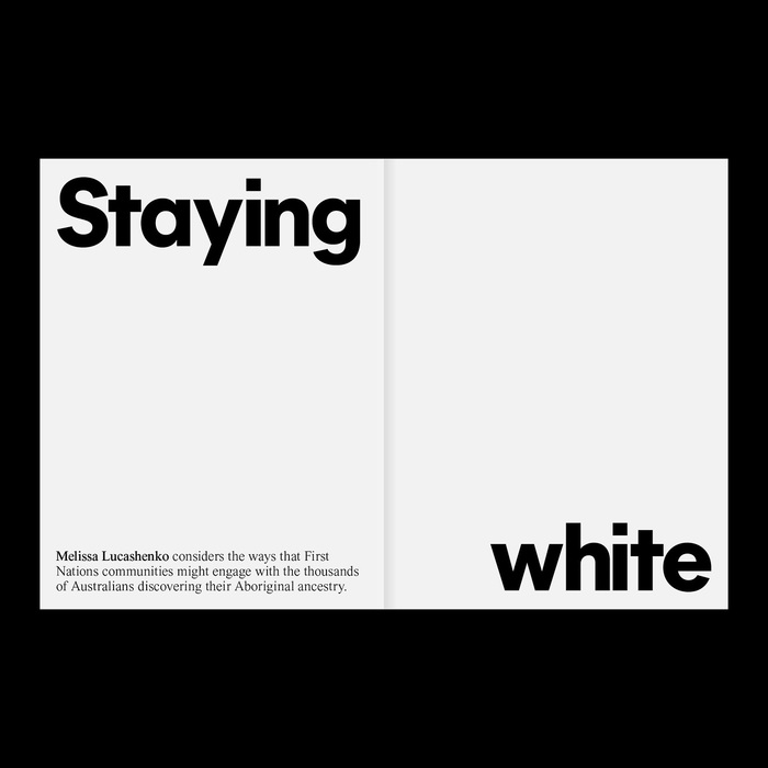
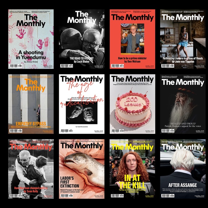
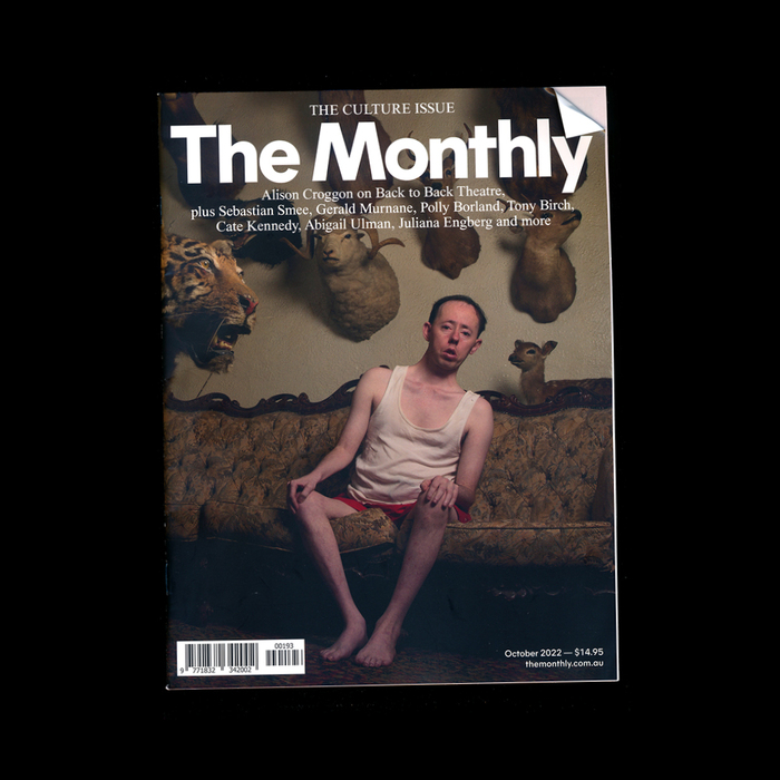
For three years and 31 issues, Melbourne-based designer M.Giesser shaped the visual identity of The Monthly, one of Australia’s leading political and cultural magazines. His redesign introduced a lighter, more inviting feel while preserving the magazine’s depth.
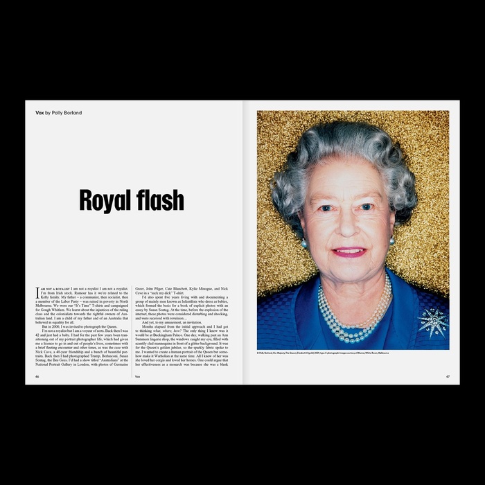
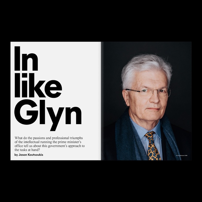
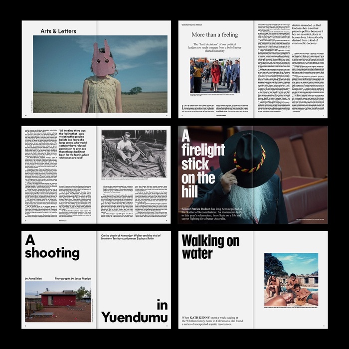
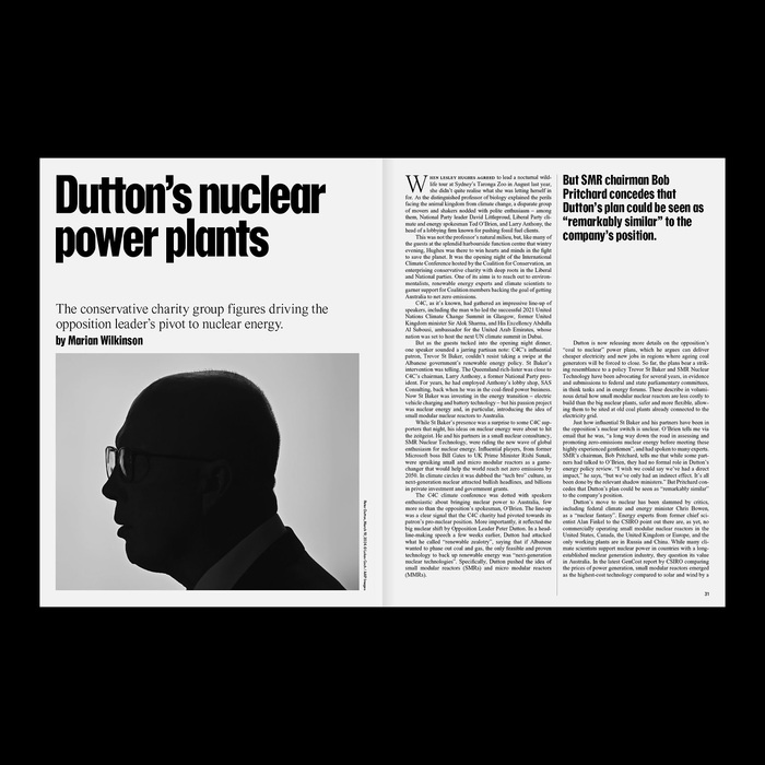
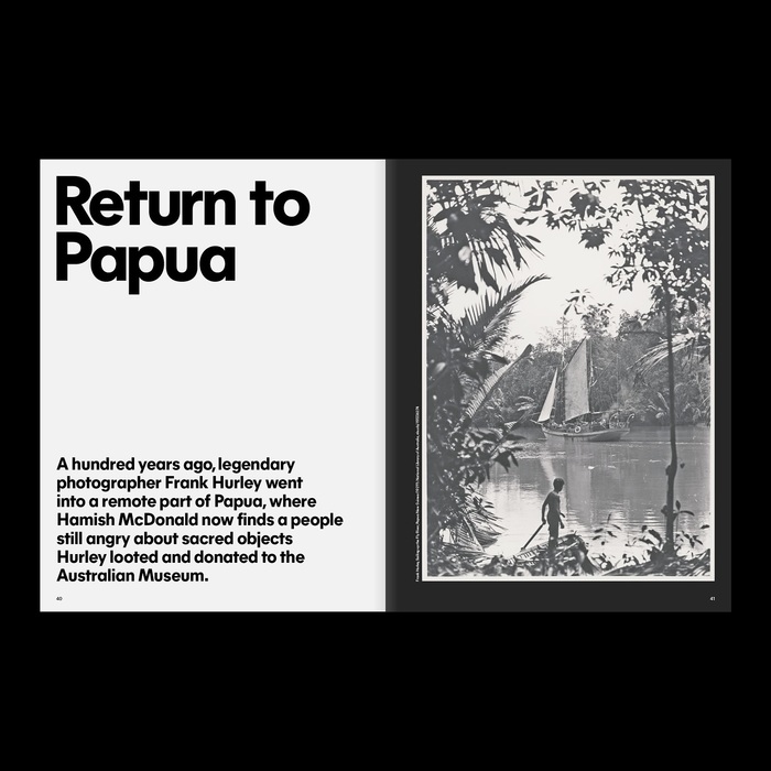
Giesser, known for a minimal and pragmatic design approach, reworked a publication he already admired. His goal was to create more space and contrast, making dense content more approachable without losing its intellectual rigor. With The Monthly’s feature essays often spanning 20,000 words, designing a layout that remained visually engaging was no small feat.
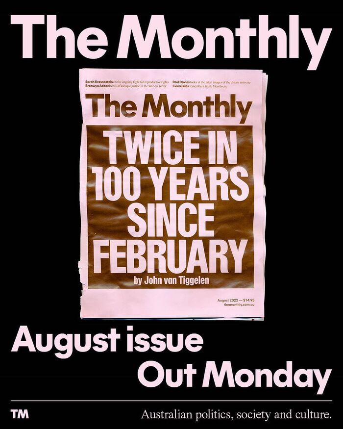
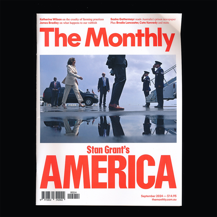
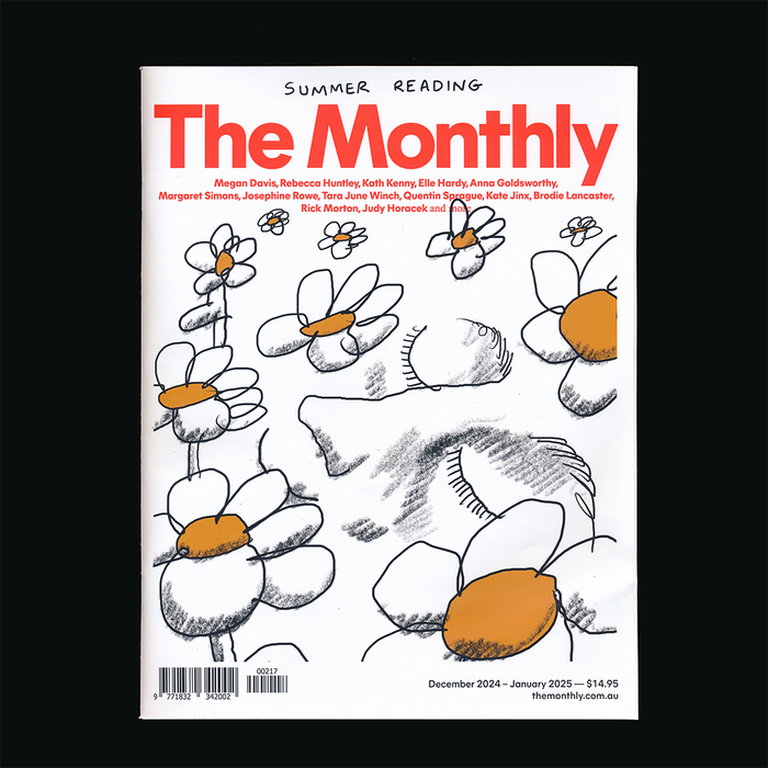
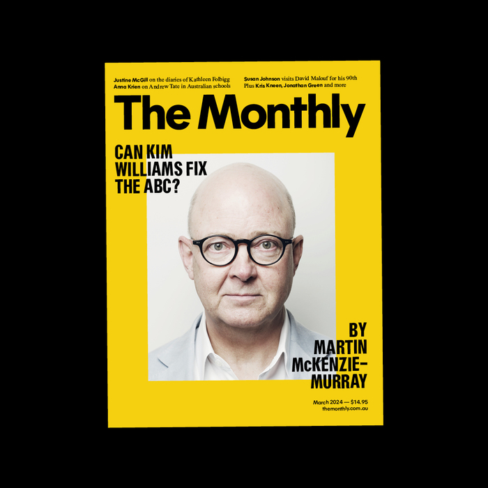
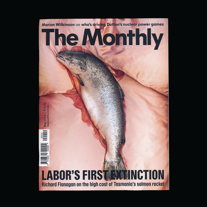
Typography played a central role in the redesign, with the magazine’s masthead set in Mier A by General Type Studio. Mier A and a custom version of Resial Condensed by Bureau Bernklau were the primary typefaces for most display and deck sizes, giving the publication a cohesive and contemporary look. The body text was set in JHA Times Now by Jan-Henrik Arnold, ensuring readability.
Unlike his past editorial projects, this redesign required a more adaptive approach, similar to The Monthly’s sibling publication, The Saturday Paper. The project also reshaped Giesser’s studio practice, introducing a recurring monthly deadline into his workflow. He initially struggled with scheduling but later found the routine provided a refreshing break from long-term branding projects. His philosophy – creating “simple and honest work” – was reflected in his approach, balancing refinement with accessibility:
Personally, I’m always more drawn to brands that feel unbranded and that possibly comes through in my work as well…
With the publication now transitioning to an in-house design team, Giesser’s work remains a testament to the impact of typography and layout in shaping the reading experience of a complex, text-heavy publication.

Source: www.mgiesser.com License: All Rights Reserved.
Source: www.mgiesser.com License: All Rights Reserved.
Source: www.mgiesser.com License: All Rights Reserved.

Source: www.mgiesser.com License: All Rights Reserved.
Source: www.mgiesser.com License: All Rights Reserved.
Source: www.mgiesser.com License: All Rights Reserved.
Source: www.mgiesser.com License: All Rights Reserved.
Source: www.mgiesser.com License: All Rights Reserved.
Source: www.mgiesser.com License: All Rights Reserved.
Source: www.mgiesser.com License: All Rights Reserved.
Source: www.mgiesser.com License: All Rights Reserved.
Source: www.mgiesser.com License: All Rights Reserved.

Source: www.mgiesser.com License: All Rights Reserved.
Source: www.mgiesser.com License: All Rights Reserved.

Source: www.mgiesser.com License: All Rights Reserved.
Source: www.mgiesser.com License: All Rights Reserved.
Source: www.mgiesser.com License: All Rights Reserved.
Source: www.mgiesser.com License: All Rights Reserved.
Source: www.mgiesser.com License: All Rights Reserved.
Source: www.mgiesser.com License: All Rights Reserved.
Source: www.mgiesser.com License: All Rights Reserved.
This post was originally published at Fonts In Use