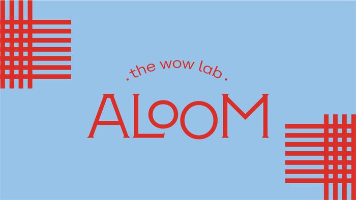
Aloom – the wow lab
License: All Rights Reserved.


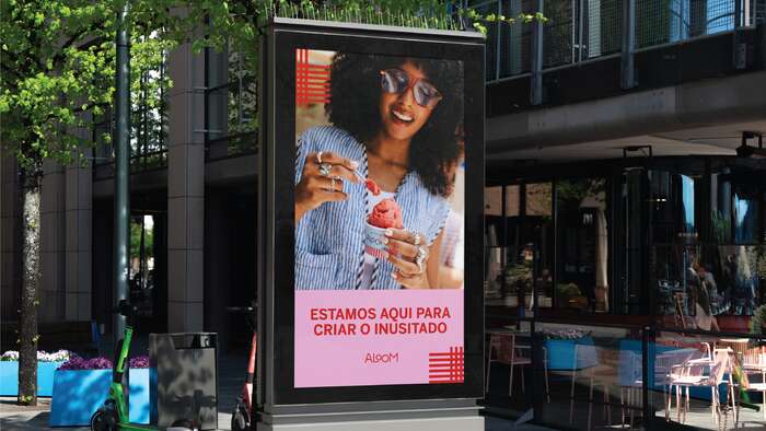
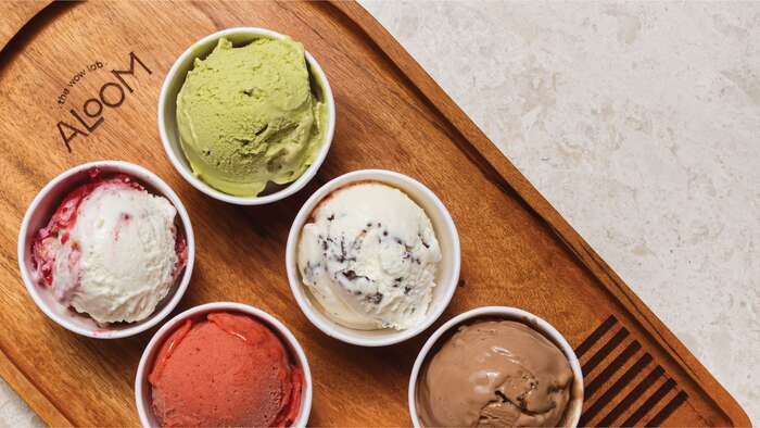
Aloom is a gastronomic lab based in Brasilia that aims to create the wow effect in every bite. As it offers a premium experience, the visual attributes were developed to express part of its impact.
To build a unique identity for the brand, we created a palette of vibrant colors and geometric forms that recall the shapes and textures of Aloom's desserts.
The visual identity was inspired by mid-century typography, with a mix of textures and colors, where form is as important as function. The use of fonts with different weights and styles is a modern take on retro that communicates the tradition of recipes in contrast to the innovative proposal offered by the brand.
To create a contrast of heights, Tipofili’s Montecatini is combined with Font Bureau’s Benton Sans. The former is a clean and elegant font that is versatile for subheadings and long texts, while the latter brings strength and prominence to titles and brand phrases.
License: All Rights Reserved.
License: All Rights Reserved.

License: All Rights Reserved.

License: All Rights Reserved.

License: All Rights Reserved.
This post was originally published at Fonts In Use