Moët Hennessy Paris office signage
Source: www.piufortuna.it ©piùfortuna & Barbarito Bancel architectes. License: All Rights Reserved.

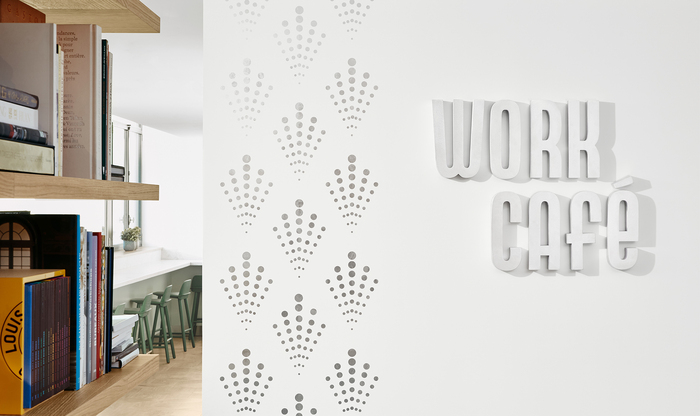
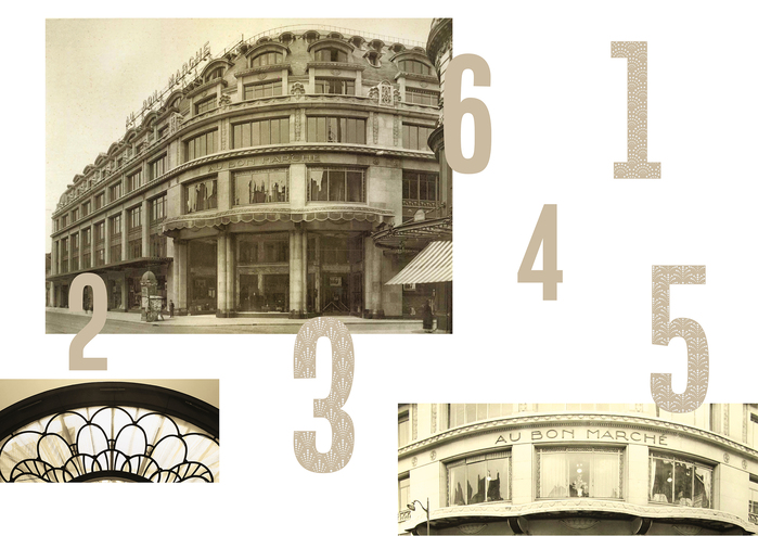
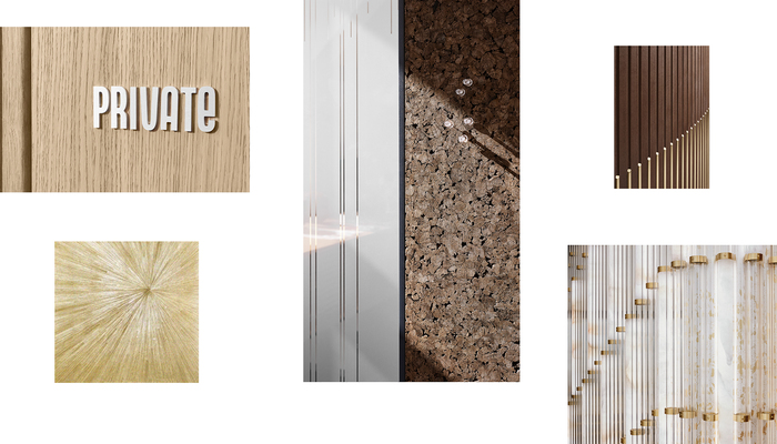
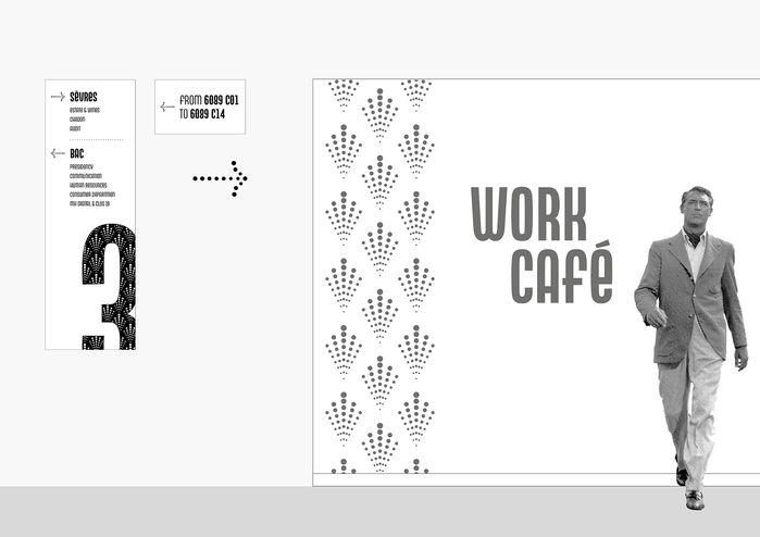
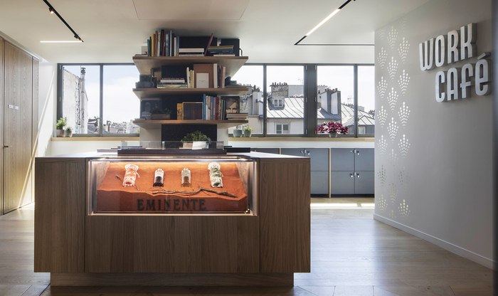
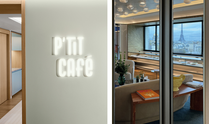
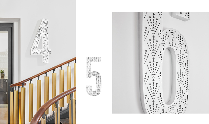
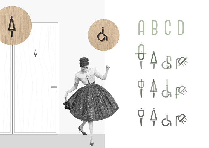
the LVMH group (Louis Vuitton Moët Hennessy) represents excellence in champagne, wines and spirits. The signage project for the new office building of Moët Hennessy in Paris is part of a larger project to design the group’s new workspaces. This additional language reflects the values of the House, enhances the Art Deco heritage of the site, and conceives a sustainable project that goes hand in hand with the architectural reflection for a cultural transformation of the company by proposing contemporary workspaces. BarbaritoBancel and +fortuna played with lightness using materials, shapes and languages to create a signage that guides and orients in a natural way, with its elegant presence.
The entire project uses Neon Nbl as font. It is a faithful digital redesign of the original geometric monocase sans designed by Giulio da Milano and released by Nebiolo in 1933–1934. This is a choice that perfectly reflect the Art Deco spirit of the building.
Source: www.piufortuna.it ©piùfortuna & Barbarito Bancel architectes. License: All Rights Reserved.
Source: www.piufortuna.it ©piùfortuna & Barbarito Bancel architectes. License: All Rights Reserved.
Source: www.piufortuna.it ©piùfortuna & Barbarito Bancel architectes. License: All Rights Reserved.
Source: www.piufortuna.it ©piùfortuna & Barbarito Bancel architectes. License: All Rights Reserved.
Source: www.piufortuna.it ©piùfortuna & Barbarito Bancel architectes. License: All Rights Reserved.
Source: www.piufortuna.it ©piùfortuna & Barbarito Bancel architectes. License: All Rights Reserved.
Source: www.piufortuna.it ©piùfortuna & Barbarito Bancel architectes. License: All Rights Reserved.
This post was originally published at Fonts In Use