Mirlo visual identity
Source: www.fairetype.com Faire Type. License: All Rights Reserved.
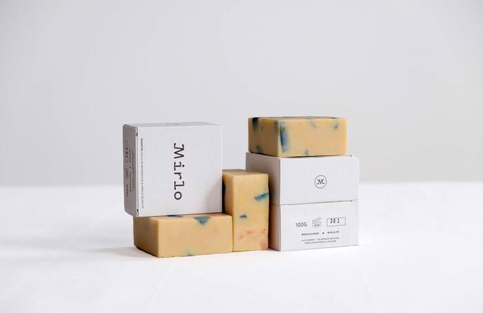
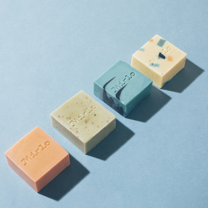
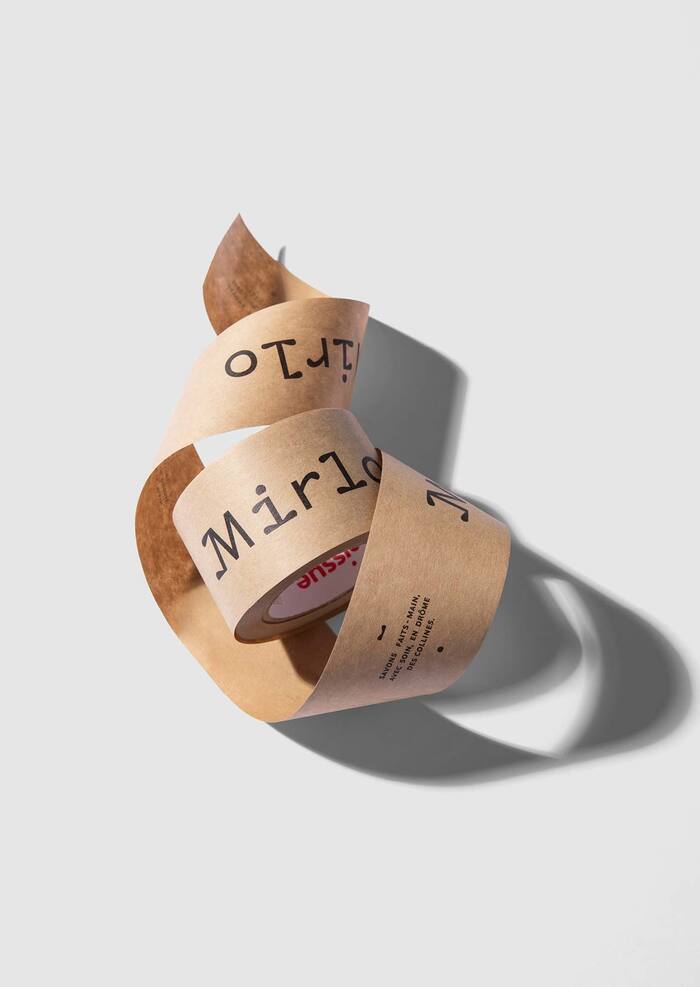
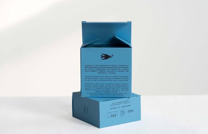
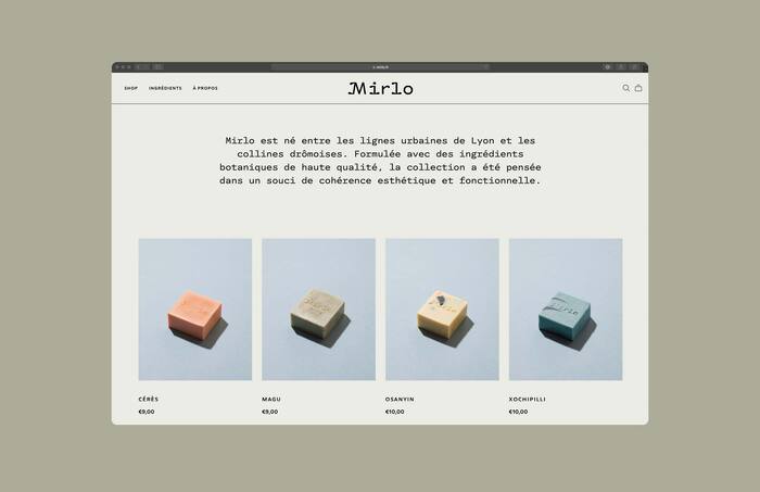
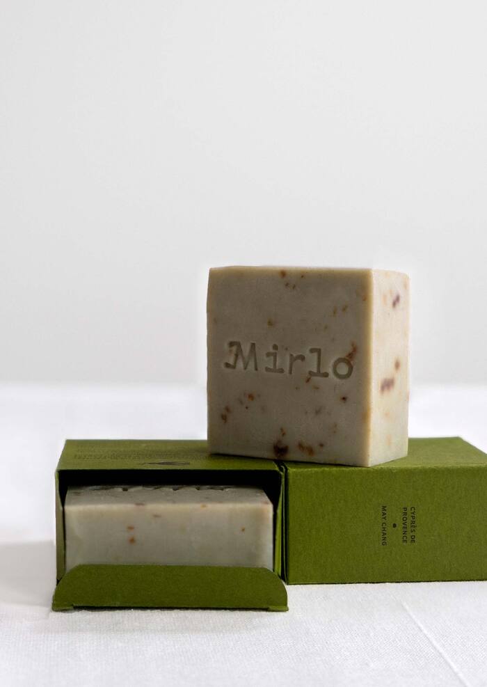
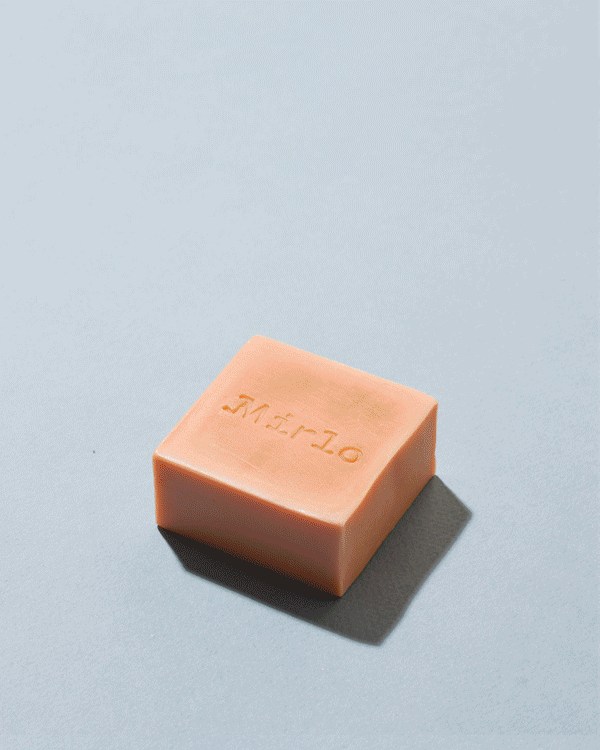
Branding, packaging and website design for Mirlo, a savonnerie based in Lyon, France. Making soap is a rigorous and traditional process in France,. The logo was designed to embody the seriousness of the process, but also feel playful with a light and floral quality. The characters of the logo, especially the i and the l, feel like they grew like plants out from their serifs. The color palette takes cues directly from the soap themselves. The website was designed to highlight the beauty of the soap while also showcasing the process and the high-quality ingredients. The typographic system features a custom cut of Luma for headlines and titles, and Palme in all caps for body copy.
Photography: Ghislain Mirat, Julie Darnat
Illustration: Carole Barraud

Source: www.fairetype.com Faire Type. License: All Rights Reserved.
Source: www.fairetype.com Ghislain Mirat. License: All Rights Reserved.
Source: www.fairetype.com Ghislain Mirat. License: All Rights Reserved.
Source: www.fairetype.com Faire Type. License: All Rights Reserved.

Source: www.fairetype.com Faire Type. License: All Rights Reserved.
Source: www.fairetype.com Faire Type. License: All Rights Reserved.
Source: www.fairetype.com Faire Type. License: All Rights Reserved.
Source: www.fairetype.com Ghislain Mirat. License: All Rights Reserved.
This post was originally published at Fonts In Use