Milton Wright – Friends and Buddies album art
Source: bid.omegaauctions.co.uk Omega Auctions. License: All Rights Reserved.


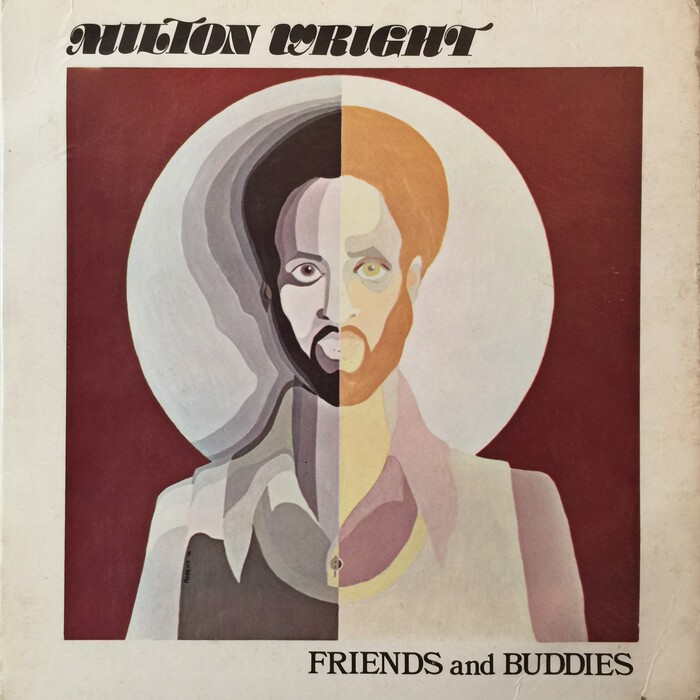
This use of Stilla caught my eye right away when I came across this record on Discogs. I first heard the track “Keep it Up” on the Strange Games and Things mix by DJ Spinna (credited there as Milton Wright Jr.), so I knew the song well, but I had never seen the original album until now. I noticed that the album designer made good use of both versions of the T in Stilla. The one used in “MILTON” dropped its ball terminal, nicely avoiding a collision with the ball terminal of the L, and the T used in “WRIGHT” is the default shape – with ball terminal – fitting nicely after the H.
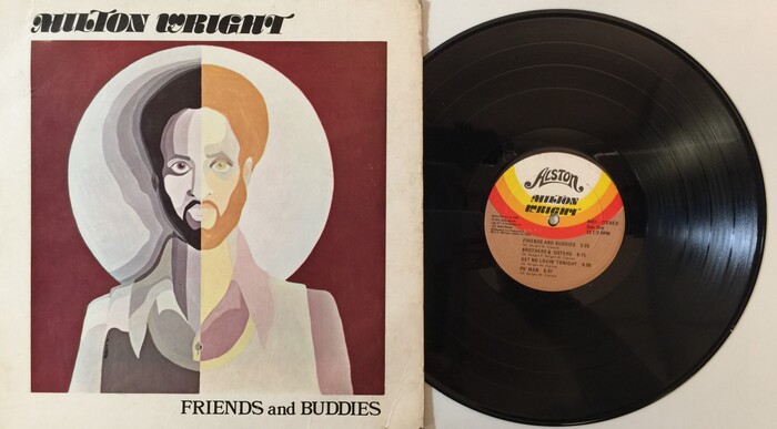
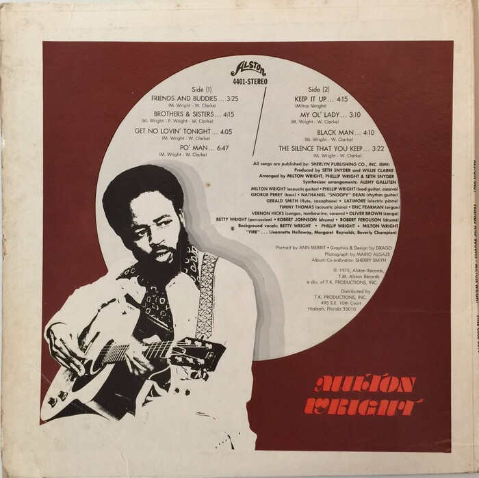
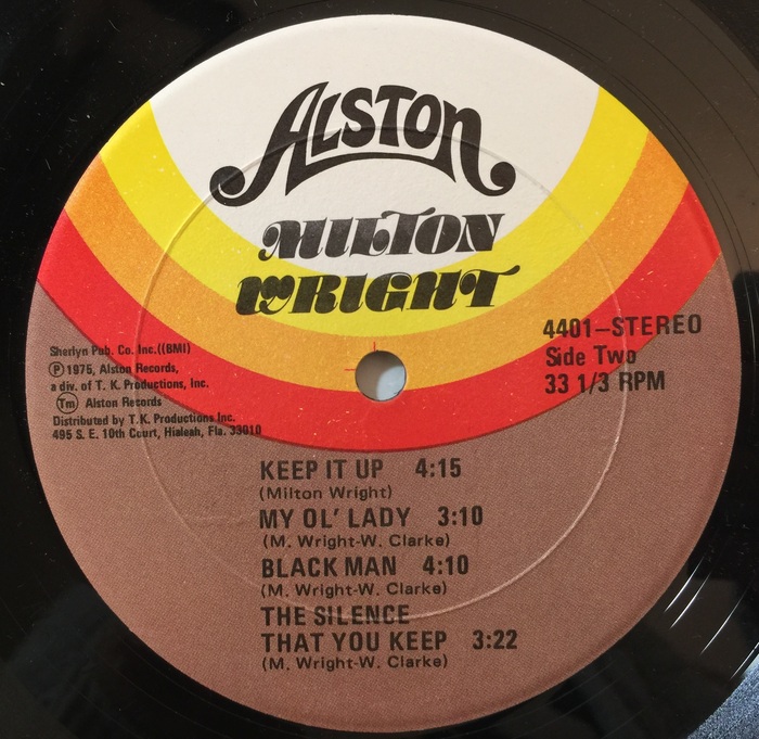
The lively and ultra-bold artist name set in Stilla contrasts nicely with the more sober album title “FRIENDS and BUDDIES”, set in “Sixties Bookman”, a.k.a. Bookman Bold Swash (used here without any swashes). On the reverse side, the track listing and credits also work well. They are set in Futura, using the Bold weight to separate the middle credits, and with generous leading for the smaller text, which is really helpful with a low x-height typeface like Futura. The rainbow motif on the label, using earth-toned shades of red, orange, yellow, and brown, are exactly what you’d expect to see in 1975 and it sets the mood perfectly. The label typography uses regular-wide and condensed styles from Univers. After admiring the song “Keep it Up” for so many years I’m happy to see that the original album typography is equally admirable.
Source: bid.omegaauctions.co.uk Omega Auctions. License: All Rights Reserved.
Source: bid.omegaauctions.co.uk Omega Auctions. License: All Rights Reserved.
Source: bid.omegaauctions.co.uk Omega Auctions. License: All Rights Reserved.
This post was originally published at Fonts In Use