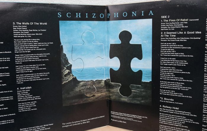
Mike Batt with The London Symphony Orchestra – Schizophonia album art

Source: www.amazon.co.uk License: All Rights Reserved.


Frankly, I don’t know much good to say about either cover or music of this 1977 Mike Batt album. I’m not into symphonic rock (and even then, this is not the finest example of the genre). The surreal artwork by Michael Hasted is at best a Magritte pastiche. And to top it off, the uninspiring typeface selection is used in an unimaginative way. But: designer Maurice Wilson of Studio Gerrard chose an interesting typeface for the album title: Cristal, an underrepresented typeface on this website with only three Uses before September 2023.
Cristal (Deberny & Peignot in 1953) was one of the first typefaces issued on transfer sheets, a Letraset precursor named Typophane. Once a frontrunner, the typeface was never updated with a digital version. Arlt Deco 2 and Scala Jewel Crystal are digital fonts in the same vein.

Source: r62musicstore.com License: All Rights Reserved.
This post was originally published at Fonts In Use