Mijo app

Mijo. License: All Rights Reserved.

Gamay by Darden Studio is the typeface used by Mijo.
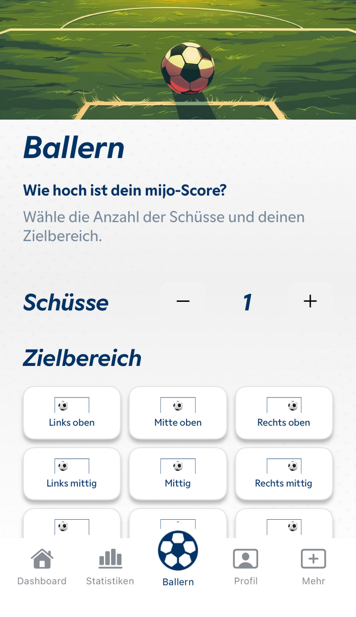
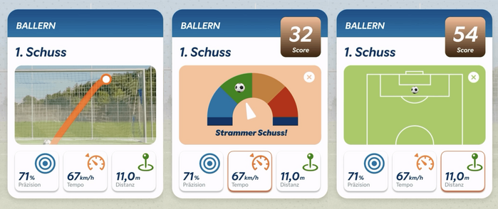
Mijo is a mobile app that helps soccer players optimize their shooting technique by analyzing parameters like flight curve, precision, and speed. Pitched as “the soccer field revolution”, the German startup aims to make such data analysis available to anyone.
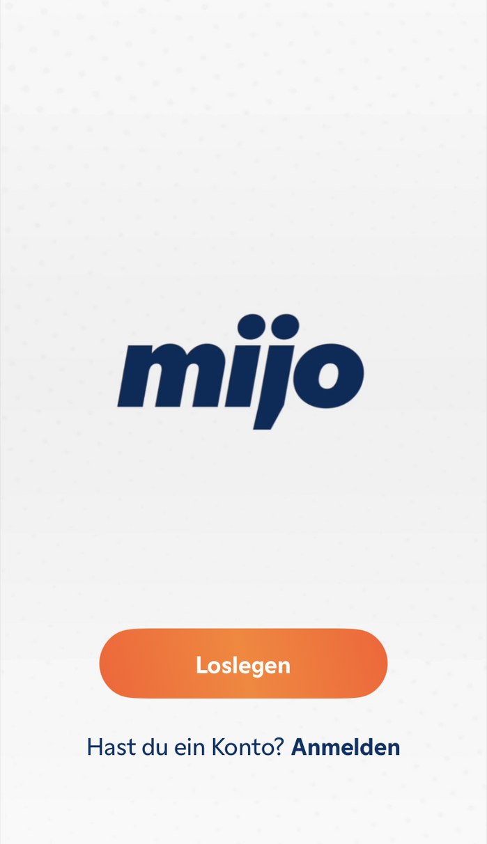
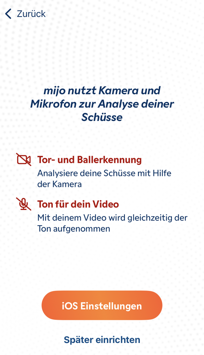
The Mijo logo is based on an Extrabold Italic style, used in all lowercase letters, featuring two of Gamay’s appriopriately round dots. Viktoriya Grabowska’s typeface family is also used for UI text throughout the app, in a range of weights and styles. Its clear-cut design makes for a nicely readable interface, while the italic’s slant gives the headlines momentum.

License: All Rights Reserved.
License: All Rights Reserved.
License: All Rights Reserved.

License: All Rights Reserved.
License: All Rights Reserved.

Source: www.sueddeutsche.de Thomas Schimmer. License: All Rights Reserved.
The founders – sports scientist Johannes Piller and physicist Christoph Keil – demonstrate their app in Grafing, Germany.
This post was originally published at Fonts In Use