London Tea
Published November 10, 2025
By FontsInUse
Contributed by Adam Ladd
Source: www.familyandfriends.uk.com © Family (and friends). License: All Rights Reserved.


Source: www.familyandfriends.uk.com © Family (and friends). License: All Rights Reserved.
Source: www.familyandfriends.uk.com © Family (and friends). License: All Rights Reserved.
This post was originally published at Fonts In Use
Source: www.familyandfriends.uk.com © Family (and friends). License: All Rights Reserved.
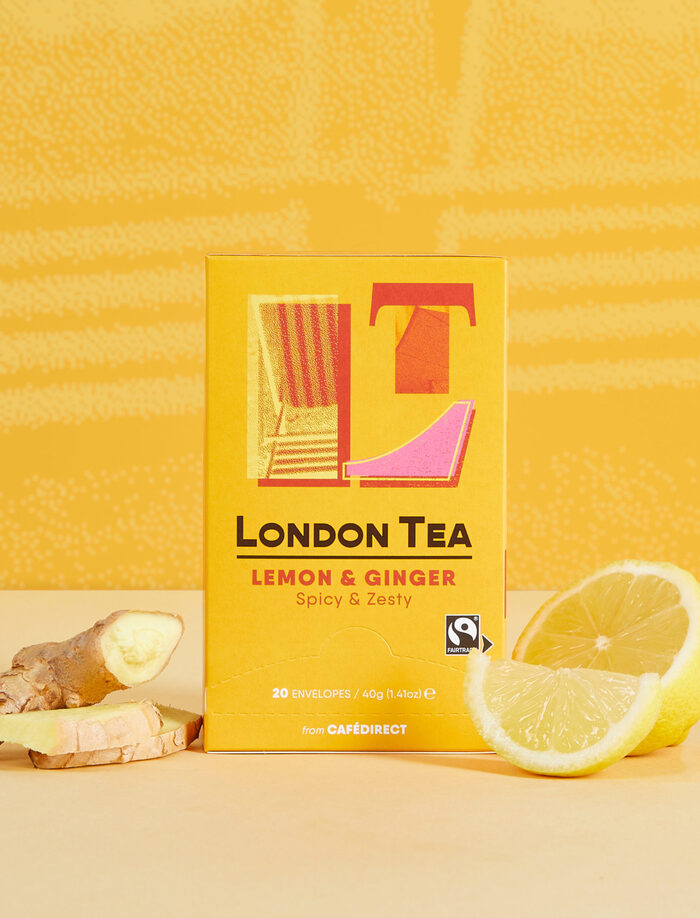
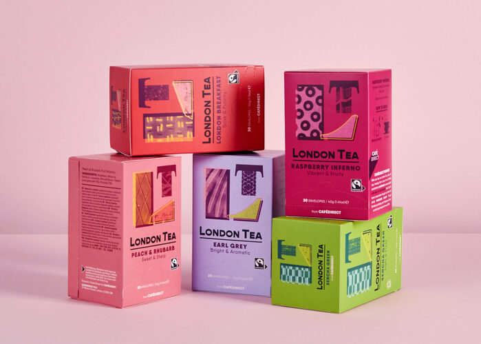
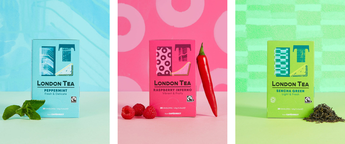
London-based studio Family (and friends) refreshed London Tea for Cafédirect with a playfully refined identity built around a hand-illustrated LT monogram. Bright, youthful colors distinguish the different flavors, while the typography remains simple and straightforward, letting the artwork take the spotlight.
The system pairs Gopher, a reverse-contrast modern sans serif by Adam Ladd Design, with the geometric sans serif Qanelas by Radomir Tinkov. Together, they balance personality with precision—modern, readable, and full of warmth.
See more of the case study on Family (and friends).
Source: www.familyandfriends.uk.com © Family (and friends). License: All Rights Reserved.
Source: www.familyandfriends.uk.com © Family (and friends). License: All Rights Reserved.
This post was originally published at Fonts In Use
Read full story.
WRITTEN BY
FontsInUse
An independent archive of typography.
More from FontsInUse