Meteor 2025
Source: part.no Photo: Mario Urban. License: All Rights Reserved.


Meteor is a biennial for contemporary theatre and performing arts, organised by Bergen Internasjonale Teater (BIT). In 2025 the festival received a new visual identity developed by PART. The identity is part of a larger design process we've undertaken for BIT and its sub-brands, Meteor, Oktoberdans and Prøverommet — each with its own rhythm, but now united on a shared visual platform.
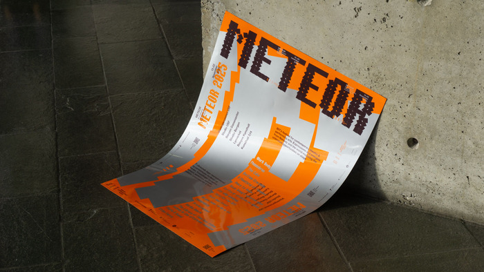
Where BIT uses three styles of the typeface family Bertin, Meteor uses one: Bertin Square Orientation. The color palette is raw and physical: a powerful orange, a deep maroon and a metallic grey.
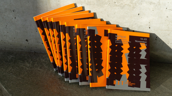
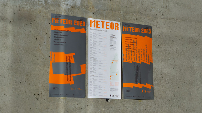
The campaign takes shape through print; the hero piece is an A1 format poster printed with orange and metallic silver sopot colors on coated stock. The poster is the basis for the entire physical campaign: cut and folded into two different program covers, two smaller poster formats that also work as pocket-sized campaign pieces, and finally into wayfinding during the festival. One print, many functions: a circular and tactile approach to festival design.
Source: part.no Photo: Mario Urban. License: All Rights Reserved.
Source: part.no Photo: Mario Urban. License: All Rights Reserved.
Source: part.no Photo: Mario Urban. License: All Rights Reserved.
This post was originally published at Fonts In Use