Super Eurobeat compilation covers (2000–2003)
Source: eurobeat.fandom.com License: All Rights Reserved.


From Wikipedia:
Super Eurobeat (Japanese: スーパー ユーロビート, Hepburn: Sūpā Yūrobīto; abbreviated SEB; officially stylized as SUPER EUROBEAT) is a CD compilation album series of Japanese Eurobeat music. It has been running for over three decades, making it one of the longest-running music compilations. Following Super Eurobeat Vol. 250 in 2018, the series became an annual release.
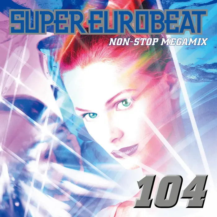
This is how the album covers for the Super Eurobeat series looked during the peak of eurobeat’s popularity in the early 2000s. This cover format launched on New Year's Day 2000 with volume 101, and was retired after June 2003 with volume 139. The volume numbers are set in City Bold Italic. Yes, there is a real italic to that typeface where the dots aren’t slanted. A digital version of the italics by Berthold exists.
The “SUPER EUROBEAT” wordmark, originally designed by Round Table Associates in 1991, appears to be based off of Insignia, redrawn with narrower proportions, angular glyphs for S, U, O, and protruding bits in P R B moved from the center to the top.

Source: eurobeat.fandom.com License: All Rights Reserved.
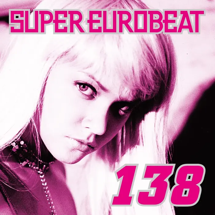
The volume number was flattened to just have an outline starting with volume 111.

Source: eurobeat.fandom.com License: All Rights Reserved.

Source: eurobeat.fandom.com License: All Rights Reserved.
Source: eurobeat.fandom.com License: All Rights Reserved.
The model images became monochrome and lens flares were removed from the covers in 2003.
Source: www.discogs.com License: All Rights Reserved.
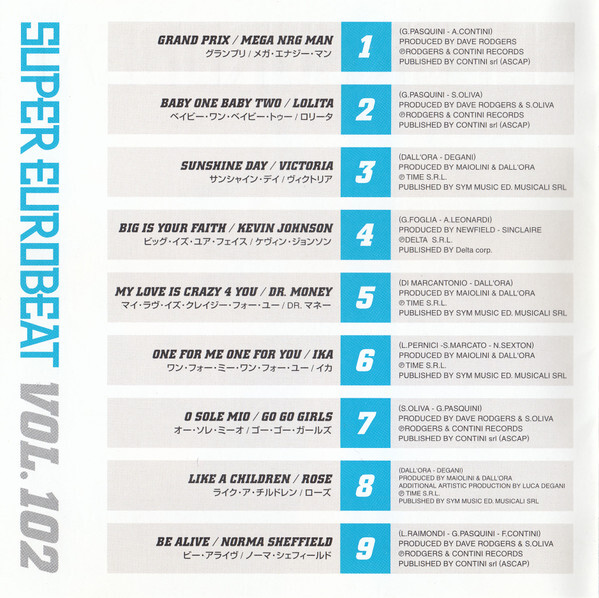
Tracklist from the liner notes, so you can see the period isn’t slanted. Credits are set in Helvetica. The Japanese font is yet unidentified.
This post was originally published at Fonts In Use