The Matterhorn pop-up bar
Source: www.commonhouse.com Common House. License: All Rights Reserved.


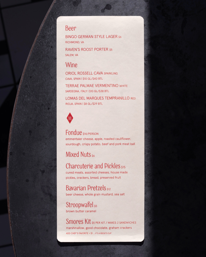
Common House put Clearly to great use for the branding, cocktail menu, website, and “lift tickets” for their Alpine ski bar The Matterhorn. Clearly is used for the bar’s logotype and as the primary display typeface with Aperçu and Aperçu Condensed as complimentary sans-serifs.
Keith Freeman, Common House Creative Director, talks about the inspiration behind the pop-up bar concept in the Daily Progress:
In a more significant way, though, the theme was influenced by something my dad always touted as his favorite place on earth: the ski lodge after a long day on the mountain with friends and family,” he said. “The warmth, the camaraderie, the drinks and snacks, the mess of thawing scarves and hats and socks. To him, to me, it was always the best part of winter and our favorite place to reminisce about the day’s adventures and simply enjoy being together. Selfishly, this was what I wanted to recreate and share with Charlottesville. The mountains are not too far and many are familiar with this experience. But for those who have never been to a mountain lodge, we wanted to bottle that feeling and make it more accessible.

Common House. License: All Rights Reserved.

Common House. License: All Rights Reserved.

Common House. License: All Rights Reserved.
Common House. License: All Rights Reserved.

Common House. License: All Rights Reserved.
This post was originally published at Fonts In Use