Marka
FIRM.GS. License: All Rights Reserved.


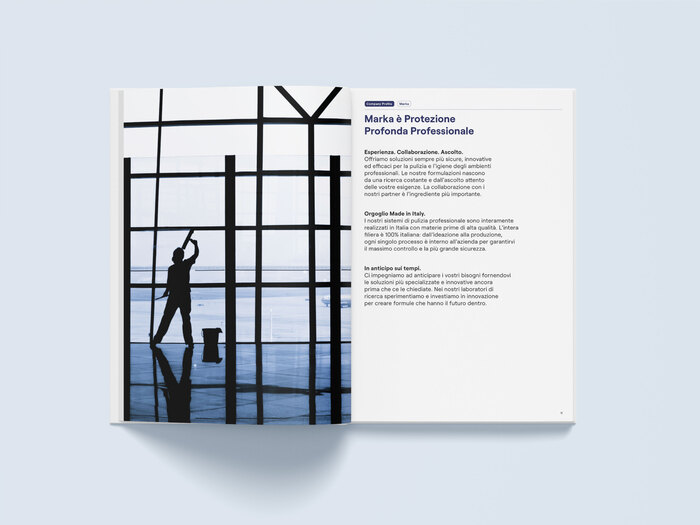
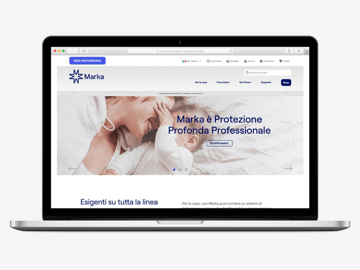
FIRM.GS developed the new identity of Marka, leader in the professional cleaning sector with the aim of entering the B2C market.
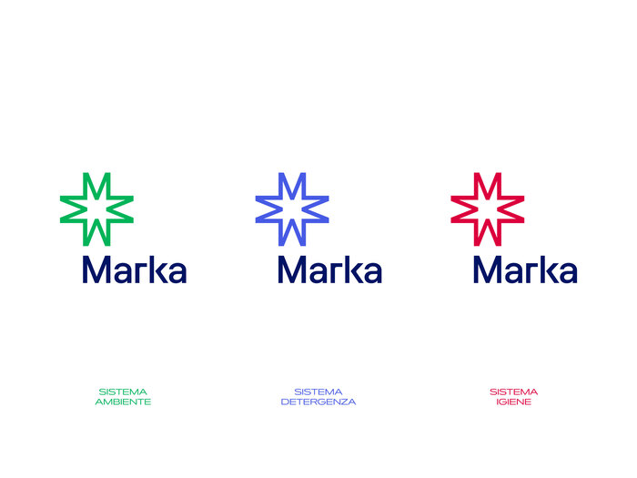
Starting from this analysis, we developed an image capable of expressing the commitment and strong technical vocation of MK, a group that includes the Marka brand and is a leader in the formulation of highly specific and effective products.
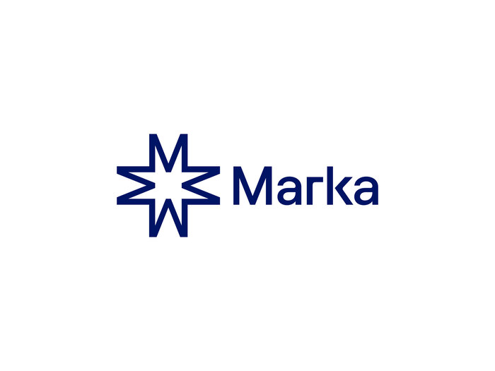
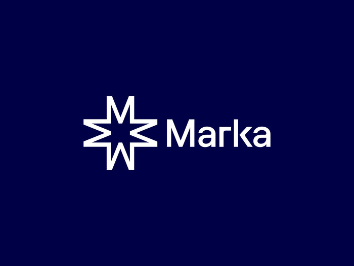
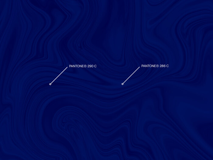
The logo is a semiotic expression of this repositioning. The pictogram recalls simple shapes: a star and a cross, an extreme synthesis of the concepts of protection, deep cleaning, and professionalism and it is created by duplicating and mirroring the M of the logotype.
The typography, constructed with alternating extremely geometric curves, sharp lines and edges, speaks of the rigor and care that Marka adopts in its business processes.
As a direct consequence, we chose Roobert by Displaay Type Foundry as corporate typeface thanks to its geometric and rational identity.
FIRM.GS. License: All Rights Reserved.
FIRM.GS. License: All Rights Reserved.
FIRM.GS. License: All Rights Reserved.
FIRM.GS. License: All Rights Reserved.

FIRM.GS. License: All Rights Reserved.

FIRM.GS. License: All Rights Reserved.
FIRM.GS. License: All Rights Reserved.
FIRM.GS. License: All Rights Reserved.
FIRM.GS. License: All Rights Reserved.
FIRM.GS. License: All Rights Reserved.
FIRM.GS. License: All Rights Reserved.
FIRM.GS. License: All Rights Reserved.

FIRM.GS. License: All Rights Reserved.

FIRM.GS. License: All Rights Reserved.
This post was originally published at Fonts In Use