PRD
Published May 25, 2023
By FontsInUse
Contributed by Tabrez Ahmad
Source: www.tabrez.cc License: All Rights Reserved.


Source: www.tabrez.cc License: All Rights Reserved.
Source: www.tabrez.cc License: All Rights Reserved.
Source: www.tabrez.cc License: All Rights Reserved.
Source: www.tabrez.cc License: All Rights Reserved.
This post was originally published at Fonts In Use
Source: www.tabrez.cc License: All Rights Reserved.
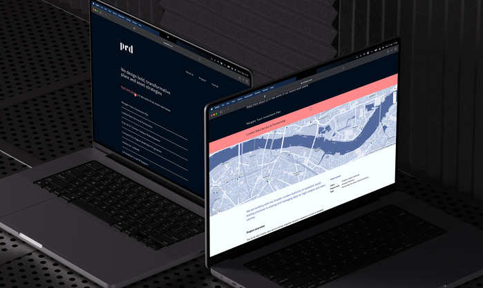
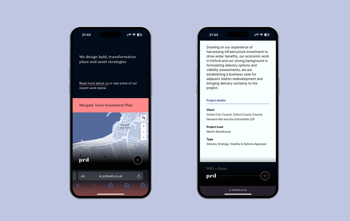
PRD position themselves as experts in the field of socioeconomic investment strategies for places, partnership, and delivery structures.
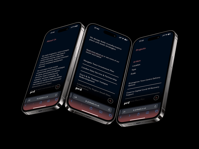
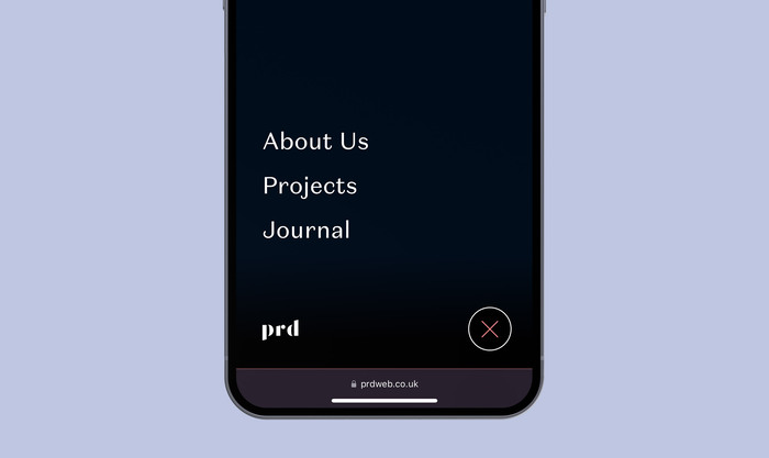
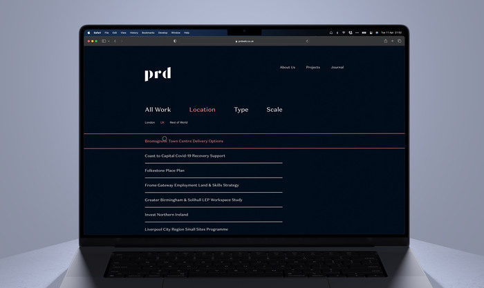
Working collaboratively with PRD, I refined their colour palette and typography. We used Klim Type’s unconventional Domaine Sans Text for the headers and Rasmus Andersson’s ubiquitous Inter for long-form copy. Combining a solid grid system, accessible colours, and carefully crafted typography, the website is optimised for comfortable reading, even without a typical “showcase website” layout. Each project they work on is specific to a “place,” so we used a MapBox API to customise the colour scheme to work alongside the website UI. The design was crafted for seamless experiences on mobile and desktop.
Source: www.tabrez.cc License: All Rights Reserved.
Source: www.tabrez.cc License: All Rights Reserved.
Source: www.tabrez.cc License: All Rights Reserved.
Source: www.tabrez.cc License: All Rights Reserved.
This post was originally published at Fonts In Use
Read full story.
WRITTEN BY
FontsInUse
An independent archive of typography.
More from FontsInUse