Manifestoes of Surrealism by André Breton, paperback edition
License: CC BY-NC-SA.


This is the 1972 paperback edition of André Breton's Manifestoes of Surrealism. I believe the interior to be the same as the hardcover, but I don't know for sure. (As with the hardcover, the book design is credited to Quentin Fiore.)
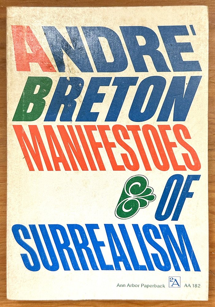
The cover uses skewed Helvetica Compressed [see comments] for the author's name, and Inserat-Grotesk for the book title. The decorative dingbat is picked up from the hardcover design, and skewed to match the new type. Also, like the hardcover, note the unusual solution for the accent on the E in André, this time using a line parallel to the top bar of the E.
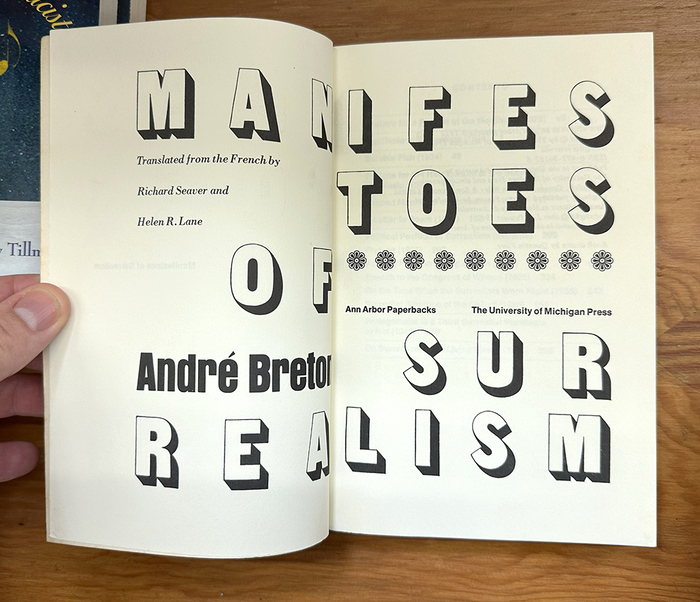
The interior of the book is notable for its use of a different text face for each section.
The title page spread uses Sans Shaded for the title and Anzeigen Grotesk for the author's name. The translator credits are in Bodoni Italic, and the publisher names are in Helvetica Medium.
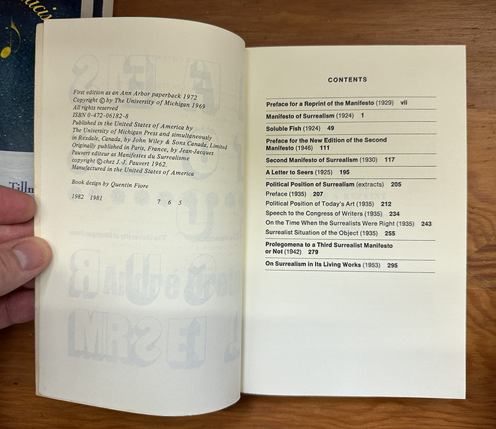
The copyright page is in Times New Roman Italic, and the table of contents is in Helvetica.
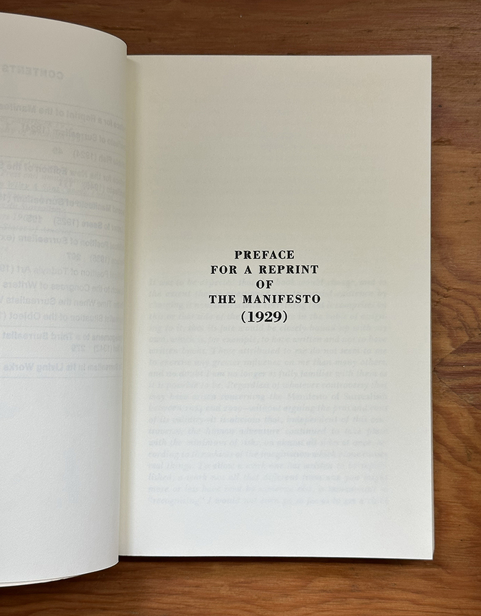
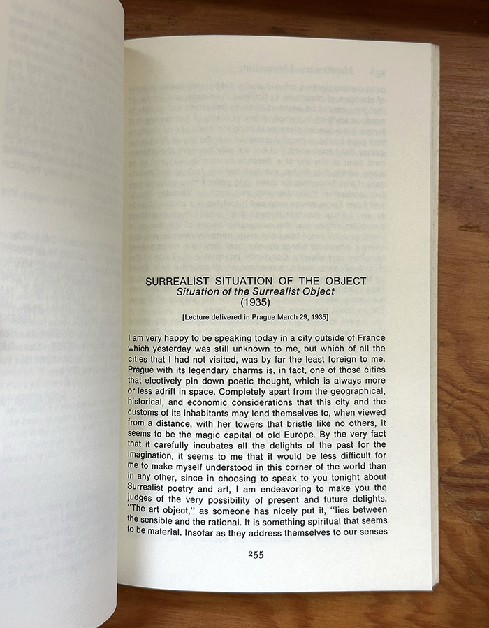
The section openers are set in Bodoni Bold.
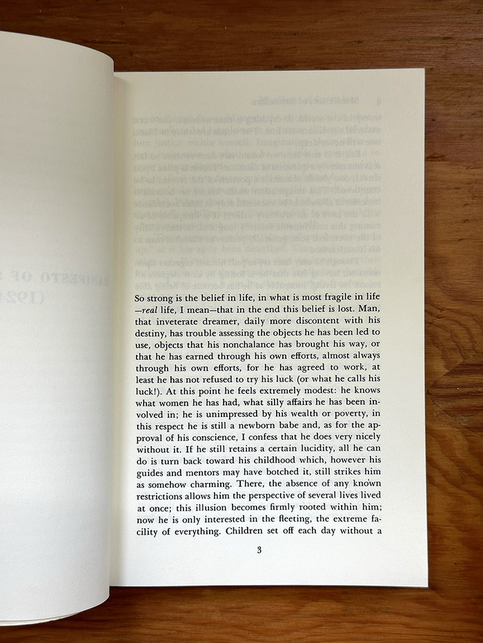
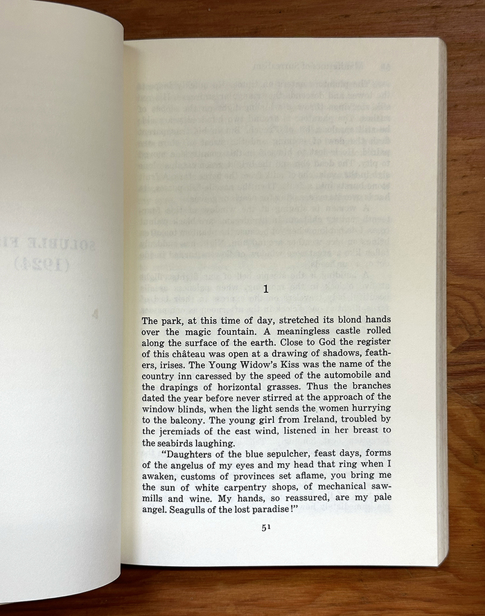
The texts are set in a mix of Baskerville, Century Expanded, Helvetica, and Bodoni Bold.
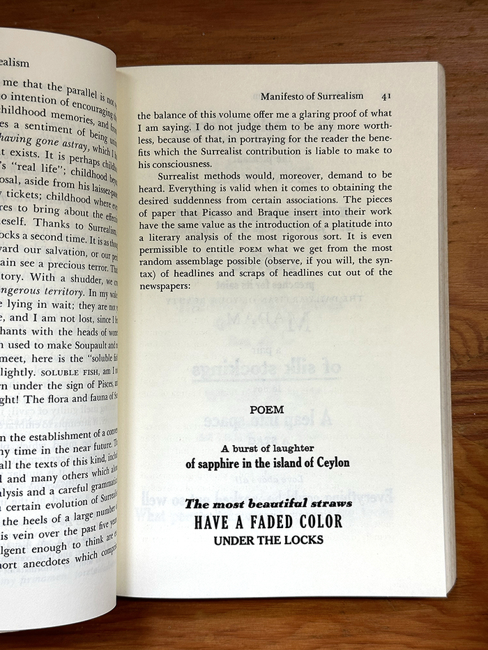
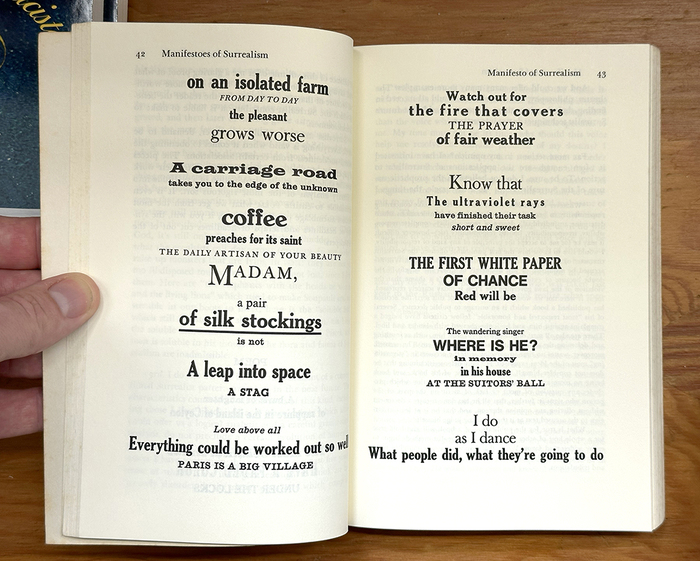
Within the first manifesto is “Poem,” randomly assembled from headlines and scraps of headlines, reset in many typefaces, including Cheltenham, Baskerville, Vulcan Bold Italic (see Greco, Latin Bold and Latin Wide, Windsor Bold, Beton Bold, and Clarendon.
License: CC BY-NC-SA.
License: CC BY-NC-SA.
License: CC BY-NC-SA.
License: CC BY-NC-SA.
License: CC BY-NC-SA.
License: CC BY-NC-SA.
License: CC BY-NC-SA.

License: CC BY-NC-SA.
License: CC BY-NC-SA.
This post was originally published at Fonts In Use