Malta Hilton identity and advertising
License: All Rights Reserved.
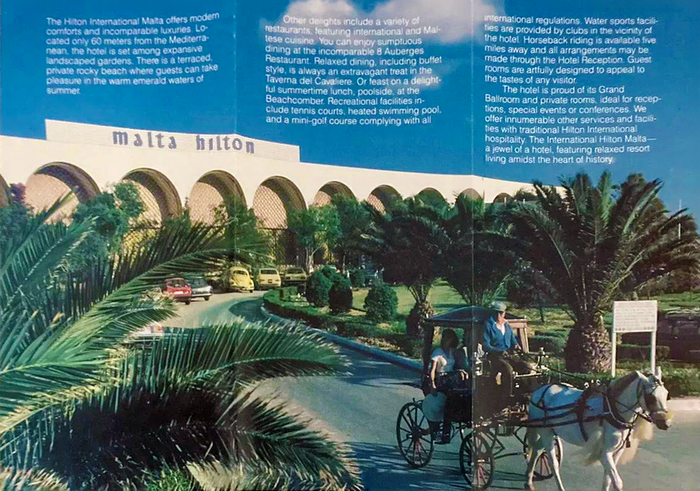
Malta Hilton brochure from the 1980s with the wordmark in Libra



The original Malta Hilton opened in St Julian’s in 1967, three years after Malta gained independence from Britain and as tourism was becoming central to the island’s economy. Designed by Thomas E. Stanley and Associates and rooted in late modernism, the architecture featured New Formalist and Mediterranean influences. Two low horizontal wings, symmetrically laid out and slightly angled away from a central section, extended across the heart of the 30-acre (12 ha) site. Round arches gave the façades a strong horizontal rhythm and emphasized the building’s low profile. The two wings framed much of the hotel’s seaward-facing grounds, where remains of the 18th-century Spinola Entrenchment and the later British Fort Spinola continued to shape the resort. A similar approach was applied to the interiors, bringing local and historical references into a contemporary setting.
The scale of the site allowed for extensive outdoor facilities, including tennis courts and a miniature golf course, with broad stretches of open land remaining between them, some of it covered in near-wild Mediterranean scrub and a grove of cacti. Across these spaces, guests could wander to surviving sections of the old fortifications, where historic cannons were displayed, or reach the hotel’s beach club on the rocky shoreline. The old Hilton closed in 1996 and was demolished to make way for Portomaso, a much denser complex comprising a new Hilton, a man-made marina, convention facilities, apartments, offices and a larger retail component, as well as the Portomaso Business Tower, Malta’s first high-rise development.
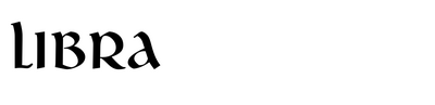
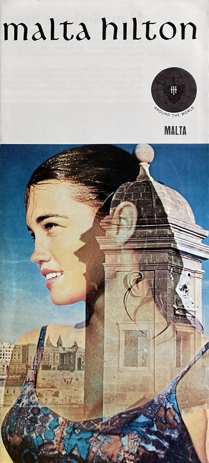
A certain interest in the past also extended to the graphic identity of the original Malta Hilton. The property-specific wordmark was set in Libra, designed by S.H. de Roos for Lettergieterij Amsterdam in 1938. Its uncial-based forms lend the logotype an abstract sense of historical depth. A separate monogram, likely custom-drawn, combined the lowercase initials m and h in a style that seems to echo Libra loosely.
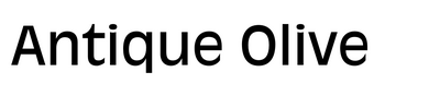
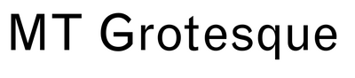
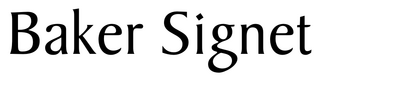
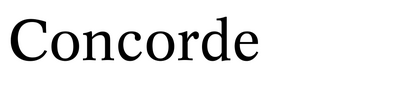
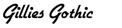
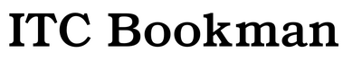
Advertisements used comparatively neutral faces for body copy, including Monotype Grotesque, Helvetica and Univers, as well as Times New Roman and Concorde. More distinctive designs, such as Antique Olive, Baker Signet, Bradley, Gillies Gothic and several versions of Bookman were employed for headlines and other display purposes, apparently selected according to context, availability and current fashions rather than following a coherent typographic system.
Beyond the scope here, but worth noting: a small number of examples in the collected material show the wordmark being replaced by a Libra-like substitute. Furthermore, around 1989, the property-specific design gave way to the then-current Hilton International wordmark, which was used in advertising and mounted on the building until its demolition.
License: All Rights Reserved.
1967 Malta Hilton brochure
License: All Rights Reserved.
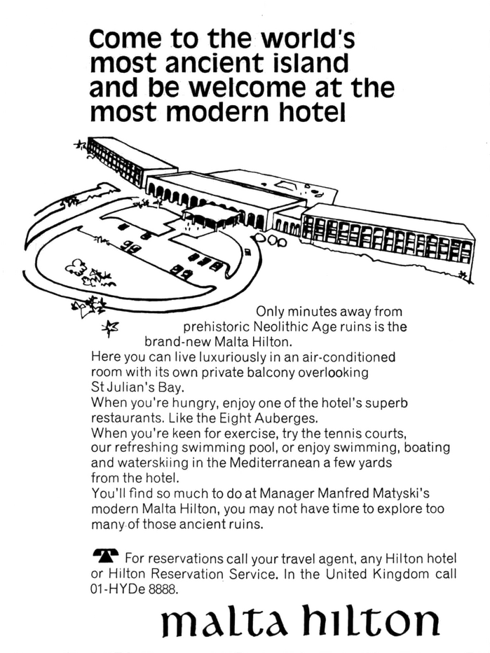
The Illustrated London News, 3 February 1968. Headline set in Antique Olive, body copy in Monotype Grotesque.
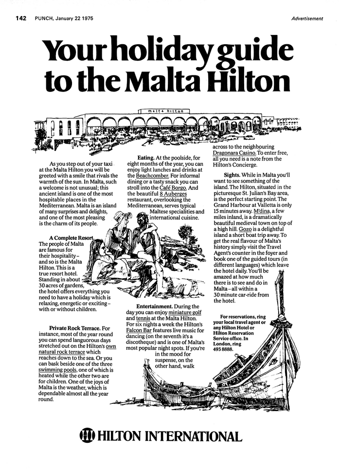
License: All Rights Reserved.
Punch, 22 January 1975. Headline set in a version of Baker Signet (either Baker Signete Extra Bold by Headliners or Signete Serial 5 by Brendel / Typeshop), body copy in Concorde, running header in Univers, with Frutiger’s preferred 16° italic.
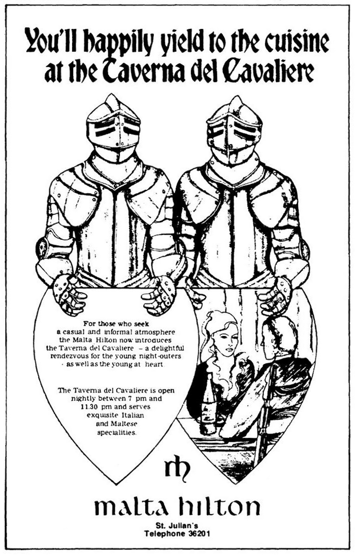
License: All Rights Reserved.
Times of Malta, 4 May 1977. Headline set in Bradley.
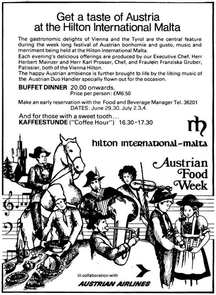
License: All Rights Reserved.
Times of Malta, 2 July 1981. Headline set in Helvetica, supporting copy in Univers (numerals in the DATES line are Helvetica), “Austrian Food Week” in Bookman Swash
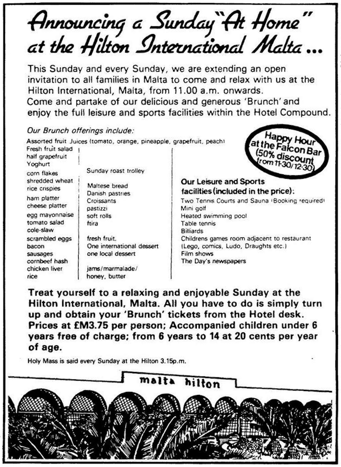
License: All Rights Reserved.
Times of Malta, 13 November 1982. Headline set in Gillies Gothic, body copy in Univers.
License: All Rights Reserved.
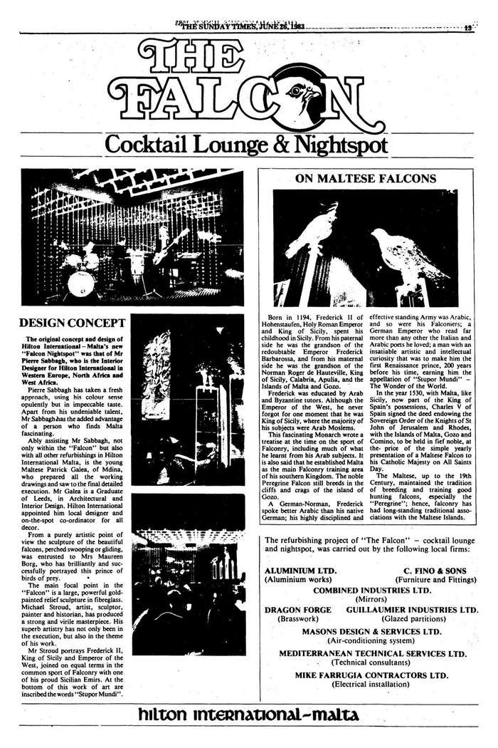
The Sunday Times, 26 June 1983. “The Falcon” logo based on ITC Bookman Outline with Swashes, “Cocktail Lounge & Nightspot” set in Bookman, body copy in Times New Roman.
This post was originally published at Fonts In Use